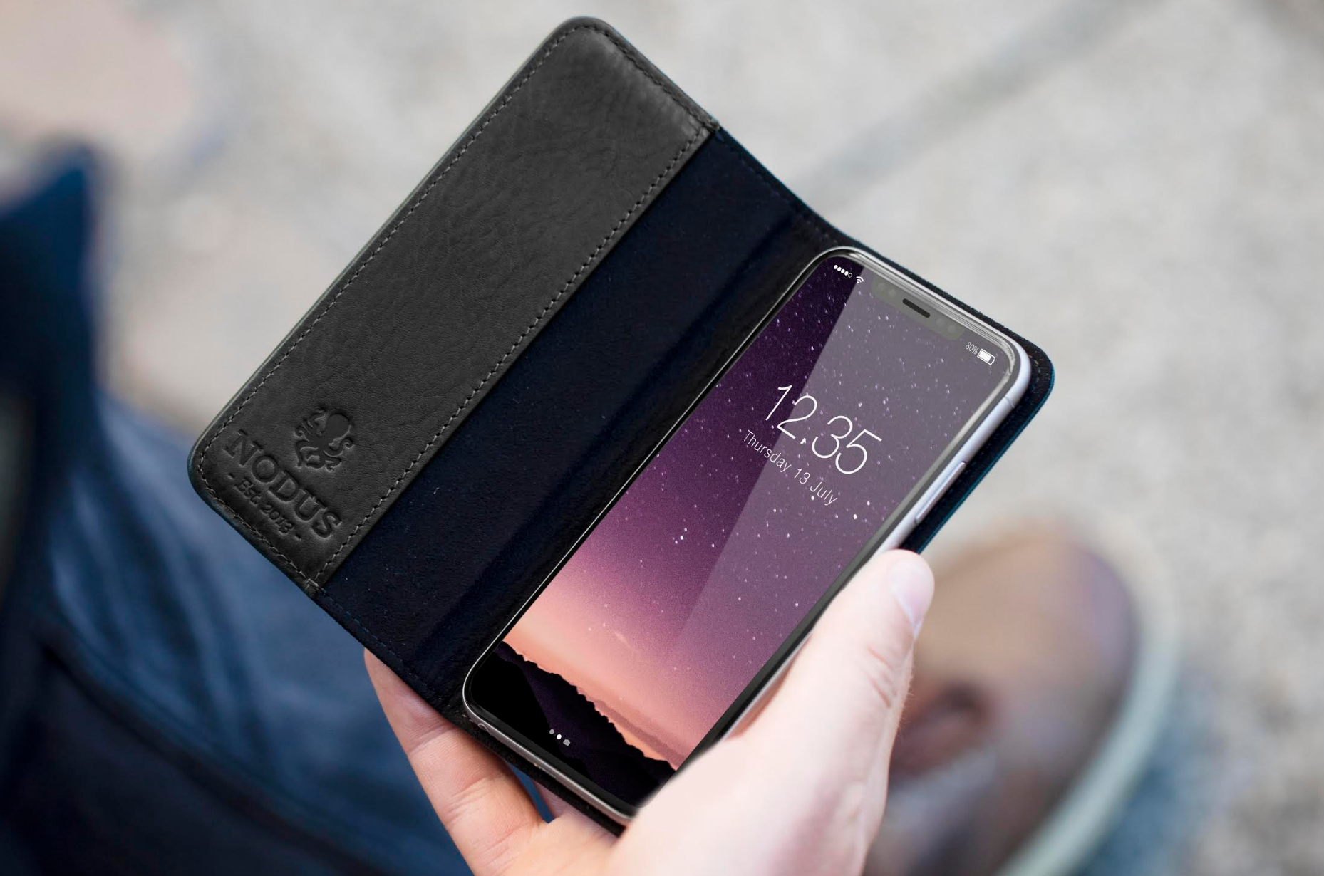
It is unlikely to look like that, sorry to burst bubbles. That is asymmetric design. Unlike Apple. Secondly, the Home Button absolutely has to remain at the bottom face of the device, and because this is so, this area may as well be perpetually black, akin to the Touchbar and symmetrical with the top bar. That's just logic.
Thirdly, the top is unlikely to be like that with the status bar. Why? Because you cannot fit the status bar in those two areas. They're too small. You have to have the time glanceable on the screen at nearly all times. To even consider that Apple would just get rid of the time is boredline absurd in my opinion. It's simply one of those things that CANT happen. Why do I say can't? Because glanceable time is fundamental to the experience that everyone knows. The moment people have to do something to see the time (and yes, I mean swiping down the new lock screen/Notification Center), is the moment you annoy tens of millions of people. It's simply not happening.
Everyone knows the change from dots to bars truncated the text in the status bar slightly, but the simple truth is, intelligent thinkers don't stop at that. Intelligent thinkers say, okay, they did this, but that doesn't necessarily mean their intent is what is seemingly obvious. The intelligent thinkers go beyond the obvious, the superficial. It's ease to assume that was the intent, it's much harder to go beyond that and consider why that isn't so, but merely coincidental.