Become a MacRumors Supporter for $50/year with no ads, ability to filter front page stories, and private forums.
Do you even know what CMYK is? It is used in printing (I am a prepress operator by trade) and it is not a colour standard, the standard that most CMYK printing aims for is ISO 12647/2

Tv's, phone screens ect are RGB. sRGB is a Colour space which most phone tend to target.

I’m a designer by trade. Of course I know what CMYK and RGB is. The point I am making is that digital color that can represent real world color should be the goal. Not overly saturated, hyped up color modes. That’s the point. Aim for a true representation of color.
 
  • Like
Reactions: dazz87
I’m a designer by trade. Of course I know what CMYK and RGB is. The point I am making is that digital color that can represent real world color should be the goal. Not overly saturated, hyped up color modes. That’s the point. Aim for a true representation of color.
In that case most phones give you that option or come setup like that out of the box. Pixel XL, Note 8 and I dare say the iPhone X are all capable of accurate colours to sRGB. I think the biggest misconception is that Samsung phones are not accurate or natural looking due to them using the Adaptive setting out of the box, set them to basic and they are very accurate.
 
Define "proper colour management"?
It is easy. If image capture with srgb it will be displayed with that colour gamut. If taken with p3 or adobergb (which has a much higher gamut than srgb)it will be displayed with that gamut as intended by the content creator.

Trouble with putting in basic mode is it might be good for srgb, but then it will display everything with that gamut - even images intended for higher gamuts. Imagine you have 3 images that have different colour profiles, in a Samsung you would have to change the colour mode multiple times to get what it would like as intended by the creator. In iOS there is no need to change anything.

It gets even worse if you do content creation on Samsung as it doesn’t even save the colour profile of the image properly. You get a super saturated image on screen and once you send it to someone else or post on instragram it looks way down deferent for other people when they view it.
 
  • Like
Reactions: Mescagnus
It is easy. If image capture with srgb it will be displayed with that colour gamut. If taken with p3 or adobergb (which has a much higher gamut than srgb)it will be displayed with that gamut as intended by the content creator.

Trouble with putting in basic mode is it might be good for srgb, but then it will display everything with that gamut - even images intended for higher gamuts. Imagine you have 3 images that have different colour profiles, in a Samsung you would have to change the colour mode multiple times to get what it would like as intended by the creator. In iOS there is no need to change anything.

It gets even worse if you do content creation on Samsung as it doesn’t even save the colour profile of the image properly. You get a super saturated image on screen and once you send it to someone else or post on instragram it looks way down deferent for other people when they view it.
I understand what Colour management is, I was trying to understand exactly what Apple was doing different and it now makes sense. I guess Samsung could improve Adaptive mode to do the same after all that is the whole point of it. For some reason Samsung seem to believe people prefer more punchy colours. Personally I like Adaptive mode.
 
I understand what Colour management is, I was trying to understand exactly what Apple was doing different and it now makes sense. I guess Samsung could improve Adaptive mode to do the same after all that is the whole point of it. For some reason Samsung seem to believe people prefer more punchy colours. Personally I like Adaptive mode.
It's not that much different that people who prefer the Vivid/Dynamic picture mode on their televisions. I despise those people, personally.
 
  • Like
Reactions: dazz87
Galaxy Note is King and I'm sure they didn't compare any of the Note 8's display modes....i seen my girlfriends iphone x and it looks dull. It has nothing on my Note 8 display. Also,ask Mr.Mobile what he thinks and he agrees with this assertion.

Much better article for comparison....

https://translate.googleusercontent....shtml&usg=ALkJrhgc7Ngw5ZkI0rb7z5sUeFXdPHD8Og
Dawww jamesrick don't feel bad, buddy. The Note 8 had a good run... lol. Unfortunately it seems Apple improved upon Samsung's existing design. Too bad it's PenTile, but I'd still take Apple's implementation of it any day, given what that comparison just revealed.
 
Last edited:
It's not that much different that people who prefer the Vivid/Dynamic picture mode on their televisions. I despise those people, personally.
Same!! I have my TV calibrated professionally and I HATE people that have their TV set on dynamic mode, but on my phone I like the punchy colours that Samsung phones provide as I don't watch movies and Tv shows on it.
 
The article was completely bias. It didn't look at display modes for color accuracy for the Note 8. Viewing angles is to the eye of the beholder. There are more color shifts in the iphone X than the S8 or Note 8. You are better waiting for displaymate reviews. Leaving out information about resolution, ppi, display modes, customization for a cooler or warmer display etc. in the galaxy series really shows that the article was completely bias. In person, anyone who sees both displays knows the s8 and note 8 is impressive compared to the iphone X's display which is really a S6 panel with some Apple customizations. Hey, my girlfriend who sleeps next to me every night has the iphone X and even she said it cannot compete with the Note 8's screen. Happy iPhone Day....
"I think anecdotal evidence is far more reliable than scientifically retrieved numbers"

"My source is better than your source because my source aligns with my agenda"

I'm getting that kind of vibe from this post
 
So is iphone x oled panel on par with s6 generation or s8?
its all speculation at the moment. However going off all the off axis colour shift complaints, lower PPI and lower brightness i'm going to bet its not the same generation as the S8. It seems likely its an S6 panel with a modified sub pixel arrangement and Apples colour calibration.
 
A three year old tech into an over 1000$ device...Apple should stay on lcd
And that 120hz touch input whats that all about?
So instead of an s6 oled panel, apple should went with lcd promotion
 
I’ve spent the evening with my new X. The display is amazing. It’s razor-sharp, with perfect color and blacks. The blue shift seems minor, only really noticeable if you tilt the phone quite a bit. Not an issue if you look at your screen at a normal angle.

Apple clearly went for a balanced and realistic calibration, but if you want to see the display really pop, load up an HDR photo or movie. I just watched a phaser battle scene from Star Trek Into Darkness. The colors were deep and the phaser flashes and explosions were startlingly bright.
 
A three year old tech into an over 1000$ device...Apple should stay on lcd
And that 120hz touch input whats that all about?
So instead of an s6 oled panel, apple should went with lcd promotion
Its all speculation and remember that custom Sub Pixel arrangement is a big deal. From all reports the iPhone X screen it pretty damn good with exception of the off axis colour shift.
 
  • Like
Reactions: redman042
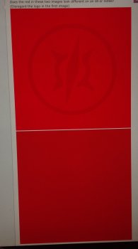
Does the red in these two images look different on an s8 or note8? (Disregard the logo in the first image)
2C64EDD7-1686-472D-937A-1AFF5EBBBE71.png
7706FB71-0667-41DA-B08F-601A5B456D7A.png
 
Samsung limits itself, it wants to control your brightness. Before i purchased an iphone i compared my note 5, my buddies galaxy s7 and an iphone 6 plus. Both of us had to start adjusting settings so we could understand why the iphone looked better with an lcd screen. Ill also never miss samsung warning me everytime i turn the volume up on my phone. Its so annoying when you're trying to turn the music to full volume with the screen off and it wont let you until you look at a warning about sound levels.
Samsung has to limit the brightness for its users because they can't seem to get their heads around the fact that screen burn-in is a thing that happens when you turn your brightness up full trying to impress Apple users.
 
Are personal attacks really needed.
[doublepost=1509781742][/doublepost]
look exactly the same on my S8 in adaptive mode.
They shouldn’t look the same on a high gamut device, because the images are tagged with different profiles. The first image should be more saturated. Do you see the logo on the first image?
 
They shouldn’t look the same on a high gamut device, because the images are tagged with different profiles. The first image should be more saturated. Do you see the logo on the first image?
They are png files, I think you need to upload a tiff file. They look the same on my laptop aswell.
 
They are png files, I think you need to upload a tiff file. They look the same on my laptop aswell.
They look the same on my iPad 3 because it is only an sRGB device (as is your laptop) They should look the same on a device that only has an sRGB gamut. They look different on my iPad Pro 10.5”, because it has color management, high gamut, and can read the tagged profiles. Do you see the logo in the first image on either device?
 
They look the same on my iPad 3 because it is only an sRGB device (as is your laptop) They should look the same on a device that only has an sRGB gamut. They look different on my iPad Pro 10.5”, because it has color management, high gamut, and can read the tagged profiles. Do you see the logo in the first image on either device?
Ok when I download the image on my S8 and open them I see the logo on the first image. On my laptop I don't see the logo
 
Last edited:
Here's approximately what it looks like on my iPad Pro. It can automatically select the correct color gamut for each image, even when they are both next to eachother on the same page. That's why iDevices don't need selectable color modes.
image.jpeg
 
Nope I dont see the logo. Ok when I download the image and open them I see the logo on the first image.

Here's approximately what it looks like on my iPad Pro. It can automatically select the correct color gamut for each image, even when they are both next to eachother on the same page. That's why iDevices don't need selectable color modes.
View attachment 731958

Couldn't have said it better myself. That's the power of proper colour management.
 
Here's approximately what it looks like on my iPad Pro. It can automatically select the correct color gamut for each image, even when they are both next to eachother on the same page. That's why iDevices don't need selectable color modes.
View attachment 731958
Fair enough and if it was the device I was watching all my Blu-rays movies on I would not be happy but I use my phone for social media and to take a few photos here and there so proper colour management is not a priority for me.
 
Fair enough and if it was the device I was watching all my Blu-rays movies on I would not be happy but I use my phone for social media and to take a few photos here and there so proper colour management is not a priority for me.
It should be important if you want to share your photos. What other people see will look significantly different to what you thought you uploaded.
 
Register on MacRumors! This sidebar will go away, and you'll see fewer ads.