Got a tip for us?
Let us know
Become a MacRumors Supporter for $50/year with no ads, ability to filter front page stories, and private forums.
Is iOS 7 designed for a White iPhone?
- Thread starter Raggsokk
- Start date
- Sort by reaction score
You are using an out of date browser. It may not display this or other websites correctly.
You should upgrade or use an alternative browser.
You should upgrade or use an alternative browser.


scrappydoo93
macrumors regular
What dock is that? ebay/chinese?
It's Chinese but the quality seems fair enough. I wanted something that matched the black iPhone and got this one for like 10 bucks.
lordofthereef
macrumors G5
At the bottom it says features see subject to change. Everything about iOS7 looks unpolished, very beta like.
And apple puts their signature on it?
Listen, I can respect your opinion, but its just that, an opinion. I don't think we are going to see wild changes at all. What we have now is an almost finished product, most likely. I honestly think it looks great. Agree to disagree I guess.
Also, saying "features see subject to change" is how a company covers its butt in case people start whining up a storm if Apple has to pull something for whatever reason. Fine print like that is pretty par for the course these days and is no indication that one thing or another will be different at final release.

Wow, get a clue guys.
You don't get obvious sarcasm, do you?
TacticalDesire
macrumors 68020
Posted by someone else in another thread but was buried by all the useless topics being started.
Listen, I can respect your opinion, but its just that, an opinion. I don't think we are going to see wild changes at all. What we have now is an almost finished product, most likely. I honestly think it looks great. Agree to disagree I guess.
Also, saying "features see subject to change" is how a company covers its butt in case people start whining up a storm if Apple has to pull something for whatever reason. Fine print like that is pretty par for the course these days and is no indication that one thing or another will be different at final release.
I wouldn't say it looks great but I do think it looks pretty basic. But I don't remember the features subject to change quote from the previous release...
Last edited:
Yeah, none of the other iOS releases said "features subject to change".
I don't mind getting another phone. I really don't. I don't like flat Fischer-Price-like design it's why I didn't like Metro.
And it's odd that Apple would come out with this. There are some really great developers out there that when you open their apps, you like the look, but iOS7 is just as tacky as I had feared it would be.
Leonard1818
macrumors 68020
True story: (maybe)
Apple has a surplus of white phones and they're trying to drum up appeal of white so they can reduce surplus.
Apple has a surplus of white phones and they're trying to drum up appeal of white so they can reduce surplus.
True story: (maybe)
Apple has a surplus of white phones and they're trying to drum up appeal of white so they can reduce surplus.
Actually I think the white sells better than that black iPhone 5.
lordofthereef
macrumors G5
I wouldn't say it looks great but I do think it looks pretty basic. But I don't remember the features subject to change quote from the previous release...
I don't necessarily remember it from one release or another. But I can certainly say I have seen it before. And usually, features don't end up changing, almost at all. Again, legal and pr butt covering. That's likely it.
sclawis300
macrumors 65816
Pretty sure it was sarcasm, lol.
You don't get obvious sarcasm, do you?
They were being smart @$$es. I understand sarcasm. Pretty sure they thought OP was stating that os7 would only be available on the white iPhone when clearly OP meant it looked best on the white as if they preferred the white phone.
nerdfighter
macrumors member
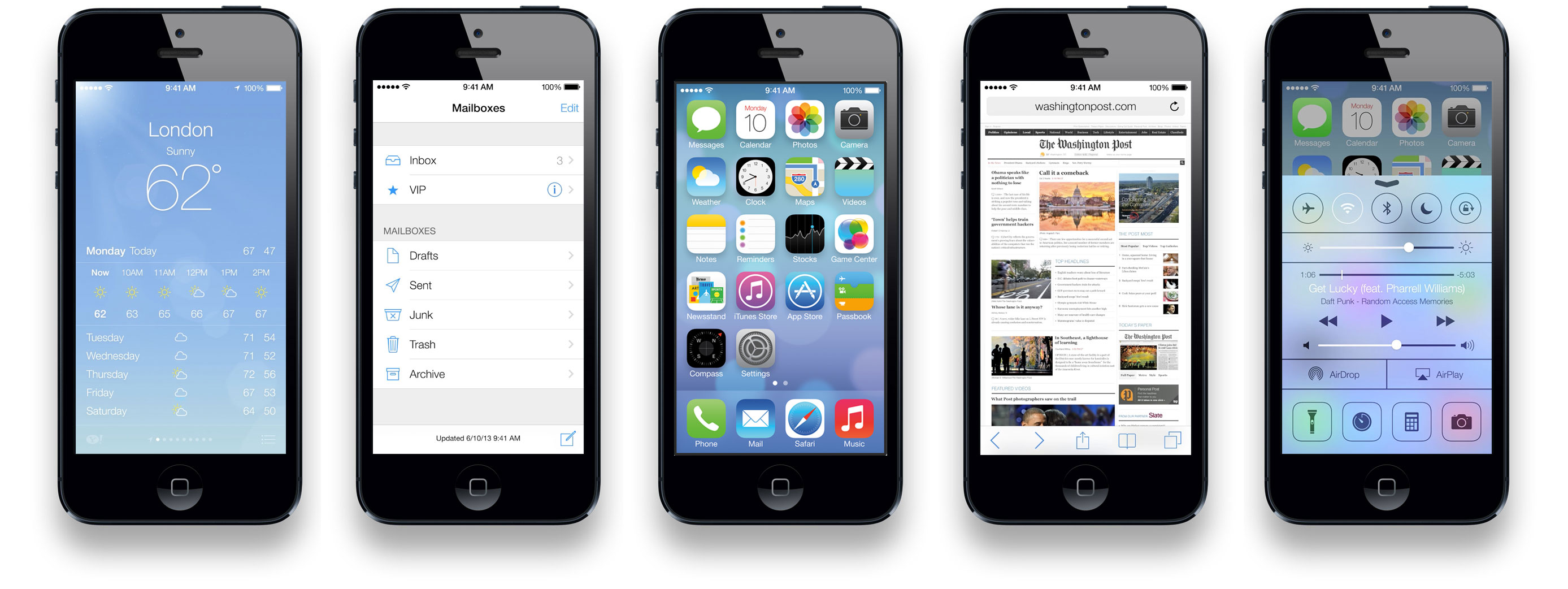
It's somewhat worse when you have an app like Mail, Messages, Settings, or App Store (for example) open, where it's predominantly white, with thin fonts, and thin blue "icons"/arrows--looks quite garish on a black iPhone in particular.Here you go.
Yeah I mentioned this in another thread. The current theme seems heavily skewed towards a white iPhone. They need to either adjust the icons/apps to be more neutral, or offer a secondary theme.
I'm just surprised no one caught any of this the first time around. Maybe it's because they only had six months to work on the software? Either way, the lack of color consideration is noticeable.
I'm just surprised no one caught any of this the first time around. Maybe it's because they only had six months to work on the software? Either way, the lack of color consideration is noticeable.
Bawstun
Suspended
Apple has always been known for white products though. Making a white iPhone just to please that audience is an example. They've never made black accessories and still ship with white cords, chargers, etc.
I *hope* they make a dark version of iOS 7, because I HATE reading text with a white background but I really doubt they will. 🙁
I *hope* they make a dark version of iOS 7, because I HATE reading text with a white background but I really doubt they will. 🙁