Become a MacRumors Supporter for $50/year with no ads, ability to filter front page stories, and private forums.

dspalton

macrumors 6502a
Jul 28, 2008
788
3
Fleet, UK
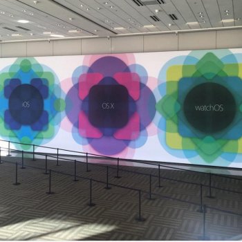
I find that circles are softer and much more inviting.

ios7-ui-concept-psd.jpg


That looks serene to me. I don't like the actual icons, but those round shapes look absolutely calming.

oops, man accident
 

Abazigal

Contributor
Jul 18, 2011
19,547
21,986
Singapore
The words are practically bursting out of those circular app icons. I admit I find the round app icons quite visually appealing, but it seems quite limiting in term of what content it can display.
 

PsykX

macrumors 68020
Sep 16, 2006
2,388
3,131
On OS X, the safari icon looks great. It is round.

It's not SO bad in Yosemite, but I still think something's wrong with it. As you know, it's a matter of taste.

But IMHO, they got the flat interface much better in Yosemite than iOS. And last year Lollipop got the flat interface much better than iOS too. I'm not in love with the material design, but they still kept some depth in the interface - which I hope Apple brings back this year.
 
  • Like
Reactions: uid15

uid15

Suspended
Mar 9, 2015
1,186
637
Round icons would be okay... if you were blind.

No, Apple are NOT going to gratuitously give you round icons. Why do people jump to these simplistic, poorly (if at all) reasoned, illogical conclusions? Round icons are used on the watch because of constrained space - it seems people's minds jump to "Oh, so they're using round icons now? Interesting... so it must therefore follow that iOS will come next".

That would just look ugly and awkward, like one of these cheapo Android Chinese phones.

Wrrrrrrronggg!
 
  • Like
Reactions: zxy

uid15

Suspended
Mar 9, 2015
1,186
637
I'll welcome the change for the sake of new look alone. iOS's staleness gives me an eyesore.

So because your eyes are "sore", you are willing to hope that Apple would inflict this HORRENDOUSLY UGLY example of poor design harmony and taste upon the rest of the world?

You don't understand Apple and the harmony and balance of UI and UX, if you think round icons would suit iOS. Go back and study design.
 
  • Like
Reactions: AZhappyjack

Rogifan

macrumors Penryn
Original poster
Nov 14, 2011
24,122
31,152
The "recents" and "favorites" were round in iOS 8. The icons showing on the Search screen are rounded squares. The categories for "Nearby" are round, but they are not app icons, either.
Well they might not be apps but what would you call them if not icons?
 

JohnApples

macrumors 68000
Mar 7, 2014
1,634
2,776
Honestly I think the only reason why they haven't transitioned to round app icons is because of how iconic (pun not intended) the rounded-square app icons have become. They're synonymous with iPhone.

Aren't they the only square-shaped icons left in the whole iOS ecosystem? Like stated above, the dial-pad, Favorites, Nearby, Reminders checklist, power-off switch, etc. Heck, they even removed the square from the home button after the iPhone 5!

Really though, it would just be an unnecessary pain to have all third party developers switch to a round template for the icons. And what about the developers who take forever to update? Will there be a strange mix of square and round icons, or will the un-optimized icons be weirdly cropped to fit the circle shape?

Nah, even if I personally like the circle icons, it's best to leave them be.
 
Register on MacRumors! This sidebar will go away, and you'll see fewer ads.