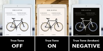
Sadly in the form of media (which is what the screen is used for) it does.
Calibrated screens tend to be more on the yellower looking scale than cold white or blue. “Preference” in this area, is just choosing the wrong setting on purpose because it looks kewl to you.
The reason is: all directors, content creators, editors, photographers, etc edit and use a color space that coincides with a calibrated screen. If you go online on a Mac and look at neon green shoes you want to buy for example; a calibrated screen will show you as close as possible (accurate!) what those neon green shoes will look like in person. You click buy and your shoes arrive, looking similar like the photo you saw online.
If you use a bluer looking screen to look at those shoes, those shoes would not look anything like they’d look like in person. You’d be defeating the purpose of what the screen is for lol. Same goes for movies, video games, etc. A dark scene or any scene in a movie should look a certain way, in the way the director intended. Going out of spec on purpose because of a presence nullifies the point of the media you’re consuming with your eyes lol. If the director wants to make the scene look contrasty and cold looking; they will change it accordingly but it will be with the warmer tone of the calibrated scene itself. It will still look different but it’ll be within the paradigm of a warmer screen. Does this make sense?


