You use a set of apps weekly to do the same thing but don't remember their names or have them pinned to your dock?
Can't you find some way to automate most of the tasks if you're doing it all it time? Surely between the command line, automator and shortcuts you could setup something once and then not have to go through a big complicated process.
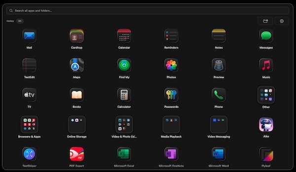
Using the Launchpad wasn’t a “big complicated process”. It was very simple and intuitive, unlike this new “Apps” monstrosity, which is neither…. Launchpad was a
real app launcher, Apps is essentially a crappy Finder Applications folder that completely ignores Apple’s design conventions, a header is a search bar, even though it isn’t clearly labelled as such, Siri Suggestions at the top aren’t labelled at all, and then only a pitiful 20 apps at a time are visible on my 27” desktop monitor! My 6.1” iPhone’s display shows more apps at once on screen then that! What a joke. And not only all of those things, but notification badges don’t even display in this Apps monstrosity! And now I’m still unclear about where to delete apps from, as Launchpad provided a simple and intuitive way of doing so by right clicking the apps icon in Launchpad, just like on the Home Screen on iOS and iPadOS.
Launchpad was so intuitive and simple to use, and there’s absolutely zero reason it couldn’t coexist with the enhanced Spotlight Search. People act like “you should have just searched your apps”, well, the thing is, before, you had the choice of both. And by the same token, should they remove the Home Screen from iOS? What’s the point of having a GUI if everything has to be done via keyboard anyways? By that logic, why not just return it to a terminal with no GUI, that way the few who ever touch a terminal can sit there telling us that we shouldn’t have used the GUI…?
Some of us are more efficient with visual cues. We may not remember the exact name of the app right in the moment, we remember the icon. We may not want to have to use the keyboard and remember the keyboard shortcut for invoking Spotlight. Some people new to the Mac may actually
like the familiarity the Launchpad provided. They may find it more useful for learning to use the Mac, if they already had an iPhone.
OS 26 versions brought greater software unity in so many ways, and that was the big theme at WWDC25. But this Apps folder crap would be hard pressed to be any less unified. I hate this new Apps menu with a passion, I hate to say it, but even Windows Start Menu in Windows 11 is better designed than this. A search bar is a search bar, not a stupid header, everything is clearly labelled, users are allowed to actually pin apps where they want on it, and they even incorporated the same auto-categorized app folders from the iOS and iPadOS App Library, which is far more useful than this stupid Mac Apps page because you can actually see 7 of the most used apps in each category with App Library.
I really hope they rework this Apps page, and allow it to be more customizable and give it a more unified design with iOS and iPadOS. Because in it’s current form, it’s a pile of garbage that spits at Mac users who had built up years worth of muscle memory with Launchpad, and replaces that with a garbage Applications folder that shows hardly anything, and doesn’t even use labels…

 macmost.com