Become a MacRumors Supporter for $50/year with no ads, ability to filter front page stories, and private forums.
Last time I checked, post count is not "time on a website," but actual contributions to the forums. Seriously, how hard of a point is this to get? Maybe we all should get LESS money for working MORE hours at our jobs?

Quantity has nothing to do with quality though. We have trolls all over the place here that get their posts counts up with one liners and emoticons. I don't consider those contributions, if anything they are detrimental and just take up space on Arn's servers. Do my almost 7,000 posts here somehow make me a "better" member than you? No.

As for the job thing, thats not even a logical equivalent, you EARNED that money by actually doing something productive.
 
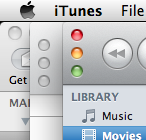
Gray icons suck on the left side of the iTunes window.

Well its installed. I made a quick video for everyone.

http://www.youtube.com/watch?v=SfwYU3w9ecg

Full review will be posted in a few days.

I wish they didn't make the side bar icons grey, this version of iTunes looks not so nice and beautiful anymore.

You took the words right out of my mouth. I hate the new look of iTunes 10. I wish I'd never updated from 9.2.1. I miss the colored icons. It looks like the life has been drained out of iTunes. That's right. It looks like a vampire just sucked the blood out of iTunes, and iTunes is now dead with no color whatsoever. I can't believe Apple would do something like this. It's very un-Apple-like. I'm very disappointed. :mad:
 
seriously this makes no sense

hybrid mode is crap. why can you not change the artwork size to what ever you please? and how come the grey arrows point back to list mode as opposed to staying in super cool hybrid mode (presuming you have them changed from pointing to the itunes store)?
 
You took the words right out of my mouth. I hate the new look of iTunes 10. I wish I'd never updated from 9.2.1. I miss the colored icons. It looks like the life has been drained out of iTunes. That's right. It looks like a vampire just sucked the blood out of iTunes, and iTunes is now dead with no color whatsoever. I can't believe Apple would do something like this. It's very un-Apple-like. I'm very disappointed. :mad:

There are a ton of sites that host older versions of software, including iTunes. If its really that big a deal then go fetch 9.2.1.
 
Itunes 10.0.. my *ss!
80~ megabytes? i went in and deleted
all the localizations and re-compressed it and it 's down to 20.
75 FRICKING percent of the update is just localization files and,
to add insult to injury, PPC code! I understand some of you
people are still using older PPC mac computers with older versions
of OSX, but seriously.. downloads for you need to be migrated to a legacy
version of apple.com called getoffmylawn.apple.com.

If you have a Mac Pro, you can use 2 TB "Caviar Black" drives from WD. If you have an Unibody MacBook Pro, you can use 1 TB "Scorpio Blue" drives from WD. If you have a storage problem, you need to upgrade your storage.

The Advanced Format (4k sectors) 2.5" disk is compatible with all Intel-based Unibody MacBook Pro computers, because they use the GPT for bootable disks.
 
Quantity has nothing to do with quality though. We have trolls all over the place here that get their posts counts up with one liners and emoticons. I don't consider those contributions, if anything they are detrimental and just take up space on Arn's servers. Do my almost 7,000 posts here somehow make me a "better" member than you? No.

As for the job thing, thats not even a logical equivalent, you EARNED that money by actually doing something productive.

You're right about quality. In which case, yes, you're a better MacRumors forum member than me. I'd like to see you get a t-shirt, I really would.
 
If you have a Mac Pro, you can use 2 TB "Caviar Black" drives from WD. If you have an Unibody MacBook Pro, you can use 1 TB "Scorpio Blue" drives from WD. If you have a storage problem, you need to upgrade your storage.

The Advanced Format (4k sectors) 2.5" disk is compatible with all Intel-based Unibody MacBook Pro computers, because they use the GPT for bootable disks.

Look pal, I have an obsession with file size and extraneous bits on my machine. It's my pride and joy to shrink, chop away at, and hack down any trees, bushes,etc growing arrogantly inside my disk drive over all my bits and bytes! Secondly, bandwidth with my sattilite ISP is fricken expensive. Around here you exist on a Fair Access Policy, which means if you download more than 350mb in 8 hours they cut you off for 24 hours.

You didn't even mention what you thought of the version numbers.
 
Ugh, it's ugly! Everything is grey, the volume bar is funky, we get a nice new the hybrid view, but can no longer show album art in list view, the top looks odd with the application title removed and the vertical kill, shrink, embiggen icons (which are arranged opposite a traffic light arrangement), plain icon, and still 64-bit.

It's faster, but that's all that's good about it. The interface doesn't flow with the rest of the OS. From a functional standpoint, it still works fine, but from an aesthetic standpoint, it's a disaster.

EDIT: 32-bit, my bad
 
Ok, just updated. It came up in system updates.... couldn't resist :D

My observations (I even screencapped it before and after so I can compare it in detail, at least visually :D):

  • I guess it may well be faster, it was one of the things I paid attention to considering how many have mentioned this. But again, iTunes has always worked wonderfully for me (and it seems I'm in some strange minority) so I'm not noticing a 'night and day' difference here.

    [*]Think the new 'grey buttons' are much better! They are not just monotone now, but differently drawn as well. The old ones were fugly anyway, no love loss here.

    [*]There is definitely a lot more spacing now (on the song listings for example) and it's a lot more visually appealing. This is also on the sidebar as well.

    [*]I guess I'm ok with the vertical stop lights, considering it was done to shave off the top bit that used to say "iTunes".

    [*]The new album art/list view thing-- cool I guess, but don't really care. Cover flow is my thing.

    [*]Ping-- also don't care. I don't really mind it being on the sidebar. As long as you can opt out of these things (did so with the Genius thing or whatever as well) I'm cool with it.

(btw, still don't know what the 'click the album art' thing is about, nothing happens when I do it?)
 
Ugh, it's ugly! Everything is grey, the volume bar is funky, we get a nice new the hybrid view, but can no longer show album art in list view, the top looks odd with the application title removed and the vertical kill, shrink, embiggen icons (which are arranged opposite a traffic light arrangement), plain icon, and still 64-bit.

It's faster, but that's all that's good about it. The interface doesn't flow with the rest of the OS. From a functional standpoint, it still works fine, but from an aesthetic standpoint, it's a disaster.

I agree with you. I'm very surprised Apple put this out. Icon doesn't match and looks odd, the top and top buttons break OSX convention and look weird, and the lack of color os appalling. There are some pretty poor usability choices made right here. I just can't believe it. Big bummer.

Actually, it could be fixed fairy easily, then other than that its pretty good.
 
Why aren't more people pissed that iTunes 10 is not 64 bit? Its been over a year sense Snow Leopard got released and iTunes, iWork, iPhoto... none of the iLife apps are 64 bit. WTF Apple, stop being lazy bums and rewrite your apps.

Because 99.99% of users couldn't care less about whether their software is 32- or 64-bit as long as it runs as well as they think it should.
 
I am fine with everything except one, the moving of the Close, Minimize, Expand buttons, why? 10 years of OS X, with the buttons in the same place, and Apple moves them.

I was thinking that it may be better if you have a lot of windows stacked on top of each other, with some poking out the side (like in the below attachment). Notice how the iTunes' traffic lights are usable, but Mail's aren't. However, I can't think of how'd they fit in a window whose chrome is only a short title bar...
 

Attachments

  • Screen shot 2010-09-01 at 11.19.35 PM.png
    Screen shot 2010-09-01 at 11.19.35 PM.png
    27.7 KB · Views: 384
What's so funky about the volume bar? It's just a few pixels thicker (and I personally think it looks better), I mean honestly, of all things to complain about :confused:
 
I guess I'll be the voice of dissent here, but this new iTunes is absolutely fantastic! As someone who takes care of tagging/album art with my mp3 collection, this new iTunes really makes my mp3s seem more like a real music collection. The greyed out icons look far more sleek as do all the overall little tweaks and adjustments. I know it's hard to move on to something new, but you guys will get used to it.

Cosmestically it's as refined as iTunes has ever been. Now I'm off to explore Ping a bit.
 
I see your point about stacking windows, and there it would help, but what about new users? One of the best things about OSX was that new users only had to learn one set of rules and they applied to every single program.

grandma: "what is iTunes?"
me: "the only program without a label"

sister: "I used to be able to use this without my glasses."
me: "Good. Now we wont have to listen to country music because you cant use the fricking computer!"

kid brother: "why do you even use a mac?"
me: "because you were an unplanned child."

This really pisses me off, if it's not obvious.
 
What's so funky about the volume bar? It's just a few pixels thicker (and I personally think it looks better), I mean honestly, of all things to complain about :confused:

I like the volume bar, what i don't like is they haven't made the seek bars the same size.
 
I know it's hard to move on to something new, but you guys will get used to it.

Get used to and like are two different things.

Hopefully Apple reads this thread and takes out criticism to heart. I mean seriously this looks like someone Microsoft would design, not Apple.
 
I like the volume bar, what i don't like is they haven't made the seek bars the same size.

I would have liked something to that effect as well. However they have no real estate left there to expand (and once they get their mind on thinning something down, there's no stopping)- while the volume bit was wide open for tinkering.
 
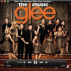
Dumb question: pull up the album art panel and double click it whie playing music. Place your arrow over the window. A title bar and controls appear ala Quicktime X! I love this!

...Was this in the old version, because I never used that feature before.
 

Attachments

  • before.png
    before.png
    503 KB · Views: 95
  • after.png
    after.png
    545.3 KB · Views: 99
I see your point about stacking windows, and there it would help, but what about new users? One of the best things about OSX was that new users only had to learn one set of rules and they applied to every single program.

grandma: "what is iTunes?"
me: "the only program without a label"

sister: "I used to be able to use this without my glasses."
me: "Good. Now we wont have to listen to country music because you cant use the fricking computer!"

kid brother: "why do you even use a mac?"
me: "because you were an unplanned child."

This really pisses me off, if it's not obvious.

I was thinking the same thing. I think they should only make these changes if all other apps are changed the same way, or it just gets confusing.
 
Dumb question: pull up the album art panel and double click it whie playing music. Place your arrow over the window. A title bar and controls appear ala Quicktime X! I love this!

...Was this in the old version, because I never used that feature before.

It's not on the old version of iTunes, although this new feature has been discussed quite a few times in this thread so far. Lots of small little tweaks, I like the overall improvements.
 
Register on MacRumors! This sidebar will go away, and you'll see fewer ads.