wozmatic
macrumors 6502
I don't understand why people hate so much on iTunes so much, it does the job.
I'd guess 90% of people use it JUST to sync their devices, the rest actually use it to play content (which is pretty funny)
Anyway, as far as playing music goes it works fine. For a party or something, set your playlist and that's pretty much it. The GUI doesn't need to be fancy.
(but everyone at parties just wants to hijack the stereo and play their stupid music)
However, 2 things I personally don't like:
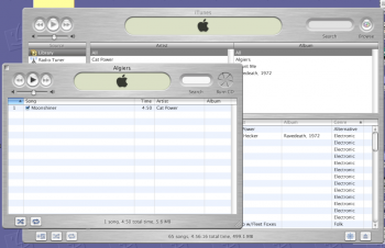
1) The hijacking of the colors based on the cover art - yeah we get it, it's neat but we should have an option to opt-out. (See fig.1)
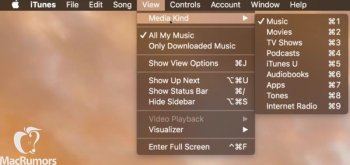
2) The list view where it stacks an album song list horizontal. That's not very intuitive for searching longer lists alphabetically. To fix this I have to stretch out the album column to keep the song list in a single column (See fig.1 and the fix in fig.2)
fig.1

fig.2

I'd guess 90% of people use it JUST to sync their devices, the rest actually use it to play content (which is pretty funny)
Anyway, as far as playing music goes it works fine. For a party or something, set your playlist and that's pretty much it. The GUI doesn't need to be fancy.
(but everyone at parties just wants to hijack the stereo and play their stupid music)
However, 2 things I personally don't like:
1) The hijacking of the colors based on the cover art - yeah we get it, it's neat but we should have an option to opt-out. (See fig.1)
2) The list view where it stacks an album song list horizontal. That's not very intuitive for searching longer lists alphabetically. To fix this I have to stretch out the album column to keep the song list in a single column (See fig.1 and the fix in fig.2)
fig.1
fig.2