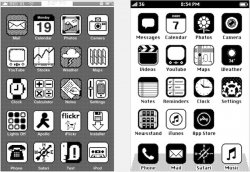
Windows phone is too flat, and there is not enough differentiation between elements creating a confusing interface
The other thing I don't like about Windows Phone is it's so highly stylized that many of its apps look the same. How do developers differentiate their products when following such a rigid UI template? OK, Facebook has blue squares and Evernote has green squares.

I hope iOS doesn't follow a similar design theme. Give app developers the flexibility to innovate their own UIs. That's what's made the iOS app catalog so great - 3rd parties pushing the envelope.