Got a tip for us?
Let us know
Become a MacRumors Supporter for $50/year with no ads, ability to filter front page stories, and private forums.
Jony Ive Pushing for 'Flat Design' in iOS 7 Amid Greater Hardware-Software Design Collaboration
- Thread starter MacRumors
- Start date
- Sort by reaction score
You are using an out of date browser. It may not display this or other websites correctly.
You should upgrade or use an alternative browser.
You should upgrade or use an alternative browser.
I hope "flat" doesn't mean the low contrast monochrome icons and controls that featured in OS X lately. Very poor HI design.
This. Emphatically.
Please - no more digital woodgrain bookshelves, no more green felt gamecenter.
The basic ios interdace is ok--no need to go tiles. If you ever use windows 8--the additional app tiles to the right look like crap--icons are much more visually interesting...unless they are some of apples--like that old youtube icon.
yeesh
The basic ios interdace is ok--no need to go tiles. If you ever use windows 8--the additional app tiles to the right look like crap--icons are much more visually interesting...unless they are some of apples--like that old youtube icon.
yeesh
Really? For one thing, the Settings layout is a mess to use.
Compared to what exactly? Android? Blackberry? (The latter actually looks like a HTML script, it's actually quite funny)

It's aesthetic, but is it functional? Kinda hard to decipher meaning at a quick glance.
I prefer skeumorphism (when executed tastefully) because it communicates faster.
Anyway, Louie Mantia about skeumorphism http://mantia.me/blog/skeuomorphism/
Ohhhh no.... Not the 'S-word' all over again...
RTP.
To give you an idea of what flat could mean, Mountain Lion itself is a trend towards flat.
Think Panther and prior. Now look at how Mac OS X looks. It'll be a trend more towards the current, and less of the bubbli-ness of before.
Think Panther and prior. Now look at how Mac OS X looks. It'll be a trend more towards the current, and less of the bubbli-ness of before.
Compared to what exactly? Android? Blackberry? (The latter actually looks like a HTML script, it's actually quite funny)
At least in Android, you find app settings in the app itself. In iOS, you don't know where app settings are. Sometimes they are in the Settings app, sometimes not. At the very least, Apple should decide once and for all what to do with app settings. It's a huge inconsistency.
At least in Android, you find app settings in the app itself. In iOS, you don't know where app settings are. Sometimes they are in the Settings app, sometimes not. At the very least, Apple should decide once and for all what to do with app settings. It's a huge inconsistency.
I agree. While it's not a huge deal I'd rather have one place to find app setting instead the current set up.
Apple, we want you to sap all the fun and creativity out.Please - no more digital woodgrain bookshelves, no more green felt gamecenter.
The basic ios interdace is ok--no need to go tiles. If you ever use windows 8--the additional app tiles to the right look like crap--icons are much more visually interesting...unless they are some of apples--like that old youtube icon.
yeesh
No more texturing buttons or UI elements. Flat 8bit color palette only.
Hurray! Finally some good news about the change within iOS. My gosh that took a while. I am curious what Ive will bring for iOS 7. Don't make all the things just flat though. Try to change it, evolve it, simplify it.
Oh and please fix iTunes sync too. That thing is more complicated than it has ever been these days.
Oh and please fix iTunes sync too. That thing is more complicated than it has ever been these days.
i hope Ive tears it all apart and puts it back together. thats the only way we can make real progress. See OS9 to OS10 for ref. Apple needs a new vision like a new step of NextSTEP...STEPafterNext. K? Thx, Ive. Also, I want an iChair. I know you designers like furniture and ****...
This could be good. I'm glad Ive's design expertise will be put to work in iOS 7, and we won't have to wait until iOS 8.
Image
inb4 microsoft sues.
I'm sure they won't implement the same way that M$ has. But i'm GLAD they are finally going to make a substantial change with the iOS UI.
It's really long overdue
conservative changes as in a new skin UI?
what about more flexibility and usability something like NCsettings for example? the lockscreen is ancient too
I have never understood the idea that something is bad just because it is 'old'. There are many old things that we continue to use. For example claw hammers have been used since Roman times and have only had minor changes in all these centuries. If something suits the purpose for which it was designed why should it be changed?
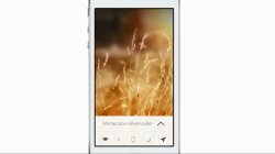
Talking about "flat" designs, I wouldn't mind something like this (credit to Mohamed Kerroudj):
Attachments
Huh? What's so bad about the music app?
The lack of a colour scheme. (From iOS 6-present).
The headers and footers are the same colour as the content, the highlight colour is now grey, and there's no visual distinction between elements.
If you have ever used the music app on stage (say, for a backing for live music), it's a huge pain. You want to quickly find elements in an easy and natural way – by colour or shape! Both are pretty much non-existent in the new music app.
So essentially: bring back the blue header and the black footer, and bring back the blue highlight colour and I'll be happy.
This makes me a bit nervous as Greg Christie doesn't report to Ive so how much can Ive tell him what to do?
That dynamic is changing, according to the people close to the company. The stealth software developers still exist. But now, Apples mobile software, or human interface team, which has been led by executive Greg Christie, is being briefed about industrial prototypes earlier, these people said. The person described the change as a thawing.
Ive, who is well-known for his sleek, iconic hardware designs, now sits in on the human interface teams regular review sessions to vet new designs, these people said. While he and Christie, known as a blunt talker, have very different styles, the people familiar with the process described the sessions as pleasant and cordial.
Jobs never gave this to Ive when he was alive - just hope it was not for a reason nobody can see now that he is gone.
Agreed, although I'm sure this was a conversation Steve and Tim must've had at one point: "How much more responsibility can Ive handle?" Considering how fundamental good design is to Apple and its products, I'm sure this is something they explored (especially after Steve knew his time was limited).
Register on MacRumors! This sidebar will go away, and you'll see fewer ads.