Become a MacRumors Supporter for $50/year with no ads, ability to filter front page stories, and private forums.

MacRumors

macrumors bot
Original poster
Apr 12, 2001
69,401
40,445


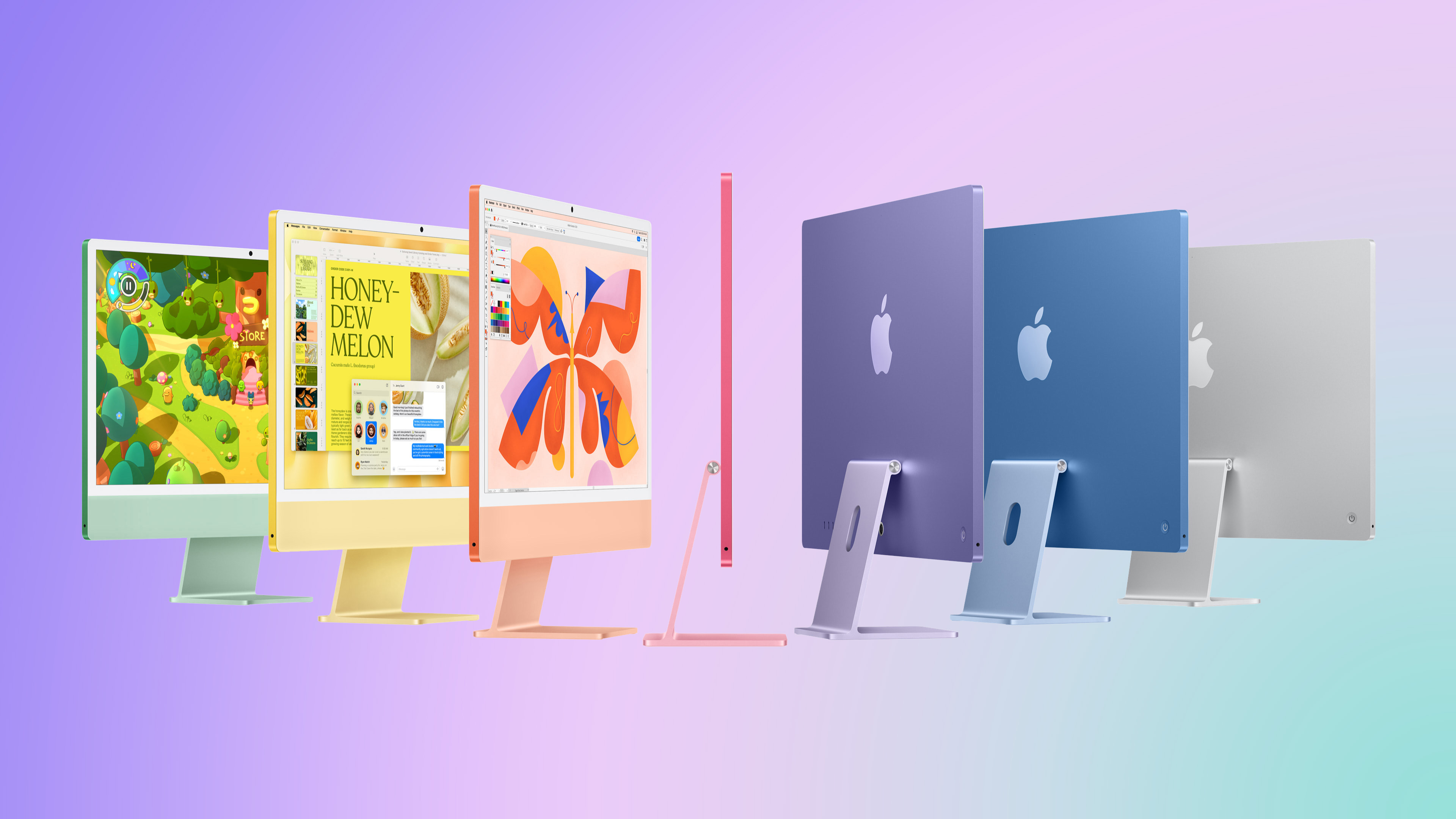
When the iMac moved from Intel processors to Apple silicon in 2021, the desktop computer also received a new colorful, ultra-thin design. Since then, the iMac has lacked something that it had for many years: an Apple logo below the screen.

Apple-iMac-M4-hero-feature.jpg

Perhaps unsurprisingly, Apple did prototype a version of the current iMac with an Apple logo in the "chin" area, according to a post on X today from a user known as Kosutami. The user has occasionally shared images of alleged Apple device prototypes, but they have also shared some incorrect information in the past.

Apple evidently went with a logo-free iMac screen, but 2021-and-newer models do still have a large Apple logo on the back of the computer.

It would probably be more surprising if Apple had NOT tested both logo and logo-free designs, but if this sort of thing interests you, then now you know.

Do you think Apple made the right choice? Let us know in the comments section.


Article Link: Leaker Reveals an iMac Design Detail That Never Happened
 
Last edited:
Iconic or not, they should have omitted the ugly chin with the washed out colors (of the actually nice color options) all together...

if necessary, could have put the components somewhere on the backside of the monitor in a little box or make the monitor slightly thicker.
 
I would have liked one. That would glow when sleeping. Or flash when read/write activity. Or one that turns completely RED when the iMac crashes or overheats. Or with FaceTime Calling enabled blink like crazy when you get a call. Or on second thought, nah got used to it gone. Don't miss it at all. Love the thin design and clean look of the iMac. Very minimalist, the logo would have distracted the design.
 
Iconic or not, they should have omitted the ugly chin with the washed out colors (of the actually nice color options) all together...

if necessary, could have put the components somewhere on the backside of the monitor in a little box or make the monitor slightly thicker.
The chin makes it recognizable as an iMac from the front, marketing is very important for Apple.
 
I always thought that the iMac would have been better looking had they made it look like the Thunderbolt display, but that would of left them with no colours around the screen (which is fine by me).
 
The chin looks empty. Better with the Apple logo. If they were to remove the Apple logo, remove entirely the chin and put all the electronics behind the screen. The chin without the logo doesn’t look as nice as with the logo!

Also, the bezels should be black not white. Black bezels improves the perception of contrast.
 
Agreed. I also wish they didn't go two tone. I think the darker colors are great. The lighter pastel accent colors bother me. Either keep everything the same vibrant color or accent with silver.
 
Register on MacRumors! This sidebar will go away, and you'll see fewer ads.