Got a tip for us?
Let us know
Become a MacRumors Supporter for $50/year with no ads, ability to filter front page stories, and private forums.
Leaker Reveals an iMac Design Detail That Never Happened
- Thread starter MacRumors
- Start date
- Sort by reaction score
You are using an out of date browser. It may not display this or other websites correctly.
You should upgrade or use an alternative browser.
You should upgrade or use an alternative browser.
That’s an awesome idea. I’ve had one since launch and never thought of doing that. Now I’m going to find a tiny OG logo sticker to do just that 😁
Would love to see a photo of your iMac adorned with the logo sticker 😃
While I got used to it now, they should have kept it. It would have looked great with that bold colour from the back on the logo on the front. I never get to see the back of iMac so the logo would have been a great detail!
They said that 'in most places, the back of iMac is the first thing you see', but I disagree heavily. I'm sure its most people's desktop computer that sits with its back against the wall on a desk!
They said that 'in most places, the back of iMac is the first thing you see', but I disagree heavily. I'm sure its most people's desktop computer that sits with its back against the wall on a desk!
I prefer it white. White bezels. And I would paid more for white chin. It loses uniformity when you have a white and another color. I would even preferred the bezel to be the chin's color for that uniformity.The chin looks empty. Better with the Apple logo. If they were to remove the Apple logo, remove entirely the chin and put all the electronics behind the screen. The chin without the logo doesn’t look as nice as with the logo!
Also, the bezels should be black not white. Black bezels improves the perception of contrast.
Exactly. That is Tim’s way of "thinking different". Suck the soul and whimsy out of it as long as you save coin. They like everything monolithic and androgynous. The backs of modern iMacs are the types of colours we should be seeing in the iPhone line and especially with the pros. However, that would require retooling and that hits the bottom line. Can’t have that now can we.They probably saved 10 cents on each unit as a result of that efficiency move. Things add up.")
This version of iMac is so totally lacking in sex appeal that I STILL see brands using the previous model, which was gorgeous, in ads, etc.
When the iMac moved from Intel processors to Apple silicon in 2021, the desktop computer also received a new colorful, ultra-thin design. Since then, the iMac has lacked something that it had for many years: an Apple logo below the screen.
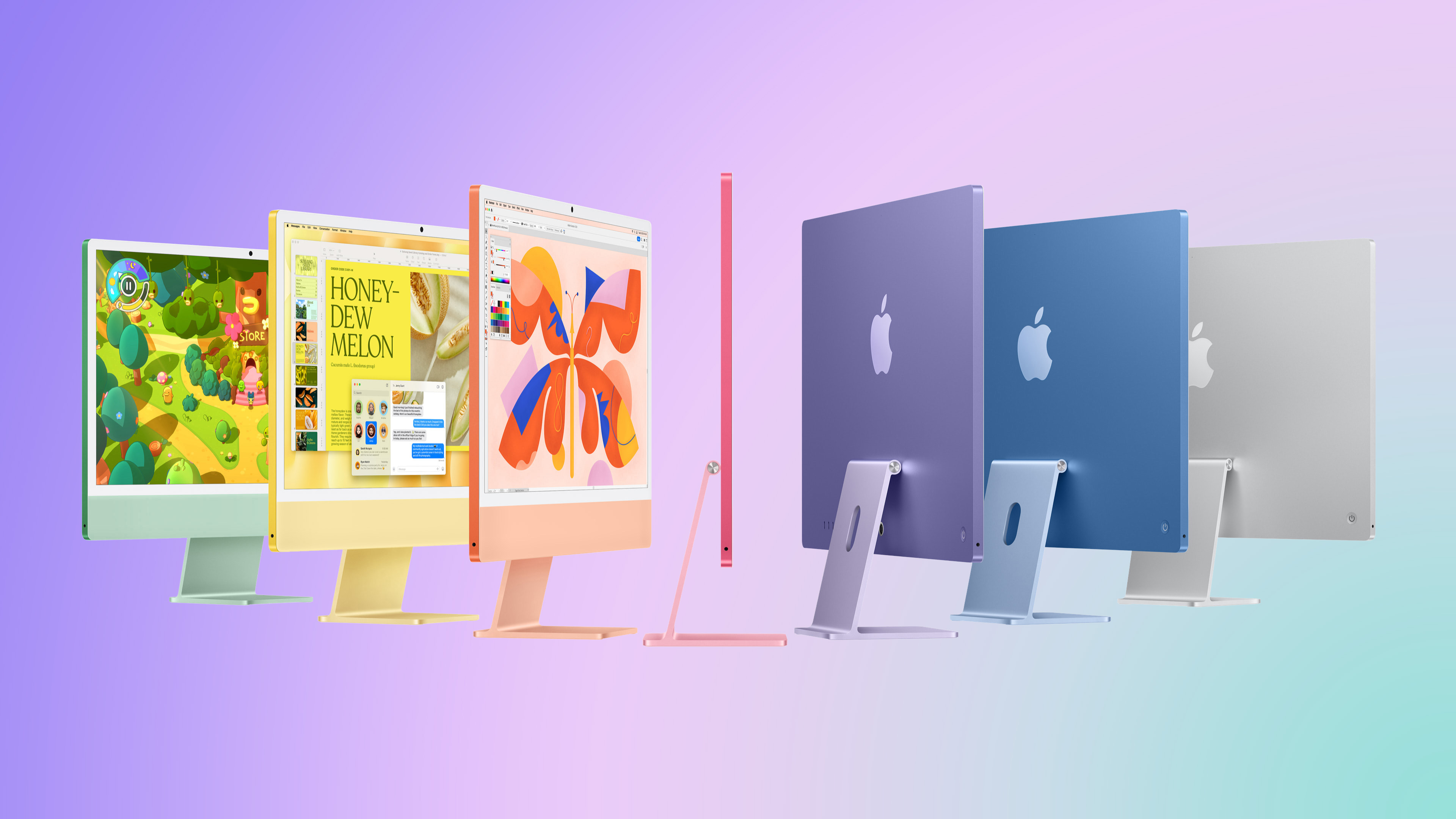
Perhaps unsurprisingly, Apple did prototype a version of the current iMac with an Apple logo in the "chin" area, according to a post on X today from a user known as Kosutami. The user has occasionally shared images of alleged Apple device prototypes, but they have also shared some incorrect information in the past.
Apple evidently went with a logo-free iMac screen, but 2021-and-newer models do still have a large Apple logo on the back of the computer.
It would probably be more surprising if Apple had NOT tested both logo and logo-free designs, but if this sort of thing interests you, then now you know.
Do you think Apple made the right choice? Let us know in the comments section.
Article Link: Leaker Reveals an iMac Design Detail That Never Happened

Apple keeps showing it with the back logo visible as if that's how the typical person has their home office set up. It's usually against the wall so the iMac looks like a generic computer a prop dept might whip up. Huge whiff.
The EU would have found a way for it to be anti-competitive… to have a sticker that integrates well with the system.Apple would have made a fortune if they sold color matched apple stickers as an extra for everyone that miss the chin logo.
Better get that extra Apple Care coverage!I only wear mine on special occasions. I have to be careful not to bump into things when I’m wearing it
Maybe someone doesn't like a cleft "chin."Maybe the logo ended up on the front because of how massive the original chin was, just to break up the expanse of silver. Now that the chin is much thinner and more colorful, maybe they feel that the logo’s not needed.
iMac Pro here. I absolutely love it. 27", Black, I'll never go back. (Until they pry it from my white, ash hands.)What's sad is that they have never given us a black one. A black one with a white or silver logo would be amazing.
Ha! Still have my iMac Pro as well.iMac Pro here. I absolutely love it. 27", Black, I'll never go back. (Until they pry it from my white, ash hands.)
I am like that, to some extent, well with clothes anyway. If I buy clothes, I don't see why I should advertise their brand.I don’t like logos on any products and I think it’s embarrassing to wear a product with a logo.
In the U.K we have to pay for plastic shopping bags and a mate of mine turns his inside out. In his view, if he has to pay, he is not paying to advertise the store. Me, i got some generic ones with no branding
I like the look of the Imac, it is one of those machines you reconise as soon as you see it, even the so call Imac look a likes don't look like a mac.
I did think about a Imac, instead of the Mac mini, but I needed to use my monitor for the Pc as well.
I did think about a Imac, instead of the Mac mini, but I needed to use my monitor for the Pc as well.
More like, the massive expanse of white and transparent double-shot polycarbonate. iMacs never had Apple logos on their “front”, or the screen bezels, until the iMac G5 came along (the G4 had a chrome logo on the dome, above the optical drive bay door, and that kind of makes it “the front”, but it was very discreet, especially if you obscured it with the swiveling display), and that is telling. It may have been only the third case design, but the G3’s reign was long and had many revisions, and none of them ever had a logo staring at you while you used it.Maybe the logo ended up on the front because of how massive the original chin was, just to break up the expanse of silver. Now that the chin is much thinner and more colorful, maybe they feel that the logo’s not needed.
I suspect that Apple stopped slapping “iMac” on the front because it was already such an iconic product, and only added the logo because of that, it looked “empty”. The chin was a throwback to the G3 and even the PowerMac G3 All-in-One and the classic Macs, but those had removable media bays on their own chins, they didn’t need (nor had, at least the later models, space for) big logos.
I don’t like logos on any products and I think it’s embarrassing to wear a product with a logo.
Luckily you're not wearing an iMac
How this made it past everyone at Apple is mystifying to me.
It obviously looks jarringly weird to see it without the logo there, and 4 years on it still looks just as odd as it did on day one. As others have said, it makes it look like a cheap knockoff iMac which is a terrible look for a product. What was the supposed design benefit to removing it? There is none. A poor choice that could never have come out of the old Apple.
It obviously looks jarringly weird to see it without the logo there, and 4 years on it still looks just as odd as it did on day one. As others have said, it makes it look like a cheap knockoff iMac which is a terrible look for a product. What was the supposed design benefit to removing it? There is none. A poor choice that could never have come out of the old Apple.
I think a logo would have looked nicer. But I'm more bothered about the colour of the chin. I think the red iMac looks beautiful from that back, but then the chin is all a washed out pink colour (and similar thing with the other colours, but the red one is my favourite).
TBH I'm never in the market for an iMac so it's kinda moot, but I still think the back looks way sexier than the front. Which is a shame if you normally have the bright, bold back towards a wall, then just get to look at the washed out pastel version front with no logo. 🤷♂️
TBH I'm never in the market for an iMac so it's kinda moot, but I still think the back looks way sexier than the front. Which is a shame if you normally have the bright, bold back towards a wall, then just get to look at the washed out pastel version front with no logo. 🤷♂️
I’m sure the iMac requires more cooling than a displayI was always confused why the iMac had a chin to begin with considering Apple can cram an M-series chip into an iPad behind the screen. Yes it would have been added thickness to enable proper cooling but probably not mores than the Studio Display or a 16" MBP in clamshell mode.
Register on MacRumors! This sidebar will go away, and you'll see fewer ads.