Become a MacRumors Supporter for $50/year with no ads, ability to filter front page stories, and private forums.

Mr. Awesome

macrumors 65816
Original poster
Feb 24, 2016
1,247
2,906
Idaho, USA
Amidst all the naysaying and beta 1 ranting that’s to be expected, I thought it would be nice to have a place to celebrate some of the technical achievements and beautiful parts of the new UI without any complaining about the bugs or UX issues that are still being worked out.

Some of my favorite details:
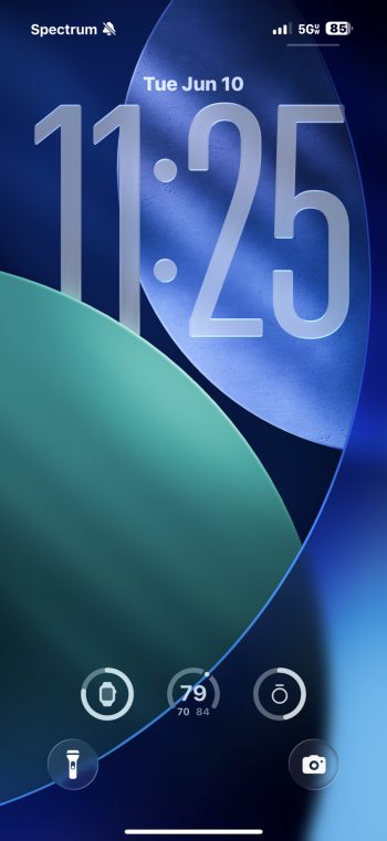
  • The prism effect at the edge of the Lock Screen and some other glass objects.
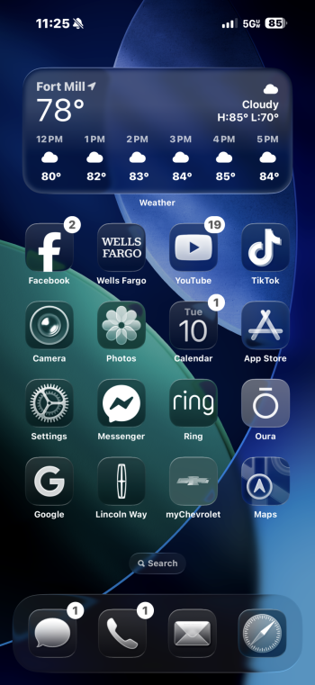
  • Folders are gorgeous and remind me of “lickable” Aqua.
  • The new app icons for the most part look fantastic. The camera icon harkens back to the iOS 6 design.
  • The automatically created glass icons for older apps are tasteful and, assuming they’re automatically generated, super technically impressive.
IMG_1476.jpeg
IMG_1477.png
IMG_1480.jpeg
 
I absolutely love it. Wouldn’t go it back. I don’t know where the hate is coming from, everything is good to read, and its beta 1. there will be tweaks.
 

Attachments

  • IMG_1950.png
    IMG_1950.png
    496.5 KB · Views: 115
  • Bildschirmfoto 2025-06-10 um 12.32.06.png
    Bildschirmfoto 2025-06-10 um 12.32.06.png
    792.7 KB · Views: 120
Last edited by a moderator:
The general consensus is it looks good but has usability issues. The screenshots in this thread seem cherry-picked. I've seen screenshots that look very busy/distracting and makes text unreadable.

Apple's definitely going to tweak it but the 'hate' is the feedback needed so that Apple tweaks it. It's like iOS's photos app, and Apple is reverting part of it back.
Mine is not cherry picked lol, literally took 2 screenshots off my actual screen.
 
Something about it is feeling nostalgic (probably the nod to the old camera icon, etc) and reminiscent of iOS 6 in a futuristic way. Excited to try it out come public release! Of course they will tweak things, and I'm sure they are seeing the future of tech as more translucent vs LEDs. Here we go!
 
How do you enable the new glass look?

My home page looks pretty much like always, there are transparent edges but not wholesale transparency like this.
 
I love the direction of everything in the liquid glass UI except for the app icons. I GET the intention and the concept which looks and sounds gorgeous in theory, but in practice, it just looks like highlights and shadow effects from the 2010s. I have no problem with "skeuomorphism." But the style of the icons specifically is like triggering to my visual design senses haha.

I think it's telling in their WWDC session videos that they love to show this view (attached) of their icon designs a lot. Because this is gorgeous. But you can't emulate this look by looking at the icon head on. Also the screens are not high resolution enough for better highlight details; it just looks like everything is outlined with 2px strokes and another 2px stroke inside that one for highlights. No 3D glass effect.

They also mention the highlights change based on the angle of the phone from the gyroscope but its way to subtle to notice, if its even there at all.

Idk, I hope they keep working at it and get the look right before launch.

Screenshot 2025-06-10 at 4.14.36 PM.jpg
 
I love the direction of everything in the liquid glass UI except for the app icons. I GET the intention and the concept which looks and sounds gorgeous in theory, but in practice, it just looks like highlights and shadow effects from the 2010s. I have no problem with "skeuomorphism." But the style of the icons specifically is like triggering to my visual design senses haha.

I think it's telling in their WWDC session videos that they love to show this view (attached) of their icon designs a lot. Because this is gorgeous. But you can't emulate this look by looking at the icon head on. Also the screens are not high resolution enough for better highlight details; it just looks like everything is outlined with 2px strokes and another 2px stroke inside that one for highlights. No 3D glass effect.

They also mention the highlights change based on the angle of the phone from the gyroscope but its way to subtle to notice, if its even there at all.

Idk, I hope they keep working at it and get the look right before launch.

View attachment 2518606
I think some look better than others. I know little about these types of aesthetics but, for instance, the mail apps, both Apple and Outlook, look very cool to me. The iMessage app looks more dull. It could be that they need to change some icons to match the style in order to create a better overall look.
I’m enjoying it thus far and will be patient to allow them to modify it. Improve it. Make it even better.
 
Register on MacRumors! This sidebar will go away, and you'll see fewer ads.