Got a tip for us?
Let us know
Become a MacRumors Supporter for $50/year with no ads, ability to filter front page stories, and private forums.
Live Coverage of Apple's WWDC 2017 Keynote: iOS 11, macOS 10.13, Notebooks, iPad Pros, and More
- Thread starter MacRumors
- Start date
- Sort by reaction score
You are using an out of date browser. It may not display this or other websites correctly.
You should upgrade or use an alternative browser.
You should upgrade or use an alternative browser.
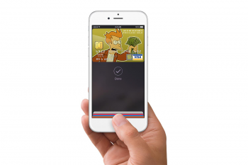
Please express your excitement with pictures of your credit cards.My wallet is ready
I expect this to happen actually. Give the pro's a heads up for what is coming in 2018.Wow, expected to go over 2 hours....hopefully a New Modular Mac Pro sneak peak.
Mine never is. And then I buy anywayMy wallet is ready
What would you put instead of the grid of icons? We already have a whole home page on the left which dedicated to widgets and such. Merge the two? That could get confusing when trying to launch apps and they're all mixed in. However, it would be nice to be able to incorporate some type of live content into app icons themselves.
That isn't my job to figure out what to put instead. Tons of people have shown concepts with forward thinking and how to do it. If Apple is so cutting edge and inventive then they should be able to come up with something other than boring icons after 10 years. They are the ones getting paid to keep people buying their product, not me. At least windows phone looked nice and incorporate hubs to tap one place and access data from different apps. Most people liked that but all of the missing apps is why it didn't succeed.
I think I read something or heard on a podcast that they're working on a freshened design. It won't be as significant as iOS 6 -> iOS 7, but it will be more than, say, iOS 7 -> iOS 10. Not sure if it was supposed to be this year or not. Guess we'll know really soon!I really want a new and fresh design. I'm so bored with this one already, we desperately need a new design this year.
Did you take off are just off or what
FYI, there are plenty of non U.S. people here, it's 19.00 here when it starts, and it's even a holiday here.
Please express your excitement with pictures of your credit cards.
Back and front please.
Nope. Keynote starts at 8PM where I am. So it's more like a "late dinner"Did you take off are just off or what
I'm just hoping for iOS for iPad to get more advanced to the extent it's almost like running macOS
No need to be so pessimistic2 hours def means a lot of filler, like game demos or an on-stage band at the end.
Please god not another terrible band on stage.2 hours def means a lot of filler, like game demos or an on-stage band at the end.
Don't forget the Security ID Number as well. Then we can enjoy the full extent of your Wallet's contents.Please express your excitement with pictures of your credit cards.
But if people liked it enough, then they would have bought more, and more developers would have made apps for it. It failed for a number of reasons, and you're right that the UI was one of the lower reasons. But the UI was still a bit unbalanced. As for it being your job, I didn't ask you to design a whole interface. That's what designers such as myself do for a living. I just wanted you to provide some example, whether it be something you've dreamed up in your head or something you've seen somewhere else before, because I was genuinely curious. The icon-driven interface has been here since Xerox PARC in the 70s and we've yet to come up with something more intuitive, simple, and elegant. I'm fed up with newcomers to these forums incessantly complaining and yet offering no constructive criticism or possible solutions.That isn't my job to figure out what to put instead. Tons of people have shown concepts with forward thinking and how to do it. If Apple is so cutting edge and inventive then they should be able to come up with something other than boring icons after 10 years. They are the ones getting paid to keep people buying their product, not me. At least windows phone looked nice and incorporate hubs to tap one place and access data from different apps. Most people liked that but all of the missing apps is why it didn't succeed.
It's like Bingo. Just cross off the ones that you notice during the keynote. 5 in a row to get Apple Bingo!How do you play? If I get to choose 3 I'd go for "New MacBooks", "Sales update" & "Overly dramatic product video"
Register on MacRumors! This sidebar will go away, and you'll see fewer ads.


