Become a MacRumors Supporter for $50/year with no ads, ability to filter front page stories, and private forums.

MacRumors

macrumors bot
Original poster
Apr 12, 2001
68,990
40,003


Apple has been updating some classic Mac icons during the macOS Tahoe beta, upsetting some longtime Mac users who prefer the original look. In beta 5, Apple changed the design of the built-in Mac storage icon, which you'll notice if you have it on your desktop.

macOS-Tahoe-Beta-5-Macintosh-HD.jpg

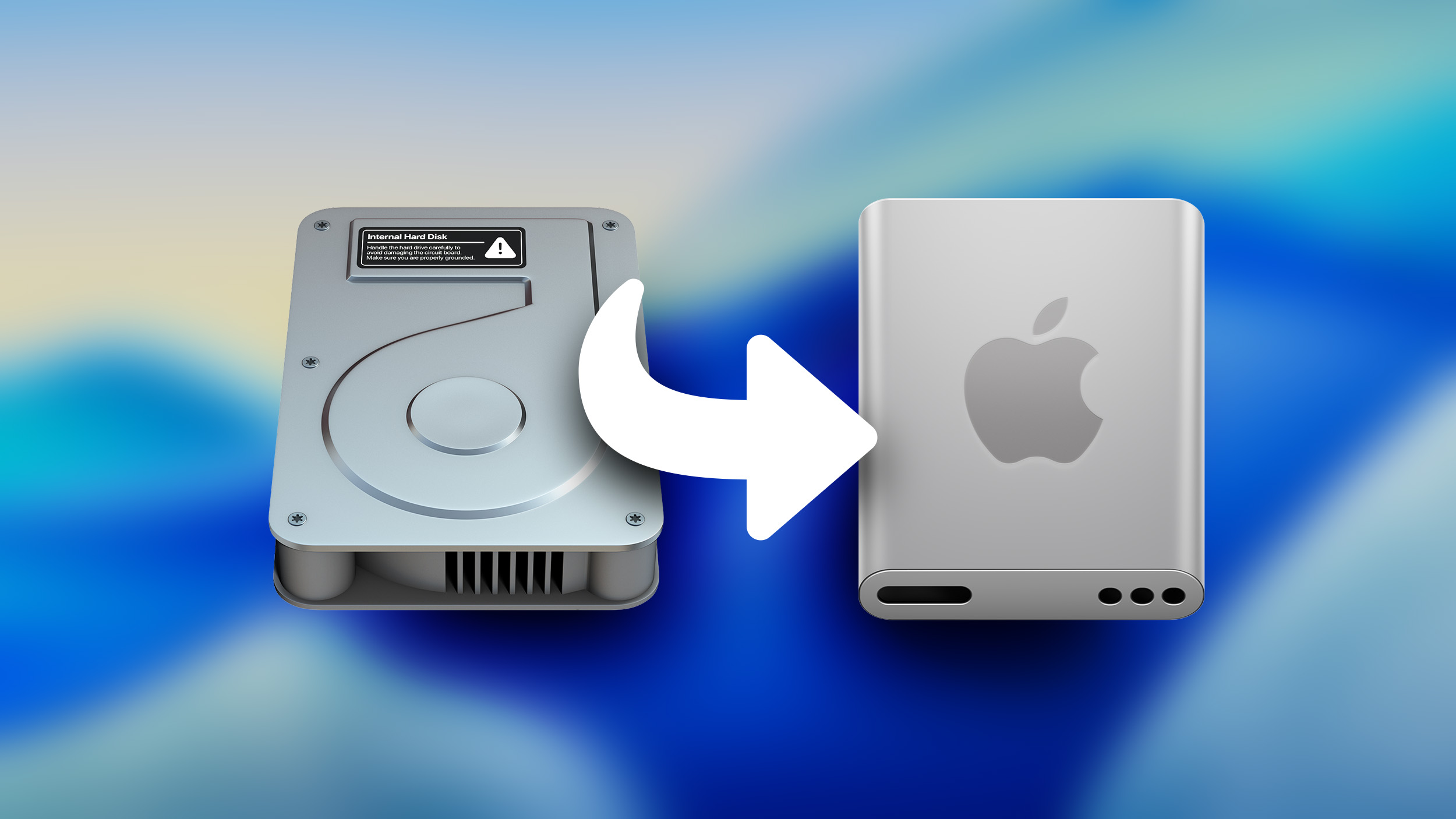
The existing icon still resembled a hard disk drive, but the new icon looks like a modern solid state drive. Apple's Macs stopped using hard disk drives starting more than a decade ago. The low-cost 21.5-inch iMac was the last Mac that had a hard drive component, as it used Apple's SSD + HDD Fusion Drive. All current Macs use SSDs.

If you don't want to see the new icon, you can hide Macintosh HD from view entirely. To do so, open up the Finder app's settings and click the check mark next to "Hard disks."

Apple also updated Disk Utility and the Finder icon in earlier betas. With the Finder icon, Apple initially reversed the color scheme with the light shade on the left and the dark on the right, but the uproar was so significant that Apple had to return it to the classic color arrangement.

Article Link: Macintosh HD Gets a New Look in Latest macOS Tahoe Beta
 
Does the new icon just appear on SSDs, or will my 20TB external NAS backup drive, a HDD, now incorrectly show up as if it were an SSD? If they're now accurately distinguishing between SSDs and HDDs, that's great, but if they've just decided to mislabel HDDs instead of SSDs, that's just silly.
 
Having changed out several traditional and fusion drives in 2017 iMacs, I can tell you has been less than a decade since they completely switched to solid state storage......
Laptops lost the platter drives when the 'unibody' MacBook pros were retired in after 2013
Mac Minis kept them through to the 2018 space grey models
iMacs came with SSD in the 2019 model year
Mac Pros switched to SSD for the Vader 2013 models
 
Long live System 7!

Mac HD.png


More honestly, I never really liked the OSX HD icon, was always too fiddly and never matched the Aqua aesthetic.

So I much prefer the new icon, but I'm not sure about it having no perspective though.
 
I haven't used the default HD since the ability to paste your own version. Way back then I pasted a Toilet. Then a Macintosh Bomb Crash and people thinking the Mac crashed. LOL... These days I just paste a custom logo I created years ago.
 
  • Like
Reactions: lotones and jwdsail
I get that an update is probably long overdue, but the original HD icon's whole purpose was to make it glaringly obvious to the user that they are interacting with the local "internal" drive, rather than a network share or an external drive. Changing the icon to what looks like an external SSD kind of defeats that purpose.

There's a reason why the save button in so many applications is still a 3.5" floppy disk.
 
Register on MacRumors! This sidebar will go away, and you'll see fewer ads.