Got a tip for us?
Let us know
Become a MacRumors Supporter for $50/year with no ads, ability to filter front page stories, and private forums.
Macintosh HD Gets a New Look in Latest macOS Tahoe Beta
- Thread starter MacRumors
- Start date
- Sort by reaction score
You are using an out of date browser. It may not display this or other websites correctly.
You should upgrade or use an alternative browser.
You should upgrade or use an alternative browser.
It looks like an enclosure of some kind, but none of those holes appear to be USB ports.
Well, the elongated one on the left looks lot like a USB-C port.
I really wish and am hoping against hope that on April 1, 2026 we are going to get some kind of Retro nod to the past, and there will be something special released: I dream of a MacBook Air with a six colors rainbow on the lid and a theme/skin that can be applied to the OS that is called RetroOS...
But instead, I bet we will get a tweet.
But instead, I bet we will get a tweet.
Well I bought a mac mini with 2TB of internal storage so my icon will probably be a gold ingot or a diamond!
Yes, overdue.
Apple has been updating some classic Mac icons during the macOS Tahoe beta, upsetting some longtime Mac users who prefer the original look. In beta 5, Apple changed the design of the built-in Mac storage icon, which you'll notice if you have it on your desktop.
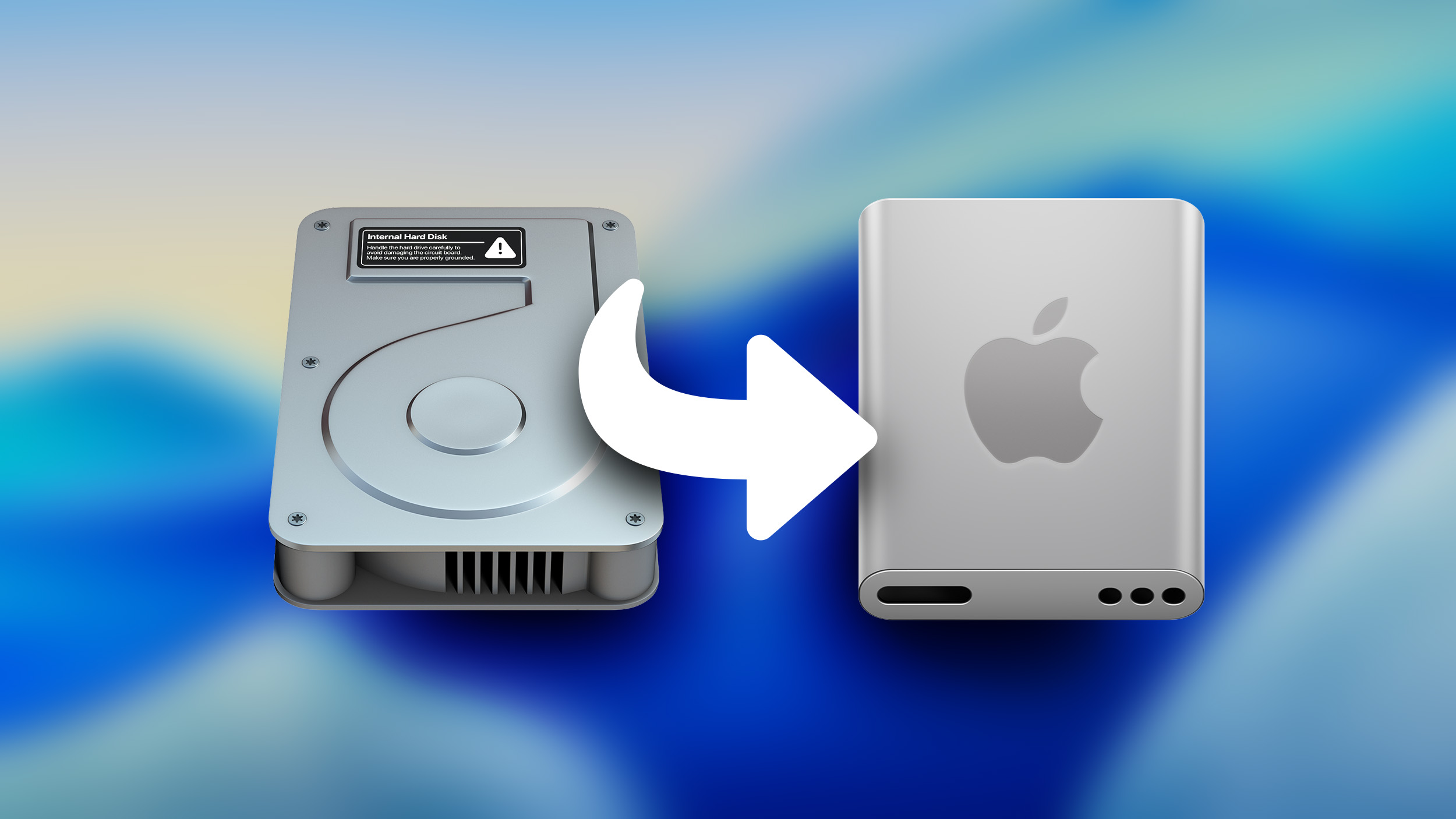
The existing icon still resembled a hard disk drive, but the new icon looks like a modern solid state drive. Apple's Macs stopped using hard disk drives starting more than a decade ago. The low-cost 21.5-inch iMac was the last Mac that had a hard drive component, as it used Apple's SSD + HDD Fusion Drive. All current Macs use SSDs.
If you don't want to see the new icon, you can hide Macintosh HD from view entirely. To do so, open up the Finder app's settings and click the check mark next to "Hard disks."
Apple also updated Disk Utility and the Finder icon in earlier betas. With the Finder icon, Apple initially reversed the color scheme with the light shade on the left and the dark on the right, but the uproar was so significant that Apple had to return it to the classic color arrangement.
Article Link: Macintosh HD Gets a New Look in Latest macOS Tahoe Beta

Too long to be a USB-C port, but too round to be a USB-A port.Well, the elongated one on the left looks lot like a USB-C port.
And so the thought process was "better make it 100%"?I’d be 99% of users had no idea what the old icon was.
I acknowledge that knowing what a harddrive is/looks like is becoming less common, although I suspect the percentage was probably quite a bit higher, but that still doesn't make the generic grey box a better option. Now it doesn;t look like a harddrive, or an SSD, and it sure as hell doesn't signal "this is a avatar of all of your machine's internal storage."
I'm sure we'll get more than a tweet. My money is on a month-long build-up to an announcement and then a two-hour infomercial as the actual announcement. You know, the usual.But instead, I bet we will get a tweet.
They look good!!
I agree, but they had to do something.I get that an update is probably long overdue, but the original HD icon's whole purpose was to make it glaringly obvious to the user that they are interacting with the local "internal" drive, rather than a network share or an external drive. Changing the icon to what looks like an external SSD kind of defeats that purpose.
There's a reason why the save button in so many applications is still a 3.5" floppy disk.
Would you have preferred a PCB with a chip on it? (I think that'd be cool)
That's too bland. An effective graphical user interface (GUI) uses metaphorical icons that mean something to users so they'll more intuitively understand the function or application the icon represents.
That icon is too bland to represent anything to anyone. Very disappointing. They should keep the original, which actually looks like a real-world object.
That icon is too bland to represent anything to anyone. Very disappointing. They should keep the original, which actually looks like a real-world object.
These are so good. I use different coloured ones for all my external drives.
Because Apple didn’t design themThey look good!!
Imagine getting upset over a icon 
Hahaha they don't know about the three holes!What are the 3 holes? Triple headphone jack?
Is there any reason they would still call it Macintosh HD? That seems as archaic as the actual disk icon. Macintosh SSD?
Most people don’t know what a HDD looks like in real life. SSDs, External Drives, and flash drives, on the other hand, are commonplace in the public.That's too bland. An effective graphical user interface (GUI) uses metaphorical icons that mean something to users so they'll more intuitively understand the function or application the icon represents.
That icon is too bland to represent anything to anyone. Very disappointing. They should keep the original, which actually looks like a real-world object.
I kinda like antiquated icons though, like floppy disk for save.
Someone please tell Apple that the perspectives on that icon are all off! Like the Apple logo can’t look like that if the drive is supposed to be tilted.
I don’t get what the deal is with Apple. For a company that is all about design, they shouldn’t be able to release something like that into a beta.
I don’t get what the deal is with Apple. For a company that is all about design, they shouldn’t be able to release something like that into a beta.
It looks like you are running the display at a lower resolution, it’s like using a Fischer price computer.
Most Fisher-Price computers had skeuomorphic designs from pre-iOS 6
Unfortunately pasted icons don't show up in the sidebar. Although an icon like this is too detailed to see well at the size shown in the sidebar.That ancient 3.5" HDD icon is a weird anachronism at this point. It's been a few years since the last Mac with an HDD shipped, and they were being phased out 10 years ago. The new one looks quite janky, though, and I also wonder if it's a placeholder.
FWIW this is the icon I've been pasting in for quite a few years now. I no longer remember where I got it or who designed it but I like it a lot:
View attachment 2534782
I occasionally check out the posts for an article to see just how some incredibly minor thing will still elicit huge negative responses. Truly amazing.Imagine getting upset over a icon
Register on MacRumors! This sidebar will go away, and you'll see fewer ads.