Become a MacRumors Supporter for $50/year with no ads, ability to filter front page stories, and private forums.

MacRumors

macrumors bot
Original poster
Apr 12, 2001
68,203
38,990


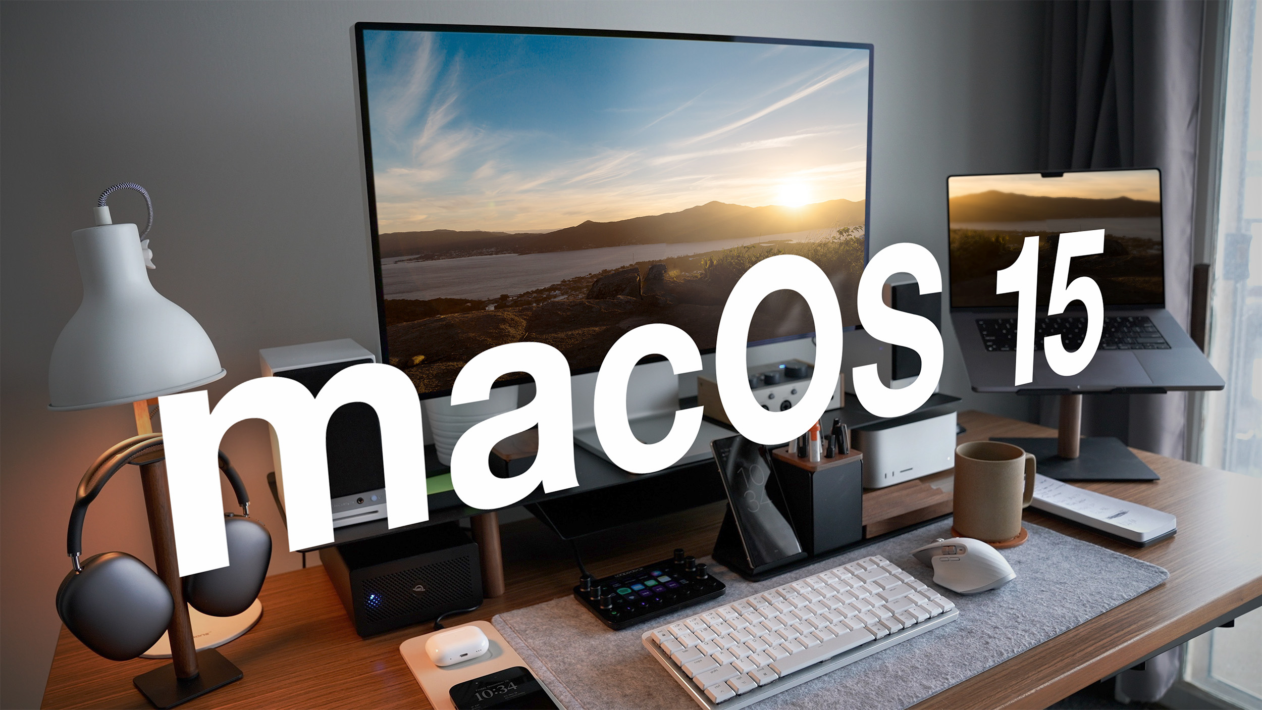
With the macOS 15 update that is set to debut at WWDC in June, Apple plans to rearrange "menus and app UIs," according to a report from AppleInsider. The System Settings app, which was last updated with macOS Ventura, will get one of the biggest updates.
macOS-15-Feature.jpg

With macOS Ventura, Apple renamed the System Preferences app to System Settings, introducing a design similar to the Settings app on the iPhone and iPad. System Settings in macOS 15 is said to feature a new organizational system based on "priority and overall importance."

The Notifications and Sound categories in System Settings will be moved lower in the list, with General settings moved up right under Network settings. Apple plans to move the existing Wallpaper and Displays sections into the same section with General settings, and Privacy and Security will be paired with Touch ID and Password and other relevant settings. Siri and Spotlight will be paired with Internet Accounts and Game Center.

Apple also reportedly plans to redesign the Siri menu bar icon, making a flat black and white icon to replace the current colorful icon, and there are said to be design changes coming to Calculator (a more iOS-like design) and Safari (a unified menu for page controls). Other rumored macOS 15 changes include a Printable Account Recovery Summary option, a new iCloud preference pane, and a "modern" user interface for AirDrop.

Apple's annual Worldwide Developers Conference keynote is set to take place on Monday, June 10, and it will see Apple unveil macOS 15, iOS 18, tvOS 18, visionOS 2, and watchOS 11.

Article Link: macOS 15 System Settings to Get Design Overhaul
 
  • Like
Reactions: adrianlondon
What Apple had in Big Sur and Monterey was fine… they ‘innovated’ themselves into a corner with Ventura. I for one hope they bring back what we had before… and please bring back the ability to rearrange the icons and let us sort by category or alphabetically. The haphazard mess that we have is unacceptable from the same company that produces the wonderful M4 and Tandem OLEDs. Let’s go Apple!
 
Last edited:
Settings are one of the worst part of iOS. There are now way too many. Settings used to be a lot simpler back in the iOS 9 days. Now It’s dizzying. Whatever they do its sure to confuse us all over again. Not looking forward to mucking around in an alien settings interface once again.

It’s weird — they can’t even get settings to be nice.
 
Gah. Don’t ruin it again, Apple. It’s a total mess right now. Try and find the old “Hot corners” wheee you can set a corner to turn the display off without screen savor (or other options) and it takes forever to find where they buried it! Should be right up in the Display category!
 
I'd feel bad about the lack of color, but I guess it makes some kind of sense... the Siri icon is the ONLY one with color. 😔
View attachment 2381713

It's weird that Siri had so many icon variations over the years, they might refresh it in general to coincide with the AI stuff.

Another thing that's bothering me is that none of the OSes actually have proper icons besides their version number on a gradient rounded rect. Also, why is the icon for the Focus feature still the half-moon, which is *one* of the focuses, Do not disturb?
 
Register on MacRumors! This sidebar will go away, and you'll see fewer ads.