Become a MacRumors Supporter for $50/year with no ads, ability to filter front page stories, and private forums.
Settings are one of the worst part of iOS. There are now way too many. Settings used to be a lot simpler back in the iOS 9 days. Now It’s dizzying. Whatever they do its sure to confuse us all over again. Not looking forward to mucking around in an alien settings interface once again.

It’s weird — they can’t even get settings to be nice.
Here’s what you do:
Find a friend with a Windows computer, and have him show you how he makes systems adjustments. It might be in the Control Panel, or in the Display Preferences, or in the Device Manager, or somewhere the <bleep!> else!

The computer did get more complicated, right? There’s Bluetooth, WiFi, and on and on. AT LEAST there’s one place for it all. Just get on your knees and thank the Good Lord you weren’t born a Windows user.

Microsoft has a habit of releasing new versions of Office that put the same commands in different places with different names, when the old way was just fine. I hope we can all agree that MacOS Prefs/Settings could use better organization, so Apple’s got a good chance of making it better this time. I don’t see how changing the name does anything but add to the confusion, though.
 
Why not just let us arrange the icons in the Control Panel any way we want?
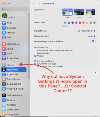
updates/renovations should 'streamline your workflow' and make the UI more efficient—don't dump us into a sparsely used pane by default. Im not saying "give us everything".

In your day-to-day usage opening System Settings,would you prefer to be brought to the Appearance pane or the General Pane while working? —If you need to make an adjustment, the General pane is ALOT more practical/logical. Better yet allow the UI to remember the last Pane used.

Screenshot 2024-05-27 at 11.46.05 AM.png
 
Last edited:
  • Like
Reactions: ric22 and Alameda
Why isn’t it using AI and simply organized based on what you use the most or whatever?

„General“ is just lazy for „we don’t know where to put it“. I do the same with my desktop folder 😅
Exactly. It's marginally preferable to "Whatever".
 
  • Like
Reactions: maxoakland
I literally in my daily rss viewing just saw a post about the history of rich text on the Mac, and it had a screenshot of TextEdit from the Aqua days. I thought, man look at how beautiful those scroll bars are… then like 2 minutes later I check my MR updates and Boom, you say the same thing.
Truth be told first thing I did on my Mac was download and install the Aqua Extreme theme. It gave Mac OS X a more modern look without compromising all those effects.
 
Truth be told first thing I did on my Mac was download and install the Aqua Extreme theme. It gave Mac OS X a more modern look without compromising all those effects.
Have any screenshots? I’m curious what it looked like
 
Judging by the comments, no one is impressed with the correct settings! The menus on both Mac and iOS have become a nightmare, where I don't even waste time searching for anything and always have to type in what I'm searching for, as things are rarely where you'd expect them.
 
Judging by the comments, no one is impressed with the correct settings! The menus on both Mac and iOS have become a nightmare, where I don't even waste time searching for anything and always have to type in what I'm searching for, as things are rarely where you'd expect them.
Well spotlight is a quick way to locate specific system settings you need using MacOS. But macOS without all the app specific settings is easier to scroll thru comparably.
 
  • Like
Reactions: JimmerJabber
Jesus, just bring back the System Preferences. That is a jewel that has been perfected for many years and no change was actually called for - even less the one represented by the hipster chaotic nonsense from iOS, called the System Settings.
 
Jesus, just bring back the System Preferences. That is a jewel that has been perfected for many years and no change was actually called for - even less the one represented by the hipster chaotic nonsense from iOS, called the System Settings.

No kidding.

The ultimate "change for the sake of change" ... and it was a downgrade in basically every possible way.

Mind boggling waste of resources at a company we always hear "can only do so much at any given time"
 
  • Like
Reactions: peter2 and Alameda
Siri and Ai will shortcut right to the needed settings.
Ai will keep track of most used so will be in your list of frequently used settings.
 
Add functionality to toggle low power mode from the control center as well as a yellow battery icon when in lp mode like iOS.
 
I've somewhat got used to the new settings menu, but still find it far more annoying to find the slightly more obscure stuff than the old one. I don't care what format it takes, I just want it to be easy to find things and navigate. Good design and usability isn't necessarily making all your products have a very similar format for familiarity, it's making them all the simplest they can be for that specific device. So good to hear they're having a re-think.
 
Register on MacRumors! This sidebar will go away, and you'll see fewer ads.