Any changes regarding Finder’s UI in beta 2? I mean, I think most of us agreed that Finder’s windows’ new UI was a bit unfortunate, and maybe they tweak it over the betas…
Got a tip for us?
Let us know
Become a MacRumors Supporter for $50/year with no ads, ability to filter front page stories, and private forums.
macOS 26: All The Little Things
- Thread starter KoolAid-Drink
- WikiPost WikiPost
- Start date
- Sort by reaction score
You are using an out of date browser. It may not display this or other websites correctly.
You should upgrade or use an alternative browser.
You should upgrade or use an alternative browser.
- Status
- The first post of this thread is a WikiPost and can be edited by anyone with the appropiate permissions. Your edits will be public.

Not really.Any changes regarding Finder’s UI in beta 2? I mean, I think most of us agreed that Finder’s windows’ new UI was a bit unfortunate, and maybe they tweak it over the betas…
No it wasn’t. He’s replying to someone requesting at the minimum an old style menu bar (like the one in macOS Sequoia) instead of a fully transparent one. The option to bring that back, while preserving transparency system-wide, got added in beta 2 and wasn’t present in beta 1.
Correct. I love the transparency effects just not the fully transparent menu bar, that bothers me for some reason I'm sure I'll figure out in time.
you can also change SSD icons to custom icons, if the the SSD is not bootable. If Bootable, no dice👎🏼
Lou
The issue has been fixed in Beta 2. SSDs that are bootable can now have their icons changed 👍
Lou
I’m not sure if it’s a bug or a feature, but the mouse cursor shows up on screenshots now. There’s a “Show Mouse Pointer” settings in Screenshot.app (

cmd, shift + 5), but I don’t remember if it was there in earlier versions of macOS. The setting also affects the behaviour in the chromeless screenshot tools (cmd, shift + 3/4).you can change this in beta 2...Correct. I love the transparency effects just not the fully transparent menu bar, that bothers me for some reason I'm sure I'll figure out in time.
Again, that’s not what people are talking about. This concerns the Menu Bar only and the option to give it a transparent background in beta 2. Read up:^^^^In Beta 1 & 2, there is a "Reduce Transparency" Option.
Lou
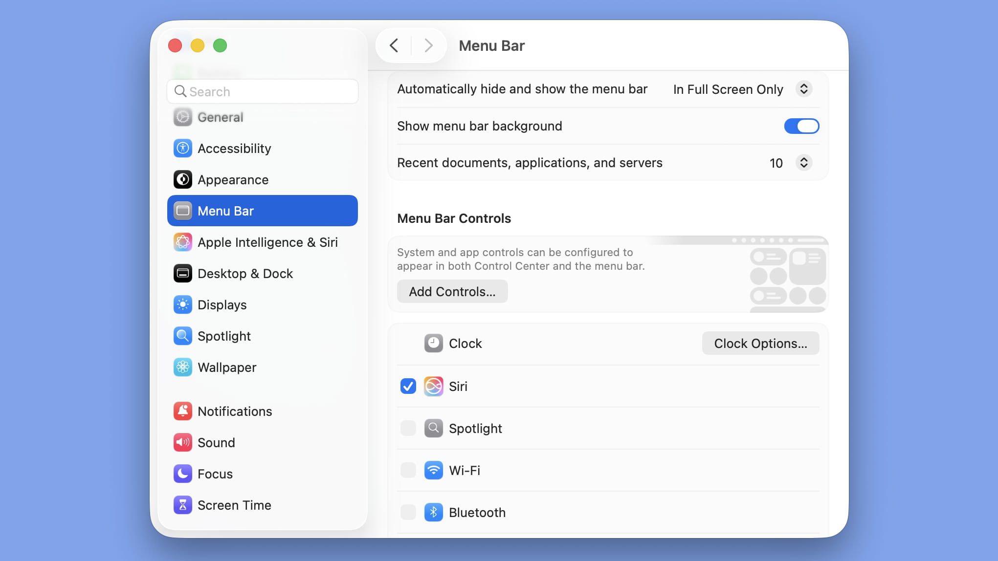
macOS Tahoe Beta 2 Lets You Add a Menu Bar Background
In macOS Tahoe Beta 2, Apple included a new option to add a background to the menu bar, making it possible to have a menu bar design that’s similar...
 www.macrumors.com
Last edited:
For Apple Notes markdown importing, what I really want to know is how true to the original the imported note will be, especially where embedded images and PDF files are concerned. I embed images and pdf's into the majority of my markdown notes in Obsidian.
has anyone tested this ?
has anyone tested this ?
Xcode 26
Do you like more clicks to do the thing you could do before with less clicks? Of course you do!


Do you like more clicks to do the thing you could do before with less clicks? Of course you do!
Honestly I have no idea how they let this happen to a Pro application toddlerificationXcode 26
Do you like more clicks to do the thing you could do before with less clicks? Of course you do!
View attachment 2526415
View attachment 2526416
Words fail me to describe how much it has regressed. This is mind boggling.Honestly I have no idea how they let this happen to a Pro application toddlerification
Forgive my lack of familiarity with Xcode. I don’t know which is which, but the top one looks a mess. Less designed, more thrown in a bucket.Xcode 26
Do you like more clicks to do the thing you could do before with less clicks? Of course you do!
View attachment 2526415
View attachment 2526416
Without offense, it shows. Yes, it might be prettier, but it's less functional and makes things harder to do than before, that was my point.lack of familiarity with Xcode
No offense taken although I will say that I hear the same kind of talk from Avid users as a means of justifying its awful UI. It’s important to distinguish between familiarity and good ui/ux. It’s not about pretty, the top one looks like it was “designed” by someone undergoing an emotional breakdown.Without offense, it shows. Yes, it might be prettier, but it's less functional and makes things harder to do than before, that was my point.
In any case I have no desire to get into an argument over Xcode, so I’ll leave it there.
Yes, top example could have been better, I am not saying it was perfect. What have they done instead is they just hid everything underneath the nested menus, which hurt the discoverability and requires more clicks to accomplish the task that previously required less clicks.No offense taken although I will say that I hear the same kind of talk from Avid users as a means of justifying its awful UI. It’s important to distinguish between familiarity and good ui/ux. It’s not about pretty, the top one looks like it was “designed” by someone undergoing an emotional breakdown.
In any case I have no desire to get into an argument over Xcode, so I’ll leave it there.
Top example:
- Everything is laid out to be clearly visible.
- Good utilization of both vertical and horizontal space.
- Looks messy.
Bottom example:
- Hides previously clearly visible options under several levels.
- Needs more mouse clicks to reach the same settings.
- Prioritizes vertical space over horizontal space.
- There is now some order, but this ordering did more harm than good.
lots of options but I’d argue it looks really confusing, negating the benefits of the visibility.Yes, top example could have been better, I am not saying it was perfect. What have they done instead is they just hid everything underneath the nested menus, which hurt the discoverability and requires more clicks to accomplish the task that previously required less clicks.
Top example:
- Everything is laid out to be clearly visible.
Only if filling every inch is a priority.- Good utilization of both vertical and horizontal space.
How often are you changing these options?- Looks messy.
Bottom example:
- Hides previously clearly visible options under several levels.
- Needs more mouse clicks to reach the same settings.
Errr- Prioritizes vertical space over horizontal space.
- There is now some order, but this ordering did more harm than good.
Depends, and when I do I want to be done with them as quick as possible so that I can return to my work.How often are you changing these options?
Does macOS Tahoe bring support for Portrait orientation when using Continuity Camera? (e.g., allowing you to record vertical videos in Quicktime using the iPhone as the camera source)
Not sure if this is only from Beta 2, but there is a new cursor design for window resizing.
Note: The circle that appears around the cursor is QuickTime Player showing clicks during the screen recording.
Note: The circle that appears around the cursor is QuickTime Player showing clicks during the screen recording.
Yes, it's the part of a cursor redesign. Did you notice that the arrow cursor is different too?Not sure if this is only from Beta 2, but there is a new cursor design for window resizing.
View attachment 2526496
Note: The circle that appears around the cursor is QuickTime Player showing clicks during the screen recording.
Yes, it's the part of a cursor redesign. Did you notice that the arrow cursor is different too?
Do you mean the standard cursor view? If so, yes, the edges are now slightly rounded, as shown by another user here.
If you are referring to another cursor state, let me know and I will see if I can check.
That's what I meant. Main cursor was changed, therefore the alternative cursors got redesigned as well.Do you mean the standard cursor view? If so, yes, the edges are now slightly rounded, as shown by another user here.
If you are referring to another cursor state, let me know and I will see if I can check.
Register on MacRumors! This sidebar will go away, and you'll see fewer ads.