How I can fix ? Holly **** , I want dark mode always onSafari changing to dark mode when a website is dark or just to the background color, like the light grey on the right
View attachment 2518062
Got a tip for us?
Let us know
Become a MacRumors Supporter for $50/year with no ads, ability to filter front page stories, and private forums.
macOS Tahoe 26.0 Beta 1 - Bug fixes, changes, and more
- Thread starter WilliApple
- WikiPost WikiPost
- Start date
- Sort by reaction score
You are using an out of date browser. It may not display this or other websites correctly.
You should upgrade or use an alternative browser.
You should upgrade or use an alternative browser.
- Status
- The first post of this thread is a WikiPost and can be edited by anyone with the appropiate permissions. Your edits will be public.
How I can fix ? Holly **** , I want dark mode always on
I am now in Dark Mode, when I go to apple.com Safari is getting completely bright again. Maybe there is something in the settings. I have to sleep now. You could also use an extension that makes every website dark, like Noir or Nightshift.
Reminds me of Windows Vista Home Basic. Or when you turn Aero off in Windows Vista/7.Here's how the OS appears with 'Reduce Transparency' enabled. Some interface elements, like the Dock and Widgets, still have a touch of colour applied to them, rather than becoming flat grey as before. It's still rough and unfinished, as is to be expected.
View attachment 2517909
As a reminder to folks, especially those that might be new to early betas: expect much of the nuances, bugs, round-hitting-square, etc, to be fixed and changed as the betas progress.
Also, CPU getting warm or system acting sluggish is expected for a day or three after installing a major update like this.
Also, CPU getting warm or system acting sluggish is expected for a day or three after installing a major update like this.
New type of warning.
Well FINALLY they corrected that disgusting change they made on Big Sur where the icon and text became center-aligned.
Now it's back to the human-oriented left-aligned design.
This is such a great and welcome change that I can forgive some other weird stuff Apple introduced.
I guess that the numerous pieces of feedback that I and many other users submitted finally paid off.
Yeah, I don't like the new design of these dialog windows. Looks odd...
Nope. That's actually a great change, well, for a change. Apple finally corrected the disgusting redesign they introduced on Big Sur where the icon and text became center-aligned.
Same with the warning dialogue in post #37. It looks weird being left-justified rather than centred. Just me?
It's just you, sorry. The centered text and icon is one of the worst changes Apple ever introduced back on Big Sur. Center-aligned text, especially of any considerable length, is illegible. It's not suitable for human consumption. Ever wondered why basically anything you read anywhere, including your own message, is left-aligned?
Last edited:
In what config do you mean? I have tried:anyone tried fusion or any other virtualization software?
Host: iMac 2019 macOs 15.5 and Fusion 13.6.3
Client: Tahoe Beta.
Result: Does the basic install and gets to Selecting Country, ..., Data & Privacy. And then reboots to Selecting Country again and repeats. So a Fail, but I was a bit surprised it got as far as it did.
Look how they massacred my boy.
2025 macOS - Spotlight now has options for search
2012 Windows 8.0 - Windows Search has options for search [MetroUI/ModernUI]
2013 Windows 8.1 - Windows Search can search Everywhere [MetroUI/ModernUI]

2012 Windows 8.0 - Windows Search has options for search [MetroUI/ModernUI]
2013 Windows 8.1 - Windows Search can search Everywhere [MetroUI/ModernUI]

Last edited:
Looks kinda cool when there is a multi colored content in the background, looks hideous on white background,Those button drop shadows and floating sidebar are CRAZY design choices. What were they thinking?? The proximity of the close button makes it look like it would close the sidebar, not the whole window. That's just bad hierarchy. I get it if you have photographic content blurred behind the sidebar, but most apps won't ever have that, certainly not Finder. Huge misstep.
Remember Windows Vista? This is our macOS Vista moment. I predict in 5 years time they'll come out with a new flatter design and that will be the "new and improved" modern look.
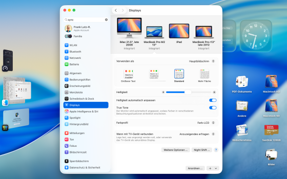
its a pity that iPhone Synchronization is still not working in Europe
I like the new design. Looks young and fresh. I bet that after some time everyone will be used to it and all the previous designs look so old fashioned.
Dear lord, what have they done? Looks like some kid tried to theme his Windoze machine to look like a Mac. This is an insult to my retinas!
I am not against the liquid glass, but the implementation of it (especially in macOS) leaves me slightly disappointed. It's still a beta though, maybe they refine itI like the new design. Looks young and fresh. I bet that after some time everyone will be used to it and all the previous designs look so old fashioned.
On my MacBook Pro, the display brightness randomly changes (auto-brightness is disabled). Super annoying.
Reminds me of Windows Vista Home Basic. Or when you turn Aero off in Windows Vista/7.
Safari has become unusable on some web sites....I can't see my tabs.
Anyone figure a work around?
Looks like when Claude Desktop launches with multiple MCP Servers, ALL the node.js processes show up on the dock!

It looks like FileVault turns itself on and is also enabled by default on a fresh install/reset.
Usually I have FileVault disabled, after upgrading my M4 mini and 2019 MBP 16” i9, both had FileVault enabled.
After an erase all content and settings on the MBP FileVault was just enabled with no option to turn off during the OOBE setup.
It can still be turned off in system settings.
Also, iOS show’s content cache information and allows you to perform a cache download speed test.
Can anyone confirm FileVault now no longer prompts to enable and is just on by default?
Has anyone seen a similar content cache info or speed test in macOS?
Overall I like it too (talking about macOS, I have very mixed feelings about iOS) but those buttons in the top bar of a window looks really really bad imoI like the new design. Looks young and fresh. I bet that after some time everyone will be used to it and all the previous designs look so old fashioned.
Register on MacRumors! This sidebar will go away, and you'll see fewer ads.


