Become a MacRumors Supporter for $50/year with no ads, ability to filter front page stories, and private forums.
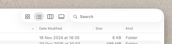
You don't think the upper left corner cuts too close to the File menu? I think it does and it's not aesthetically pleasing in my eyes – heavily rounded corners notwithstanding.

Anywho, another example of a visual ”Bug” in Tahoe that hampers legibility (FaceTime app)_

Is there a button there? The button looks quite faint on my hardware calibrated OLED display on top of the bright background. Text in the green button isn't very easy to read.
View attachment 2601236

Text in the green button gets even harder to see in dark mode and like in the light mode screenshot the green lines are also quite faint in the white button.

View attachment 2601237
If these designs are intentional they are pretty bad in my opinion.
If they aren't Tahoe has a lot of visual bugs that I look forward to being fixed. 🙂
These are excellent examples of why I think Liquid Glass is a misnomer. Dirty Paper is a more accurate description of Tahoe’s UI.
 
Again with using iOS and iPadOS to counter discussion of problems with TAHOE. Not relevant.
No, the person I was actually talking to (not you) mentioned that before with his iPhone, and included a screenshot of it, look back further in this thread… He was the one who mentioned it, I merely was replying back to him that I had tried replicating the scenario he talked about. He was using an iPhone too… 🙄🤦🏼‍♂️
 
  • Like
Reactions: MacPowerLvr
Again with using iOS and iPadOS to counter discussion of problems with TAHOE. Not relevant.
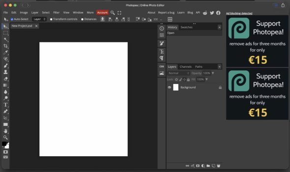
Careful what you wish for, this screenshot actually makes my case even better. The rounded window corners aren’t an issue for functionality of this complex web app (Photopea) on macOS Tahoe…
 

Attachments

  • IMG_0485.jpeg
    IMG_0485.jpeg
    138.5 KB · Views: 82
  • Like
Reactions: MacPowerLvr
No, I was referring to your FaceTime button screenshots.
Yeah, and those were in response to the other commenter’s FaceTime button screenshots, as already explained. But since you complained about my use of a web app window screenshot on iPadOS, I decided to go grab one for the same web app on the Mac, and it actually makes my case even better. So I hope you like it. 🙂👍🏻
 
Last edited:
I think the data indicates there are quite a few. Sales went way up with the introduction of Apple Silicon, Mac sales had been on steady decline, and it was beginning to look like a dying product, but Apple Silicon Macs took sales to record highs. Quite a few people switched from Windows to macOS because of Windows 11 and Apple Silicon providing something that Windows didn’t offer. Besides, it really doesn’t matter whether new/modern users are the majority or not. In order for the platform to continue to grow and expand, you have to appeal to new users. If you don’t, the platform will inevitably stagnate and die… 🤷🏼‍♂️

I’m not defensive, as I’ve said, I have limited stakes in this fight. It’s not as if Liquid Glass is a stock option on the stock market… I don’t have anything “invested” in Liquid Glass, I just really like the aesthetic and am glad to see Apple finally doing some of the things I was hoping they would to modernize the look of macOS more, and make macOS and iPadOS more visually congruent.

No worries, and I don’t have anything against people sharing complaints, I just don’t agree with them, and push back on some. 🙂👍🏻

How old are you? You seem very, very set on moving everything to rounded corners to be more 'aesthetic/modern' and you're generalising quite a bit about complex topics and trends across consumer and professional user bases. It makes you sound young and unaware of how people use computers outside of design and photo editing. Not saying you are, but for example, increasing sales data doesn't automatically mean an explosion in new users. Would we say that the high sales of the Switch 2 means there is an explosion of Nintendo fans or that it's Switch 1 users upgrading to the new hardware (Per capita, not absolute numbers)?

I think the poor heat management and keyboard of the last generations of MacBook Pros discouraged enthusiasts not to upgrade and further hold out after Apple's announcement of the macmini devkit. I don't think it's fair to say that the casual user was locked into the Windows 11 release vs Apple Silicon debate, particularly during the M1 release in the bodies of the Intel MacBook Air and Pro.

No, I don’t have any issue with the top corner. I don’t think it cuts too close, I can still clearly see it and use it. 🤷🏼‍♂️

That all looks perfectly visible and fine to me... 🤷🏼‍♂️. I think that is intended behavior, not a bug, and looks quite nice to me. 👍🏻

It's great that you can see it, but a faint grey on white outline is extremely difficult to parse as a button. Jumping from Sequoia to Tahoe shouldn't make the same user strain to scan the same content on the same screen they could use just fine (and no, accessibility settings aren't a fix - I can use literally every other OS, including iOS26 and iPad OS26 without changing default settings), but Tahoe is very, very difficult to read for me whereas I can see read and use Sequoia without issue on the same screens and hardware.

EDIT: Sorry, I don't want to spam but my man...a webapp is not using the same UI interface as a desktop application for MacOS with LG. I don't know how you can say you want to use a modern looking OS and apps and then show off photoshop 5 as evidence for that.
photoshop-cc.jpg
 
Last edited:
How old are you? You seem very, very set on moving everything to rounded corners to be more 'aesthetic/modern' and you're generalising quite a bit about complex topics and trends across consumer and professional user bases. It makes you sound young and unaware of how people use computers outside of design and photo editing. Not saying you are, but for example, increasing sales data doesn't automatically mean an explosion in new users. Would we say that the high sales of the Switch 2 means there is an explosion of Nintendo fans or that it's Switch 1 users upgrading to the new hardware (Per capita, not absolute numbers)?

I think the poor heat management and keyboard of the last generations of MacBook Pros discouraged enthusiasts not to upgrade and further hold out after Apple's announcement of the macmini devkit. I don't think it's fair to say that the casual user was locked into the Windows 11 release vs Apple Silicon debate, particularly during the M1 release in the bodies of the Intel MacBook Air and Pro.
I remember seeing data about many new Mac users coming to Apple Silicon Macs. Perhaps I’ll try to hunt it up again, but I think it was like a year or so ago.

I’m in my mid-20s. And I am totally a sucker for rounded corners. 🙂👍🏻
It's great that you can see it, but a faint grey on white outline is extremely difficult to parse as a button. Jumping from Sequoia to Tahoe shouldn't make the same user strain to scan the same content on the same screen they could use just fine (and no, accessibility settings aren't a fix - I can use literally every other OS, including iOS26 and iPad OS26 without changing default settings), but Tahoe is very, very difficult to read for me whereas I can see read and use Sequoia without issue on the same screens and hardware.
Many buttons on iOS didn’t have any outline at all for many years now… 🤷🏼‍♂️. They were just text buttons. To me, that looks fine, and I can clearly see the button outlines… 🤷🏼‍♂️. I’m sorry it’s an issue for you. Does Dark Mode improve it for you?
 
  • Like
Reactions: MacPowerLvr
I remember seeing data about many new Mac users coming to Apple Silicon Macs. Perhaps I’ll try to hunt it up again, but I think it was like a year or so ago.

I’m in my mid-20s. And I am totally a sucker for rounded corners. 🙂👍🏻

Many buttons on iOS didn’t have any outline at all for many years now… 🤷🏼‍♂️. They were just text buttons. To me, that looks fine, and I can clearly see the button outlines… 🤷🏼‍♂️. I’m sorry it’s an issue for you. Does Dark Mode improve it for you?

Ah...I can see why you have your perspective. Your age doesn't exclude you from anything, in my opinion, but it does explain a lot. I think you should at least be aware (or acknowledge) that what works for you in terms of function, like text contrast, does not mean it works equally well for everyone.

Concerning buttons and contrast: iOS does have buttons, as does iPadOS and MacOS: https://developer.apple.com/design/human-interface-guidelines/buttons

And no, Dark Mode does not improve things. To be fair, the person who posted that was talking about how it looked on their OLED monitor, not one whatever we're using so we can't really compare our experiences to that image. Apple's own guidelines say not to colour text the same colour as the background here: https://developer.apple.com/design/human-interface-guidelines/accessibility#Vision and here: https://developer.apple.com/design/human-interface-guidelines/color#Liquid-Glass-color

That said, it's not an issue for me since I upgraded to Sequoia 🙂👍🏻
 
  • Like
Reactions: Kal Madda
EDIT: Sorry, I don't want to spam but my man...a webapp is not using the same UI interface as a desktop application for MacOS with LG. I don't know how you can say you want to use a modern looking OS and apps and then show off photoshop 5 as evidence for that.View attachment 2601305
I know it isn’t using Liquid Glass, and I agree that that web app UI looks pretty ugly, my point was about whether or not web apps would have to do a ton of reworking for the rounded window corners. Someone tried to claim that having more rounded window corners would create tons of extra work for web devs. I have friends who are web devs, and they don’t agree with that assertion either. So I grabbed an example with one of the most complex web apps I’ve used that would be most likely to be impacted by the rounded window corners to demonstrate that it didn’t have any impact on the functionality of the web app. 🙂👍🏻
 
  • Like
Reactions: Sniper08
Ah...I can see why you have your perspective. Your age doesn't exclude you from anything, in my opinion, but it does explain a lot. I think you should at least be aware (or acknowledge) that what works for you in terms of function, like text contrast, does not mean it works equally well for everyone.
I’m glad that helps for understanding my position. 🙂 I understand that not everything that works for me also works for everyone. Though I think that’s exactly why Apple offers options to adjust such things. 👍🏻. And I wouldn’t be against improvements to Liquid Glass that make contrast better for others. I just don’t agree with the “throw the baby out with the bathwater” sentiment of some here. I’m sure Apple will continue to improve and refine Liquid Glass. We’re still really early in, we’re only on 26.2. And I also don’t think it’s the worst update ever. 👍🏻. I’m glad to see the moves Apple is making to create greater visual unity and congruence between iOS, iPadOS, and macOS. That’s not to say it can’t or shouldn’t evolve and improve. As I said before, I’m sure that Apple will iterate on this design and refine it more. 🙂👍🏻
Concerning buttons and contrast: iOS does have buttons, as does iPadOS and MacOS: https://developer.apple.com/design/human-interface-guidelines/buttons
I didn’t say they don’t have buttons. I know they do, I was just pointing out that in iOS text as buttons was pretty common for many years. They didn’t have any visible border at all. So I view this as progress, even if it isn’t perfect. 🤷🏼‍♂️🙂👍🏻
And no, Dark Mode does not improve things. To be fair, the person who posted that was talking about how it looked on their OLED monitor, not one whatever we're using so we can't really compare our experiences to that image. Apple's own guidelines say not to colour text the same colour as the background here: https://developer.apple.com/design/human-interface-guidelines/accessibility#Vision and here: https://developer.apple.com/design/human-interface-guidelines/color#Liquid-Glass-color
Okay, I usually find Dark Mode to offer better contrast than Light Mode, even pre-26 Tahoe. But to each their own. I didn’t see any buttons in the screenshot that are the same color as the background. One of the buttons in question in the screenshot used black text on a white background, another used white text on a green background. None used white text on a white background, or vice versa… 🤷🏼‍♂️
That said, it's not an issue for me since I upgraded to Sequoia 🙂👍🏻
Sure, if you find Sequoia to be better for your use-case, then more power to you. 👍🏻 I think people should use whatever works best for them. 🙂👍🏻
 
Last edited:
  • Like
Reactions: MacPowerLvr
I’m glad to see the moves Apple is making to create greater visual unity and congruence between iOS, iPadOS, and macOS. That’s not to say it can’t or shouldn’t evolve and improve. As I said before, I’m sure that Apple will iterate on this design and refine it more. 🙂👍🏻
Visual unity is one thing but not everything should necessarily be congruent. Over-simplifying the actual physical interactions with the interface so as not to differentiate them in design approaches is potentially very problematic. The other significant issue is the application of touch interface priorities over correct information architecture principles. A great example of this is the Now Playing bar in Music on Tahoe. Apple has moved it to the bottom, which makes sense from a touch interface perspective but not from an information architecture perspective on a computer with a keyboard and mouse/touchpad.
 
Maybe this is just me and someone will point out something obvious because I don't use Music app because the UI is terrible but here is another completely random unintuitive WTF moment from Tahoe...

I opened Music today. It's not often I do because the UI is terrible and Id rather just listen through another app. The following kind of backs that up. Anyway... I opened it up and saw the almost ubiquitous but still completely ambiguous 'tick' button at the top. No idea what it's for. What am I confirming? I've literally just opened the app!

As a test I sat for a minute or so seriously trying to guess what this 'tick' would be used for in the current context. Seriously wracked my brains. No idea so I finally clicked on it and got the attached. Bear in mind I've literally just opened the app. Nothing is selected apart from the Playlist, no songs within the playlist are selected and I've not downloaded ANYTHING from Apple Music in over 20 years! All music that is within the app is local so what download is it on about?!

There's no clue as to what the tick does then no clue as to what download it refers to when you dare to click on it. Seriously no thought goes into Apples software these days.

Also why when I send sound output to my HomePod through the Music app does my keyboard sometimes control the internal Mac speakers and not the HomePod and then other times it controls the HomePod speakers as you would expect?! The Music app is an absolute lesson in how not to make an app.


Last edited by a moderator:
I have OLED HDR and you can barely see the buttons. The UI is sooo bright it gives me headaches so I have to use dark mode. And before anyone says 'turn down the brightness' I too use hardware calibrated monitor.

What needs to happen is the insane whiteness of the UI needs dealing back to a very light grey, a kind of off white like in the transparent parts of Sequioa. This will allow the white highlights to stand out and give everything more contrast and actually make things look glassy instead of this soft furry look we have.
I've had a stab at dialing back the whiteness and applying my own LiquidGlass using Affinity. Backing up my own words basically. This is all vector based and quickly put together but the contrast is much better, it actually looks glass AND liquid like (in my opinion) and the background will still pass as 'white' amongst more darker elements. Basic contrast and tone application that Apple seem to have missed.

Thoughts?
 

Attachments

  • Screenshot 2026-02-03 at 12.06.01.png
    Screenshot 2026-02-03 at 12.06.01.png
    62.3 KB · Views: 90
  • Screenshot 2026-02-03 at 13.05.09.png
    Screenshot 2026-02-03 at 13.05.09.png
    173.1 KB · Views: 64
Visual unity is one thing but not everything should necessarily be congruent. Over-simplifying the actual physical interactions with the interface so as not to differentiate them in design approaches is potentially very problematic. The other significant issue is the application of touch interface priorities over correct information architecture principles. A great example of this is the Now Playing bar in Music on Tahoe. Apple has moved it to the bottom, which makes sense from a touch interface perspective but not from an information architecture perspective on a computer with a keyboard and mouse/touchpad.
Not necessarily everything, but I don’t see any reason why most things shouldn’t. I see no problem with the Now Playing bar on Tahoe. 🤷🏼‍♂️. A. If I’m thinking of the right thing, then it’s moveable. B. Now playing is also in Control Center at the top of the display. Where an app window is placed on the screen doesn’t really make any difference in whether it’s cursor optimized or not. Is the App Dock non-cursor optimized because it’s at the bottom of the display? I really don’t get the argument that having a clickable UI element near the bottom would be a problem or less cursor optimized… 🤷🏼‍♂️

Personally, I prefer greater consistency between the devices, it makes it a lot nicer in my opinion. 👍🏻

Edit: Wait, are you talking about the music playback controls within the Music app? That makes total sense for the controls to be at the bottom. Every other music app I’ve ever used houses those controls at the bottom. That’s the way MP3 players were laid out. So why on earth should the controls be anywhere else? Placing them at the top would be needless unintuitive. If that’s what you’re talking about, I definitely disagree. 🤷🏼‍♂️
 
Last edited:
  • Like
Reactions: MacPowerLvr
Maybe this is just me and someone will point out something obvious because I don't use Music app because the UI is terrible but here is another completely random unintuitive WTF moment from Tahoe...

I opened Music today. It's not often I do because the UI is terrible and Id rather just listen through another app. The following kind of backs that up. Anyway... I opened it up and saw the almost ubiquitous but still completely ambiguous 'tick' button at the top. No idea what it's for. What am I confirming? I've literally just opened the app!

As a test I sat for a minute or so seriously trying to guess what this 'tick' would be used for in the current context. Seriously wracked my brains. No idea so I finally clicked on it and got the attached. Bear in mind I've literally just opened the app. Nothing is selected apart from the Playlist, no songs within the playlist are selected and I've not downloaded ANYTHING from Apple Music in over 20 years! All music that is within the app is local so what download is it on about?!

There's no clue as to what the tick does then no clue as to what download it refers to when you dare to click on it. Seriously no thought goes into Apples software these days.

Also why when I send sound output to my HomePod through the Music app does my keyboard sometimes control the internal Mac speakers and not the HomePod and then other times it controls the HomePod speakers as you would expect?! The Music app is an absolute lesson in how not to make an app.


View attachment 2601496

I don’t really use Apple Music that much, so I’m no expert. But I think that’s for options for the currently selected playlist, and allows you to remove that if you wish. That’s what it looks like to me.

Edit: I looked it up, and that’s exactly what it is. The button has been used in Apple Music on iOS for many years now. The checkmark shows the music is downloaded locally and available for offline playback. And you can also use the button to remove local music.
 
Last edited:
  • Like
Reactions: MacPowerLvr
I've had a stab at dialing back the whiteness and applying my own LiquidGlass using Affinity. Backing up my own words basically. This is all vector based and quickly put together but the contrast is much better, it actually looks glass AND liquid like (in my opinion) and the background will still pass as 'white' amongst more darker elements. Basic contrast and tone application that Apple seem to have missed.

Thoughts?
Honestly, I don’t see how that’s much different from the existing design. I certainly wouldn’t be opposed to it, I just don’t notice any major visibility difference, both look visible to me. 🤷🏼‍♂️. But I do tend to prefer off-white over full white, so as I said, I don’t have anything against that. 👍🏻
 
  • Like
Reactions: MacPowerLvr
Honestly, I don’t see how that’s much different from the existing design. I certainly wouldn’t be opposed to it, I just don’t notice any major visibility difference, both look visible to me. 🤷🏼‍♂️. But I do tend to prefer off-white over full white, so as I said, I don’t have anything against that. 👍🏻
Difference is clear.
 

Attachments

  • Screenshot 2026-02-03 at 13.05.09.png
    Screenshot 2026-02-03 at 13.05.09.png
    173.1 KB · Views: 53
  • Screenshot 2026-02-03 at 12.06.01.png
    Screenshot 2026-02-03 at 12.06.01.png
    62.3 KB · Views: 100
  • Screenshot 2026-02-03 at 13.14.53.png
    Screenshot 2026-02-03 at 13.14.53.png
    53.5 KB · Views: 64
Difference is clear.
Ok, because this is what it looks like on my iPhone when I switch to Light Mode. (Yes, it isn’t a Mac, but also yes, it is Liquid Glass and the Liquid Glass is supposed to look the same)… They look fairly close to me. 🤷🏼‍♂️
 

Attachments

  • IMG_0294.png
    IMG_0294.png
    134.3 KB · Views: 58
  • IMG_0296.png
    IMG_0296.png
    62.3 KB · Views: 61
Ok, because this is what it looks like on my iPhone when I switch to Light Mode. (Yes, it isn’t a Mac, but also yes, it is Liquid Glass and the Liquid Glass is supposed to look the same)… They look fairly close to me. 🤷🏼‍♂️
But where are the glassy highlights? There's no contrast, no highlights and everything has soft edges. There's nothing Liquid or Glass like about it.
 
Register on MacRumors! This sidebar will go away, and you'll see fewer ads.