Become a MacRumors Supporter for $50/year with no ads, ability to filter front page stories, and private forums.

MacRumors

macrumors bot
Original poster
Apr 12, 2001
68,597
39,467


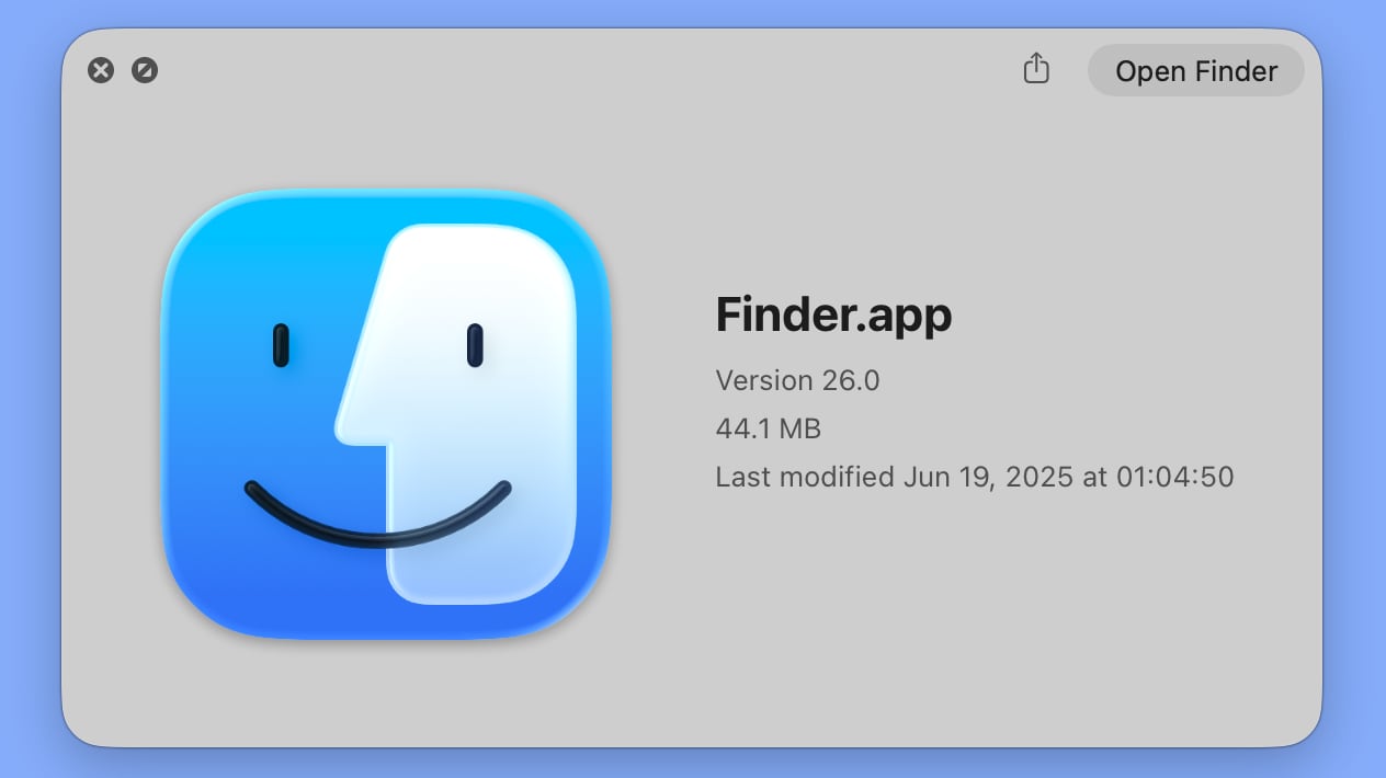
In the initial macOS Tahoe beta, Apple swapped the colors of the Finder icon, a longtime Mac classic. Rather than featuring blue on the left side of the face and light blue on the right side, the icon was primarily white and the right side of the face was blue.
macos-tahoe-finder-beta-2.jpg
macOS Tahoe Finder icon in beta 2


The updated Finder look was a significant deviation from the design that Apple has used for Finder since 1996, and many Mac users were unhappy with the change. Apple had tweaked the Finder colors and design slightly over the years, but the first Tahoe beta marked the first significant change that we've seen because of the decision to put the darker color on the right.

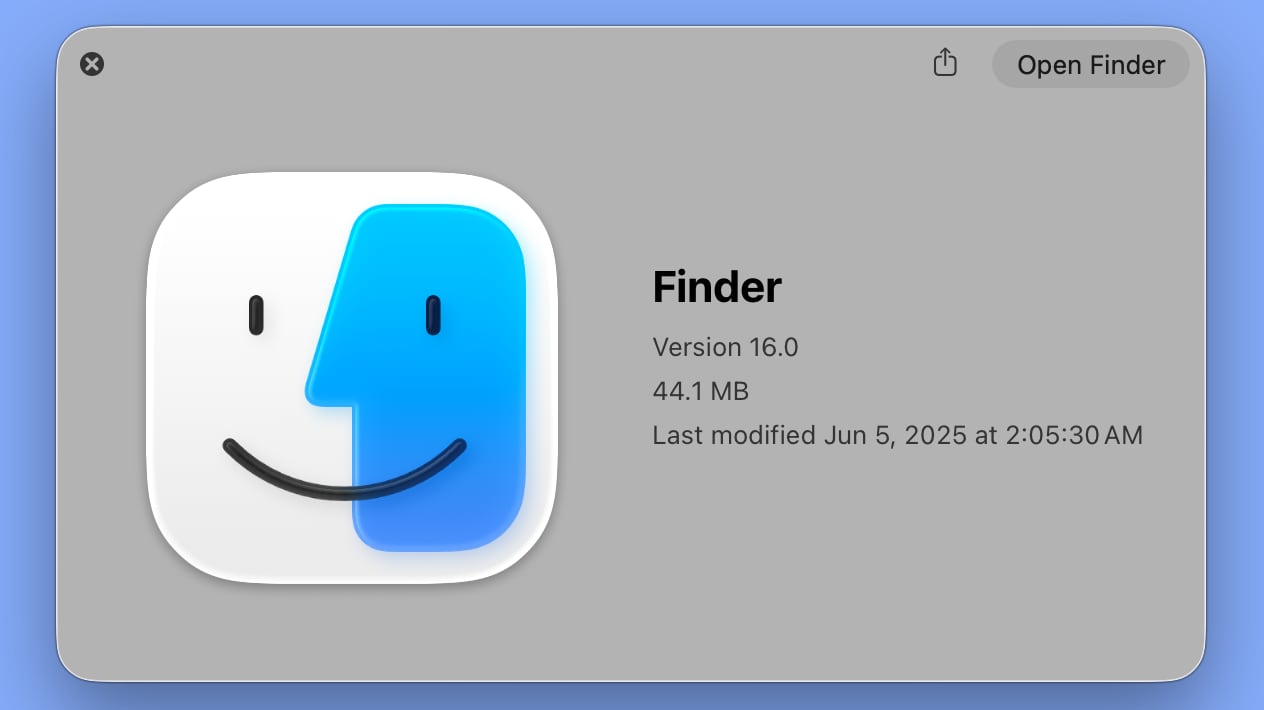
Apple has now reverted the Finder icon to a more traditional color scheme, while keeping the Liquid Glass look. The left side of the face is blue, while the lighter side is a white/blue gradient that has a layered, glass-like appearance.
macos-tahoe-finder-beta-1.jpg
macOS Tahoe Finder icon in beta 1


The icon isn't the same as the version in macOS Sequoia because it doesn't use an even color split, but it's much closer to the original design while still looking fresh.

Article Link: macOS Tahoe Beta 2 Brings Back Classic Finder Color Scheme
 
God forbids Apple change anything whatsoever. It really must make sure nothing changes and the new systems are as bland and boring as possible. Next they’ll change the name to macOS Same
Apple changes quite a bit in this UX revision, from styling to best practices/recommendations in design. This is just 1 icon with heavy cultural baggage so no wonder it can be a sensitive subject.
 
All is (almost) right in the universe. I expect the old cursors will make a comeback as well, because that bland hand pointer can’t compare to good old Mickey Mouse.
 
  • Like
Reactions: ixrated
Apple should know by now no one hates change more than Mac users.
Change for the purpose of improvement is fine — even if it's a misstep, you can often see the vision they were shooting for.
Change for the sake of change almost always sucks.

Personally, I didn't mind the colour flip as much as I do the weird Phantom of the Opera half-mask they've gone with. It's not a big deal either way,I just don't get the purpose of it.
 
Either way looks fine to me. But I think Beta 1’s style matches the liquid glass UI look better which I’m guessing is why they had made the swap in the first place.
 
  • Like
Reactions: arc of the universe
The new Finder icon did appear strikingly different, and not better. I'm glad they reverted this.

The Finder icon has always been an odd duck, and I'm glad they are retaining it at all, since they could change it to a boring Home icon, in the name of consistency.
Yeah, I'm honestly surprised they've kept the icon for this long. While I like it, it doesn't really make "sense" in the way the other icons do. It certainly doesn't say anything about file management. But there's something about that familiar smiling face that makes using the Mac a little more pleasant and human. I'm glad they've kept it.
 
God forbids Apple change anything whatsoever. It really must make sure nothing changes and the new systems are as bland and boring as possible. Next they’ll change the name to macOS Same
Actually yes, they should, in fact they should go further and revert back to OS X Mavericks or better yet Mac OS X Snow Leopard and scrap everything after 2015, flat design redesign. At least Spotlight actually works back then. Who cares about "changes" if everything barely works on a computer 10x faster than one a decade ago?
 
Last edited:
Register on MacRumors! This sidebar will go away, and you'll see fewer ads.