Got a tip for us?
Let us know
Become a MacRumors Supporter for $50/year with no ads, ability to filter front page stories, and private forums.
macOS Tahoe Beta 2 Brings Back Classic Finder Color Scheme
- Thread starter MacRumors
- Start date
- Sort by reaction score
You are using an out of date browser. It may not display this or other websites correctly.
You should upgrade or use an alternative browser.
You should upgrade or use an alternative browser.
I'm actually surprised the icon made the transition from classic Mac OS to Mac OS X. The icon was originally developed not for the Finder but as a logo for Mac OS itself during the clone era of the mid-90s when Apple needed to create branding for the OS for third party manufacturers that didn't involve the Apple logo or Apple's legacy hardware. Considering that Steve Jobs personally killed the clone program and had heavy influence in the original Aqua interface I'm surprised they decided to make the classic Mac OS logo into the Finder icon rather than relegate it to the dustbin of Apple's 1990s missteps.Yeah, I'm honestly surprised they've kept the icon for this long. While I like it, it doesn't really make "sense" in the way the other icons do. It certainly doesn't say anything about file management. But there's something about that familiar smiling face that makes using the Mac a little more pleasant and human. I'm glad they've kept it.
Ah, much better. I am glad they made this change as well as other changes in Beta 2. I hope there are many more improvements and a lot more polish to follow.
Some are saying that the Finder icon doesn't really make sense because it doesn't represent what it launches when you click on it, but I disagree. When you click on the 'Happy Mac Icon' (not sure what its actual name is), it brings up Finder, which shows you everything on your Mac. So to me, the Happy Mac icon is your Mac, and this guy is the face of it.
Some are saying that the Finder icon doesn't really make sense because it doesn't represent what it launches when you click on it, but I disagree. When you click on the 'Happy Mac Icon' (not sure what its actual name is), it brings up Finder, which shows you everything on your Mac. So to me, the Happy Mac icon is your Mac, and this guy is the face of it.
I always thought the Finder icon was supposed to be TWO faces, one from the computer on the left and one from the person on the right, converging in harmony, the basis of what Mac was meant to be.
It also tied into the older Macs having a 'happy Mac' face on successful startup, chime and all, and a dead/sad Mac face and accompanying chimes/sounds if it crashed or had a general hardware fault. It even spread to iPod for a time (sad iPod when the internal HDD died)
It also tied into the older Macs having a 'happy Mac' face on successful startup, chime and all, and a dead/sad Mac face and accompanying chimes/sounds if it crashed or had a general hardware fault. It even spread to iPod for a time (sad iPod when the internal HDD died)
Really? Who cares? Changes are good. Changes are desperately needed. Same Mac OS look forever...
We've had the same looking iPhone since iPhone 11 and no real changes and no innovation.
I wish they change all the icons so we can be surprised once and for all.
I agree with most. It must have been a slow news day to invest time and effort on a long article about the finder icon...
We've had the same looking iPhone since iPhone 11 and no real changes and no innovation.
I wish they change all the icons so we can be surprised once and for all.
I agree with most. It must have been a slow news day to invest time and effort on a long article about the finder icon...
I just want either Aqua or Skeuomorphism to return. I'm sick of reliving the bad memories of my time with DeskMate or WorkBench 1.5.
I always saw it as two faces as well; a Mac screen in the background and a user profile on the right.I always thought the Finder icon was supposed to be TWO faces, one from the computer on the left and one from the person on the right, converging in harmony, the basis of what Mac was meant to be.
It also tied into the older Macs having a 'happy Mac' face on successful startup, chime and all, and a dead/sad Mac face and accompanying chimes/sounds if it crashed or had a general hardware fault. It even spread to iPod for a time (sad iPod when the internal HDD died)
and by the way... isn't AQUA a similar look to the liquid Mac OS?
I mean. Hello. Water (AQUA) is liquid and translucent.
Back to the future in the year 2000....

I mean. Hello. Water (AQUA) is liquid and translucent.
Back to the future in the year 2000....
I prefer the style of the 2001-2003, but the 2003-2007 isn’t bad either. I don’t know how’d they bring one of those back though with the square circle shape they changed to. I guess they could just have the switch and switch plate without the Apple logo, but it just wouldn’t be the same and look a bit out of place I’m afraid. While I’m not a fan of the new icon, I guess it goes along with the whole liquid glass theme they’re going with. I do think some of the updated icons look great though, I much prefer the new Notes app icon, but the Text Edit app icon now just looks weird. It’s like they just took the previous Text Edit icon, removed the pen and zoomed in on body of the paper. They could have kept it the same as before and just made the pen fit within the square circle shape, it would’ve looked better. Oh and they didn’t even bother to update the Script Edit app icon yet and now it looks weird with their automatic resizing that put a gray border around it.While you're at it, give the settings icon another shot too. I've never been a fan of it since 2020.
Apple is unafraid to drive innovation right down to tiny pixels within an icon. This makes me happy.
You are right, the logo is straight from Picasso's work. I imagine that Jobs was a big fan of the artists painting. The left hand side of some of Picasso's works were the emotion of the characters, the right hand side were a drawing of their face.I always thought the Finder icon was supposed to be TWO faces, one from the computer on the left and one from the person on the right, converging in harmony, the basis of what Mac was meant to be.
It also tied into the older Macs having a 'happy Mac' face on successful startup, chime and all, and a dead/sad Mac face and accompanying chimes/sounds if it crashed or had a general hardware fault. It even spread to iPod for a time (sad iPod when the internal HDD died)
Now if they can fix downloads from the App Store not working…
In the initial macOS Tahoe beta, Apple swapped the colors of the Finder icon, a longtime Mac classic. Rather than featuring blue on the left side of the face and light blue on the right side, the icon was primarily white and the right side of the face was blue.
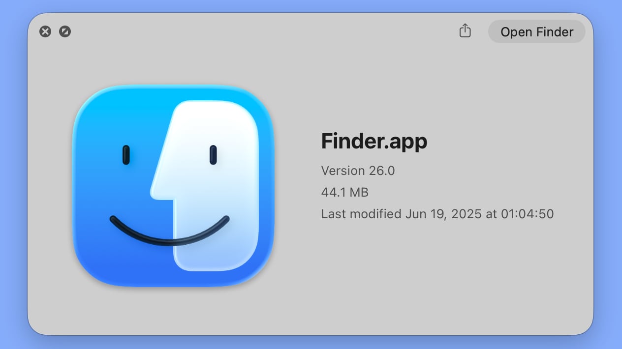
macOS Tahoe Finder icon in beta 2
The updated Finder look was a significant deviation from the design that Apple has used for Finder since 1996, and many Mac users were unhappy with the change. Apple had tweaked the Finder colors and design slightly over the years, but the first Tahoe beta marked the first significant change that we've seen because of the decision to put the darker color on the right.
Apple has now reverted the Finder icon to a more traditional color scheme, while keeping the Liquid Glass look. The left side of the face is blue, while the lighter side is a white/blue gradient that has a layered, glass-like appearance.
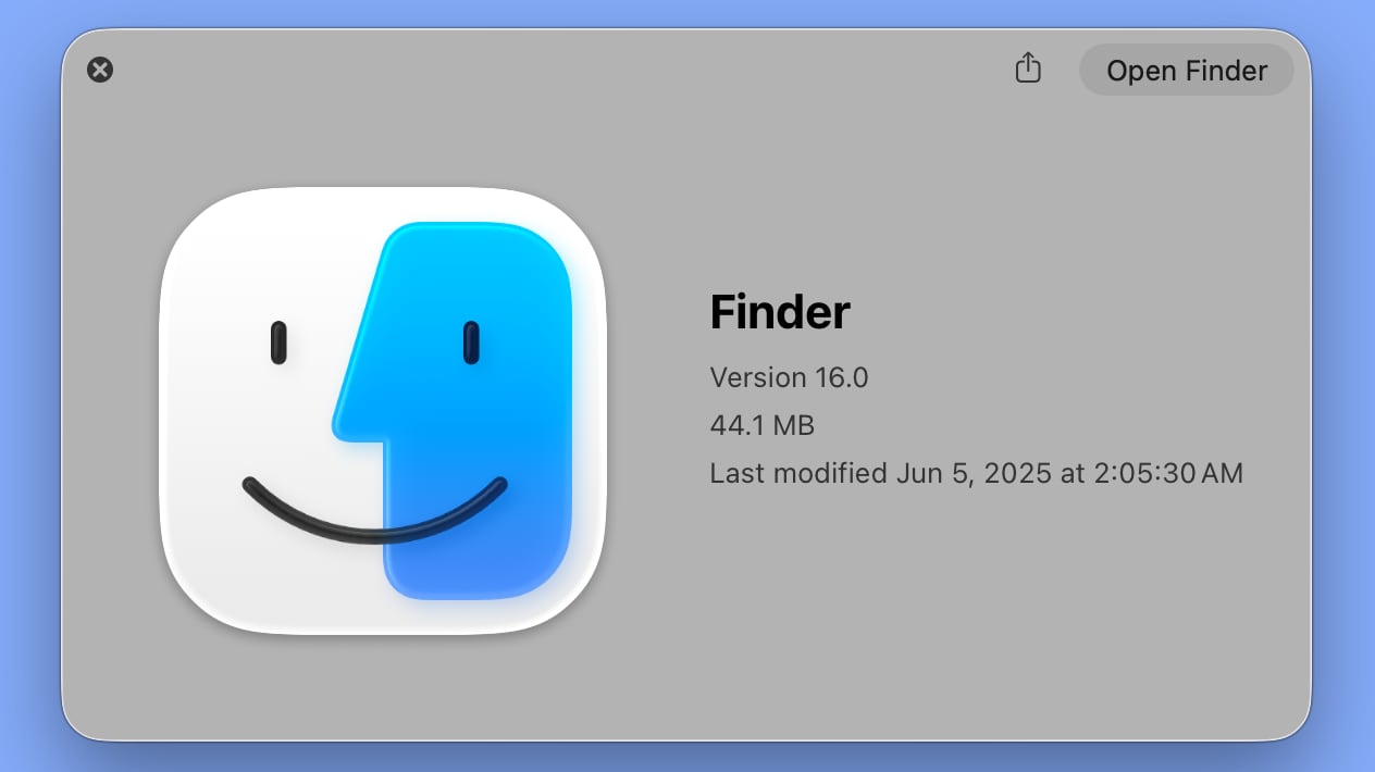
macOS Tahoe Finder icon in beta 1
The icon isn't the same as the version in macOS Sequoia because it doesn't use an even color split, but it's much closer to the original design while still looking fresh.
Article Link: macOS Tahoe Beta 2 Brings Back Classic Finder Color Scheme

wow. innovation! world changing! dent in the universe...
trash show.
trash show.
I prefer the clear on Blue. Can Someone save that finder.icns file from beta 1 and share it please?
One more thing........... Introducing the new Finder icon, the most amazing, incredible icon yet
Register on MacRumors! This sidebar will go away, and you'll see fewer ads.