Now you want the beta 1 version back after all the complaining? Y’all are never satisfied
Got a tip for us?
Let us know
Become a MacRumors Supporter for $50/year with no ads, ability to filter front page stories, and private forums.
macOS Tahoe Beta 2 Brings Back Classic Finder Color Scheme
- Thread starter MacRumors
- Start date
- Sort by reaction score
You are using an out of date browser. It may not display this or other websites correctly.
You should upgrade or use an alternative browser.
You should upgrade or use an alternative browser.

MrENGLISH
macrumors 65816
Apple should keep swapping them back and forth to keep everyone guessing, including MRs.
Mateus1320
macrumors member
This has already happened at WWDC 2021 where safari was modified during the Beta and its concept only came now in iOS 26. In macOS 29 they come back with the Finder icon in white xDToo bad for all of Apple's recorded videos from WWDC! They'll all have the old icon.
jonnyb098
macrumors 601
As long as Apple is pretty much doing what we want at this point , BRING BACK SLIDE OVER ON IPAD!!!
lucansmiles
macrumors member
I know this will be very controversial. But they pledged to make all OSes more consistent this time around. So shouldn't they just get rid of the "Finder" name altogether and just name it "Files"? Yes, my heart would cry but it would at least be CONSISTENT.
StoneJack
macrumors 68040
Other way. Files should be Finder and have proper desktop functionsI know this will be very controversial. But they pledged to make all OSes more consistent this time around. So shouldn't they just get rid of the "Finder" name altogether and just name it "Files"? Yes, my heart would cry but it would at least be CONSISTENT.
Adora
macrumors 68010
I always saw a blue 1 in the white icon. Now it doesn't stick out that much anymore.

MacAddict1978
macrumors 68000
I'm totally in the odd man out camp, but I have never liked the Finder Icon colors inverted or not.
A smiling face with a big nose just never made sense to me for the app that finds things. A golden retriever would make more sense.
I get its a legacy thing... but so was a Rainbow apple, glowing apples on the backs of laptop lids, and many other things. The new version looked clean and a little nicer, IMO.
But Mac users will die from change. We can't have mass death and casualties.
They should have just really went for stroke level infuriation and changed it to a magnifying glass, or heck, rebranded it to Sherlock and resurrected that.
PS. I loved Sherlock.
MacAddict1978
macrumors 68000
Change for the purpose of improvement is fine — even if it's a misstep, you can often see the vision they were shooting for.
Change for the sake of change almost always sucks.
Personally, I didn't mind the colour flip as much as I do the weird Phantom of the Opera half-mask they've gone with. It's not a big deal either way,I just don't get the purpose of it.
It wasn't change for the sake of change though.
The new version works better with the new design language, which gets lost when flipping it back, especially where translucency is concerned because it looks less like glass which is the entire theme.
+1 on the Phantom comment though.... but hey, when we think search, we all think "An icon of a face with a huge nose" right?
arc of the universe
macrumors 6502a
i agree. beta 1 version does look better and truer to Liquid Glass.Either way looks fine to me. But I think Beta 1’s style matches the liquid glass UI look better which I’m guessing is why they had made the swap in the first place.
like a lot of change, the change was jarring.
i think the reason why they changed it back is that the thing about the mac finder icon is that its not just an icon.
it's iconic. it's almost a kind of secondary level of an apple logo.dating from when apple was only about the mac.
therefore apple really needs to think twice about changing it other than updating with the liquid glass design language.
a younger design team that implemented that logo-status icon change probably doesn't appreciate the gravity of changing it to the extent they did.
GrassShark
Suspended
I don’t think it loses anything in the classic configuration. It’s not like we haven’t seen frosted glass in Apple’s design language.It wasn't change for the sake of change though.
The new version works better with the new design language, which gets lost when flipping it back, especially where translucency is concerned because it looks less like glass which is the entire theme.
+1 on the Phantom comment though.... but hey, when we think search, we all think "An icon of a face with a huge nose" right?
nortonandreev
Contributor
Jackson Lawton
macrumors member
Well it doesn’t, but I do like beta 1’s version more better now seeing beta 2’s version, though at the time I was one of those that wished they would have kept the color combo the same as it always has been. Does it really matter though, no not at all… It’s not like they totally redesigned the icon and kept it familiar, yet fresh and new.I don’t think it loses anything in the classic configuration. It’s not like we haven’t seen frosted glass in Apple’s design language.
flybynight
macrumors member
RoboCop001
macrumors 68000
Well, I hope that will be our last battlefield.

"Star Trek" Let That Be Your Last Battlefield (TV Episode 1969) ⭐ 7.2 | Action, Adventure, Sci-Fi
51m | TV-PGwww.imdb.com
This beta brought to you by Gene Roddenberry
Jackson Lawton
macrumors member
Yeah me too now seeing beta 2’s version, though when I first saw that they changed the color combo, I was one of them that was hoping they would change it back. Whatever though, at least they didn’t totally change it and kept it familiar while looking fresh and new, and hopefully this is the last time they change it and focus on other more important parts of the OS.I liked the beta 1 more, but I don’t think it matters. It’s an icon…
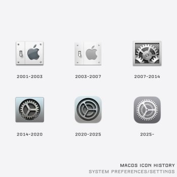
I’m a fan of the Lightswitch #2. And also the last one. I hope they clean up System Preferences. It’s a mess right now. Go back to the way it was a few years ago. Everything was so easy to find.While you're at it, give the settings icon another shot too. I've never been a fan of it since 2020.
Windoes
macrumors regular
As long as they keep the Windows icon as a blue-screen I’m fine with it
Astuces iOS
macrumors 68020
kinda logic because is your isn’t blue… but still blue in dark mode… should it be black and white?
for those who doesn’t know, the finder icon is a reflection of a face in a screen.
for those who doesn’t know, the finder icon is a reflection of a face in a screen.
Yes!!! I really miss the icon with the multiple offset gears because that's visually more pleasing because it's more dynamic and it's just not as boring as the subsequent-to-recent-ones. It looks much more realistic, which I know wasn't the goal ever since they went flat.While you're at it, give the settings icon another shot too. I've never been a fan of it since 2020.
It's amazing to realize Apple has always been about meticulous, if not playful, richness of detail. It's what has always made Apple unique and set apart from their competitors. Yes, it may seem completely superfluous and inconsequential, but that also means not actually, really, understanding what has made Apple... Apple.It's amazing what people will fixate on.
Moonlight
macrumors 65816
Monotremata
macrumors 6502
Bring back the Classic 'platinum' look of OS 8/9!
The old purple Finder face is actually my desktop wallpaper on my PC at the office heh. Really throws people off now and then. 🤣
Register on MacRumors! This sidebar will go away, and you'll see fewer ads.