Become a MacRumors Supporter for $50/year with no ads, ability to filter front page stories, and private forums.

MacRumors

macrumors bot
Original poster
Apr 12, 2001
68,526
39,360


The upcoming macOS Tahoe update that Apple previewed this week gives the Mac more personality, with several new customization options.

macOS-Tahoe-Tinted-App-Icons.jpg

iOS 18 introduced Dark and Tinted options for iPhone app icons, and macOS Tahoe extends those options to the Mac for the first time.

Just like on iOS 26, macOS Tahoe also offers a Clear option for app icons, which pairs nicely with the new Liquid Glass design.

macOS-Tahoe-Clear-App-Icons.jpg

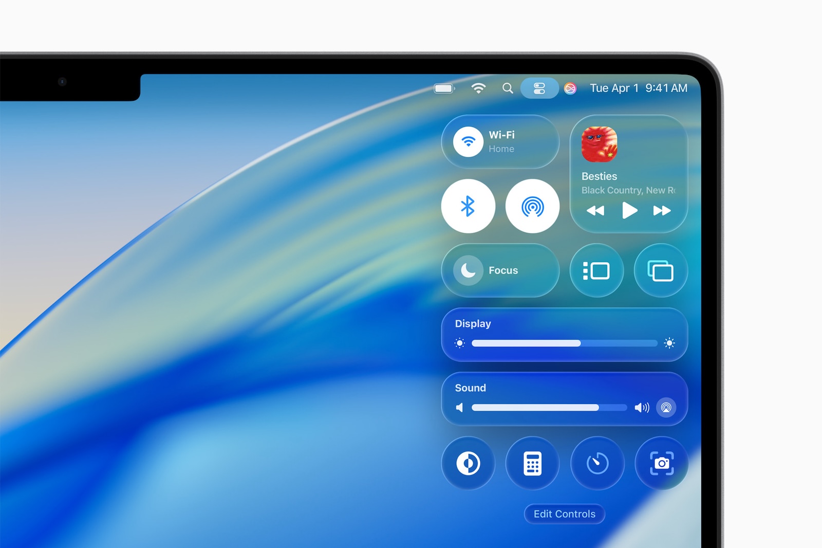
Second, macOS Tahoe brings the iPhone's customizable Control Center layout to the Mac, allowing you to easily add and rearrange controls.

macOS-Tahoe-Control-Center.jpg

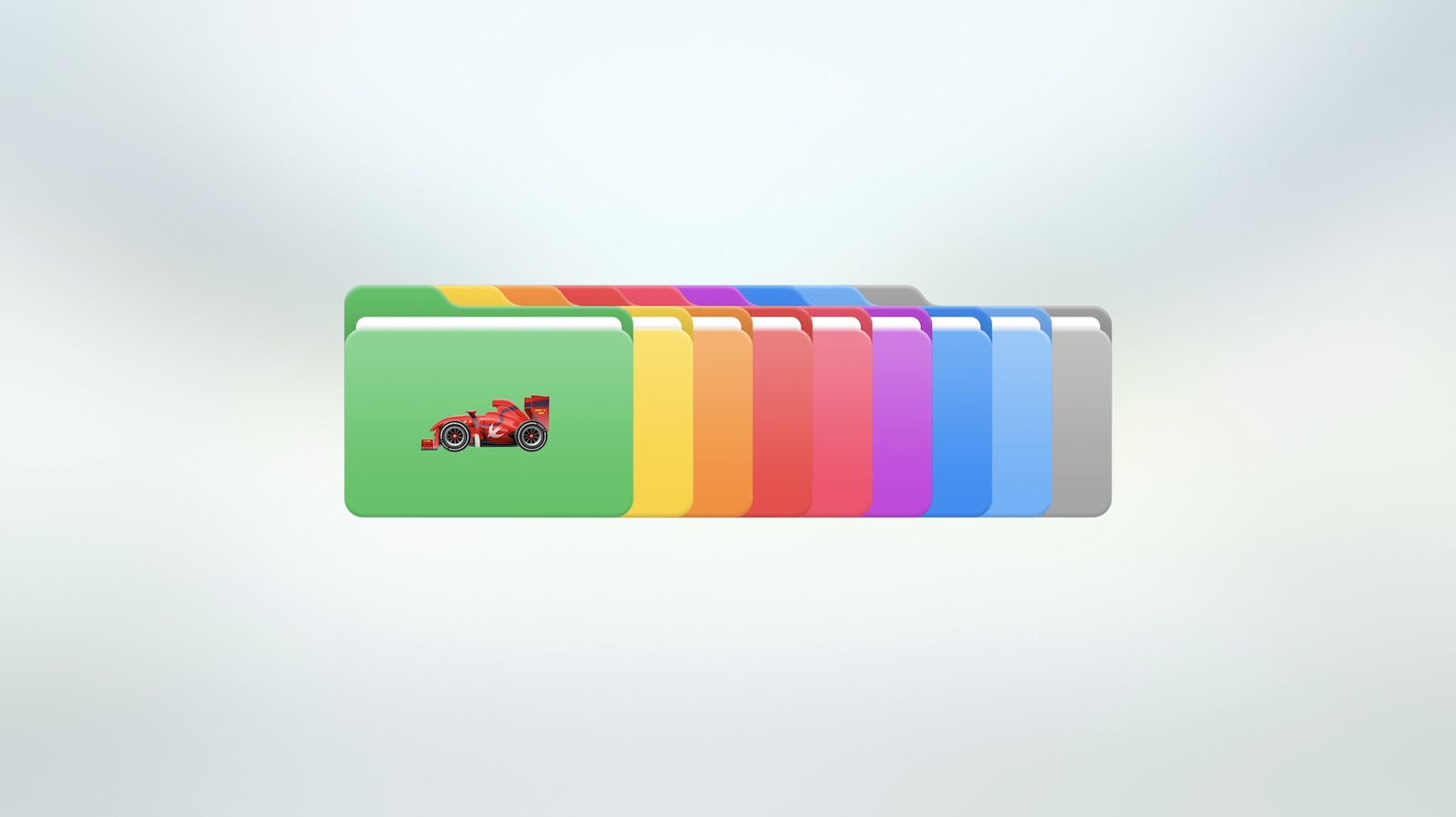
Third, macOS Tahoe makes it easy to change the colors of folder icons, and you can add a symbol or emoji to them for a unique flair.

macOS-Tahoe-Folders.jpg

macOS Tahoe is available now in developer beta, with a public beta to follow next month. The update will be released later this year.

Article Link: macOS Tahoe is More Customizable in Three Ways
 
Personally I think they really knocked it out of the park with this year's updates. It's also great that they have been able to update everything together, instead of leaving macOS & iPadOS behind for the next year like they have done so often.

Also, I think one of my favorite unmentioned improvements is the Mail app finally, finally, finally getting the option to not select a new message when you delete or move one. It was always so nonsensical that if I deleted a message mail would pop me into a different one from the list, causing it to become read.
 
Also, I think one of my favorite unmentioned improvements is the Mail app finally, finally, finally getting the option to not select a new message when you delete or move one. It was always so nonsensical that if I deleted a message mail would pop me into a different one from the list, causing it to become read.
Oh I missed that! I might install the betas just for this 😂
 
  • Like
Reactions: parameter
Personally I think they really knocked it out of the park with this year's updates. It's also great that they have been able to update everything together, instead of leaving macOS & iPadOS behind for the next year like they have done so often.

Also, I think one of my favorite unmentioned improvements is the Mail app finally, finally, finally getting the option to not select a new message when you delete or move one. It was always so nonsensical that if I deleted a message mail would pop me into a different one from the list, causing it to become read.
My biggest wish for Mail is to automatically delete or at least send to trash, any mail from blocked accounts. I don’t need them going to Junk, just get rid of them. Why is this so hard?
 
The new UI seems to be most successful perhaps on macOS (though I haven't used it). I like that folders themselves are coloured rather than adding coloured dots, this instantly appears inevitable. Custom colours would be nice, someone today wanted a true beige rather than the yellow. You should however be able to password protect folders in macOS with a right-click (ctrl+click, two fingers)—also inevitable. In the coming years Apple should open it up to devs to create icon packs users can trial, and buy. Tinting is nice to have as an option, but needs improving. Glass icons appear gimmicky.
 
Last edited:
Probably the only fairly useful thing out of the Tahoe debacle are the customizable folders, something which, it must be reminded, ALREADY existed in pre-OS X days.

The rest is just fluff.

It really is.

People are appaerently very easily impressed by anything Apple does.

Folks claiming they "knocked it out of the park" and I'm just like ... "what?"

images
 
I’m not happy about the new cursors or the hideous finder icon, but that’s just nitpicking. Even with all the changes it’s still less radical than iOS 7 was
 
  • Like
Reactions: StoneJack
Interesting: folders get colors while the dock goes white (or amber, or ...)
Tinting is about reducing visual distraction from the app you're in. I guess the idea is once someone learns the location of the apps in their dock they can tone them down and still locate them.

Whereas folders serve the opposite purpose, visual distinction. App icon tinting is a decent idea, but needs more attention.
 
Last edited:
Pretty sure that you could have custom folder icons before Mac OS X, I remember making my Macintosh HD an indigo iBook to match my machine and they took that away in X
Maybe I'm misunderstanding but you can already change the icon of your Macintosh HD, as well as other volumes, folders and file, in the current macOS (File > Get Info, select the icon in the top-left, and paste the new icon).

You can copy icons from the Get Info screen of other items in the Finder, or open any image file, Edit > Select All, and copy the image and use that.
 
The new UI seems to be most successful perhaps on macOS (though I haven't used it). I like that folders themselves are coloured rather than adding coloured dots, this instantly appears inevitable. Custom colours would be nice, someone today wanted a true beige rather than the yellow. You should however be able to password protect folders in macOS with a right-click (ctrl+click, two fingers)—also inevitable. In the coming years Apple should open it up to devs to create icon packs users can trial, and buy. Tinting is nice to have as an option, but needs improving. Glass icons appear gimmicky.
If that happens, I'll colour my folders in the shades of Mauve, Caramel, Mocha, Merlot, Lavender, Sage, Fuchsia and Claret.
🤌❤️
 
Register on MacRumors! This sidebar will go away, and you'll see fewer ads.