Got a tip for us?
Let us know
Become a MacRumors Supporter for $50/year with no ads, ability to filter front page stories, and private forums.
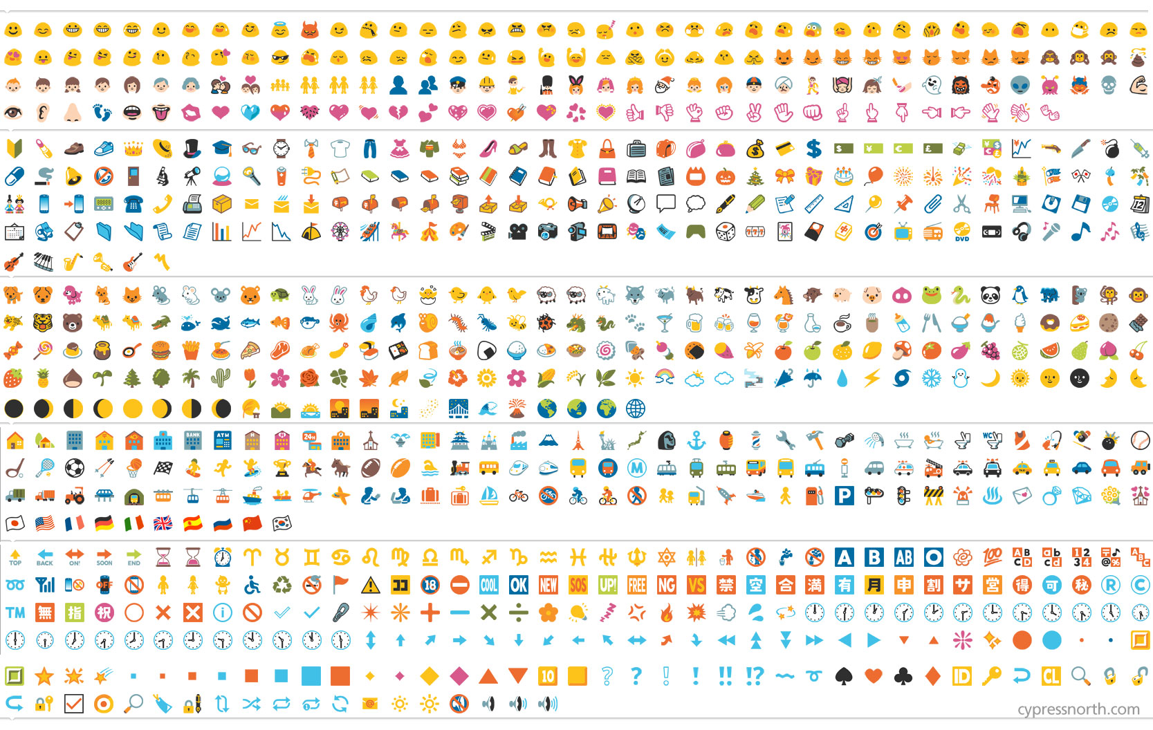
Microsoft Updates Windows 10 Emoji to Resemble Apple's Collection
- Thread starter MacRumors
- Start date
- Sort by reaction score
You are using an out of date browser. It may not display this or other websites correctly.
You should upgrade or use an alternative browser.
You should upgrade or use an alternative browser.
Glad to see MS Paint still getting some use
Same thought, I guess any worst would be hand drawn with a pencil and paper.
And who in the world green lighted the middle finger emoji, could it have been, let me guess....................Satan?
I just had a gander at Android emoji. Terrible. Microsoft's aren't bad but aren't great either.
The Android emojis are far cleaner than either Apple's or MS's.

Glad to see MS Paint still getting some use
yeah ask ive
Yep, I think Google's 'material design' emoji looks better.
However, where Apple's shows an embarrassed emoji, MS' is a Speakerface.

Those aren't the material design emoji--those are from KitKat.Image
Yep, I think Google's 'material design' emoji looks better.
However, where Apple's shows an embarrassed emoji, MS' is a Speakerface.
Register on MacRumors! This sidebar will go away, and you'll see fewer ads.