Become a MacRumors Supporter for $50/year with no ads, ability to filter front page stories, and private forums.
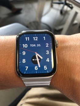
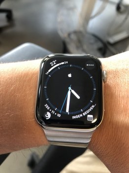
California has four pages of customization options!

The first page lets you choose the kind of indices it has: Pills, Roman, California, Numerals, Arabic, and Hindi. The second page lets you choose between a Fullscreen and Circular look, which then impacts which complications are available to you on the fourth page. The third page lets you choose between four colors: White, Off White, Black, and Blue.

The fourth page lets you choose the complication slots. If you opted for a Full Screen look on page two, there are two complication slots: a text one that provides Date, Digital Time (!), Monogram, Stopwatch, and Timer as options—and a second, more standard Circular complication that was introduced with Infograph Modular.

If you select the Circular layout on page two instead of Full Screen, you get four Corner complications and one Bezel complication, very similar to Infograph's layout, just without the four Circular complications in the middle.

This is a ridiculous amount of customizability for one face—there are so many configurations that it's hard to document its scope and parse through text, so here are a few screen shots.

https://www.icloud.com/sharedalbum/#B135Uzl7VYboK

Now that you've pushed me to check this face out, it's actually becoming one of my favorites.

Wow thanks a million - this is by far the one I look most forward to. Full screen analogue with a few complications has been Nike/Hermes territory for far too long
 
Also, a new feature for Infograph in OS 6 is this new mono color look. I’m not really a fan, but maybe it will look better if developers build their apps against watchOS 6. It’s a bit too spartan for my tastes—devoid of joy

D7CE4007-82A9-4D3C-BF0F-04F84A094F40.png
 
Also, a new feature for Infograph in OS 6 is this new mono color look. I’m not really a fan, but maybe it will look better if developers build their apps against watchOS 6. It’s a bit too spartan for my tastes—devoid of joy

View attachment 843779

Still needs work but sometimes the Infograph is too colourful to look stylish.
 
Still needs work but sometimes the Infograph is too colourful to look stylish.

Infograph definitely does have kind of a chintzy quality to it with full color complications but i personally prefer that more toyish look over what is essentially greyscale. The Solar Dial face proper themes the complications, so I dont understand why Infograph has to look so drab.
BCD502A6-E799-46A8-9791-1C5B9EC8CDC7.png
 
Last edited:
  • Like
Reactions: xDKP and Arran
Infograph definitely does have kind of a chintzy quality to it with full color complications but i personally prefer that more toyish look over what is essentially greyscale. The Solar Dial face proper themes the complications, so I dont understand why Infograph has to look so drab.
View attachment 843829
I prefer a more restrained use of color.

Infograph looks great in adverts showing an extreme closeup of the face, but it’s too garish on the wrist for my tastes. Especially when the owner’s complications are random colors and not the subtly color-coordinated ones Apple uses in promotional pictures.
 
I personally prefer this look.

Is it Mono only or are other single shade choices available?

The color I posted a screenshot of is Yellow, but there are a lot of color options. Infograph had these color options before, but now they work differently
[doublepost=1560963026][/doublepost]
I prefer a more restrained use of color.

Infograph looks great in adverts showing an extreme closeup of the face, but it’s too garish on the wrist for my tastes. Especially when the owner’s complications are random colors and not the subtly color-coordinated ones Apple uses in promotional pictures.

Yeah, infograph is kind of a mess but if you are thoughtful with it it can look pretty good actually
 
Infograph definitely does have kind of a chintzy quality to it with full color complications but i personally prefer that more toyish look over what is essentially greyscale. The Solar Dial face proper themes the complications, so I dont understand why Infograph has to look so drab.
View attachment 843829

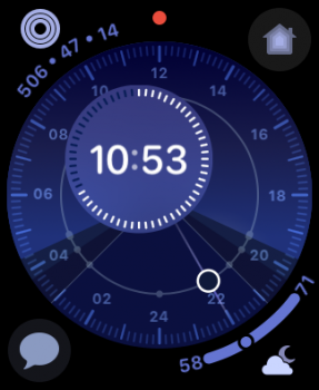
I'm dying for other color options for this watchface, including a full color version. I hate the drab blue.
 
I'm dying for other color options for this watchface, including a full color version. I hate the drab blue.

Solar Dial? I love the color harmony that's going on with that face. I don't see how other color schemes would make sense
[doublepost=1560978158][/doublepost]
Excellent, I like it.

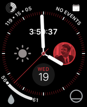
Red looks kind of cool—it's got some terminator vibes. How contact images in the Favorites complication get themed is strange, looks like a rendering bug.

IMG_2126.PNG
 
Last edited:
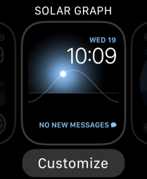
Something I just noticed is that “Solar” has been renamed to “Solar Graph” in beta 2. Here’s how infograph modular looks when color themed, by the way. Modular seems to do a better, more comprehensive job. Still wish that more of the glyphs could be colored to match

9F45B096-E4FD-434A-8BE4-C83D6B63B489.png 04E33695-243F-4F6F-A6E8-784AEA48F7DD.png
 
Last edited:
  • Like
Reactions: KeanosMagicHat
Loving this thread as I'm really looking forward to the new faces. Any chance anybody could show us the new Cellular Signal Strength complication and how it works? I haven't seen that anywhere
 
Loving this thread as I'm really looking forward to the new faces. Any chance anybody could show us the new Cellular Signal Strength complication and how it works? I haven't seen that anywhere

Loving this thread as I'm really looking forward to the new faces. Any chance anybody could show us the new Cellular Signal Strength complication and how it works? I haven't seen that anywhere

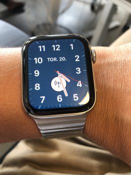
It’s changing from static to signal strength depending on If your iPhone is nearby - have attached for both the corner and circular complications
 

Attachments

  • 96512059-A915-43B8-86F1-AF49ABEF1870.jpeg
    96512059-A915-43B8-86F1-AF49ABEF1870.jpeg
    1.9 MB · Views: 338
  • 715745D3-E6AC-4432-8CAF-723834FDFF8E.jpeg
    715745D3-E6AC-4432-8CAF-723834FDFF8E.jpeg
    1.8 MB · Views: 297
  • 335B9FB3-2D56-45DA-B66B-19EB1C1E8A67.jpeg
    335B9FB3-2D56-45DA-B66B-19EB1C1E8A67.jpeg
    1.5 MB · Views: 243
  • 076E637A-950A-4217-8415-6593C7D261D9.jpeg
    076E637A-950A-4217-8415-6593C7D261D9.jpeg
    1.5 MB · Views: 342
  • Like
Reactions: Internet Enzyme
It’s changing from static to signal strength depending on If your iPhone is nearby - have attached for both the corner and circular complications
Thank you for that, it doesn't look as good as I had hoped. I guess it would look nice in the centre of a White dial but that big White circle anywhere else just doesn't seem to fit.
 
Register on MacRumors! This sidebar will go away, and you'll see fewer ads.