Warning to the disinterested: this post is really, really long so if you're not at all interested in our little statistical sidebar, start scrolling rapidly.
....Sorry, now going off the deep end because I'm trying to convince
myself that I'm right... feel free to wander off and actually talk about Macs or the MWC while I ramble
")
No worries-- I tend to do the same. Discussing things like this forces me to think through my assumptions... Hopefully everyone else will tolerate the long post, but I included code because sometimes that's more clear than language, and the thread is rather quiet anyway so I don't think many people are really going to notice...
I think you're confusing the data itself with how you choose to arrange it - and, in the end, that means that you're forgetting what it is that the data is supposed to represent.
I don't think so. If you look at the plots you're sharing, they don't present the data, they present
a summary of the data. The data is the sequence of dice roles in your examples. I just generated 5 d12 rolls and got [6,7,11,7,3]. That's the data.
That data is lost in the plots you shared-- they tell me I rolled a 3, a 6, 2 7's and an 11. It's been sorted and counted so when I plot it it will look organized, it is no longer random.
The data (dice rolls) may represent an action in a game. The histogram plots, in this case, indicate whether the dice are well balanced.
Sometimes it's the data you're after, sometimes it's the summary statistics (histogram, mean, variance, modes, etc).
Using Python, I'll create a d12 and a d6, then roll the d12 and a pair of d6's 100,000 times:
Python:
import numpy as np
import scipy.stats as stats
import matplotlib.pyplot as plt

d12=stats.randint(1,13)
d6=stats.randint(1,7)
d12Rolls=d12.rvs(size=1000000)
d6Rolls1=d6.rvs(size=100000)
d6Rolls2=d6.rvs(size=100000)
twoD6Rolls=d6Rolls1+d6Rolls2
For the d12, the first portion of the
data looks like this:
Python:
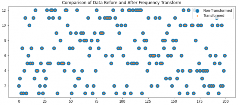
plt.plot(d12Rolls[0:1000],'.')
plt.title("d12 Rolls");plt.xlabel("Roll");plt.ylabel("Value");

You'll notice that it's "lumpy". There are places where the same number gets rolled frequently, and places where it doesn't get rolled for a long time.
This is the histogram of the data, which is what you're plotting:
Python:
plt.hist(d12Rolls,bins=12)
plt.title("Histogram of d12 Rolls")
plt.xlabel("Value");plt.ylabel("Count");

It is a smooth, flat line. The histogram is not technically the distribution, but with enough points it will converge to the distribution-- in this case a uniform distribution. Notice that the horizontal axis now is the value (which was the vertical axis) and the vertical is the count. The actual data (the rolls) are nowhere to be found. There are now only 12 numbers left-- the counts each die value occured. It is sorted and summarized, and is no longer random.
You can clearly see that Alice & Dave's are the beginning of a bell-shaped normal distribution (the expectation for D6+D6) while the others are either a much broader bell or something else entirely.
d6+d6 is most certainly not bell shaped and is not a normal distribution. The d12 is a uniform distribution.
The data from the first thousand rolls:
Python:
plt.plot(twoD6Rolls[0:1000],'.')
plt.title("d6 + d6 Rolls");plt.xlabel("Roll");plt.ylabel("Value");
Again, lumpy. (If you've ever won Settlers of Catan because that 12 on your wheat kept striking gold, then lost at Settlers of Catan because you kept waiting for that 12 on your wheat to hit at least once in the game and it never happened, you'll know what I mean by lumpy.)
And the histogram of 100,000 rolls, however, is not lumpy. It is a nice smooth curve (well as smooth as it can be with only 11 values):
Python:
plt.hist(twoD6Rolls,bins=11)
plt.title("Histogram of d6 + d6 Rolls")
plt.xlabel("Value");plt.ylabel("Count");
That is not a bell curve, it's a triangle, and not because it only has 11 values. Here's the same experiment with d100's:
Python:
d100=stats.randint(1,101)
d100Rolls1=d100.rvs(size=100000)
d100Rolls2=d100.rvs(size=100000)
twoD100Rolls=d100Rolls1+d100Rolls2
plt.hist(twoD100Rolls,bins=199)
plt.title("Histogram of d100 + d100 Rolls")
plt.xlabel("Value");plt.ylabel("Count");
Still a triangle, versus 100,000 points sampled from a normal distribution:
Python:
plt.hist(stats.norm().rvs(size=100000),bins=199);
which looks like the archetypical bell.
Now, let's look at your "small number of spreaders" example. Can't really model that with a single die roll. Your roll a die and apply a threshold, above which you're a spreader model is a reasonable one-- I'll model it here as a Bernoulli distribution, which is essentially the same principle. In this case, 5% of people are spreaders and each infects 10 people, the rest of the population give it to no one. I'll generate a population of 350 million people.
Python:
spreaderStats=stats.bernoulli(0.05)
spreaders=spreaderStats.rvs(size=350*1000*1000)*10
Here, I'll show the distribution first.
Python:
plt.hist(spreaders,bins=11)
plt.title("Infectivity of the Population")
plt.xlabel("Infectivity");plt.ylabel("Number of People");
Again this isn't the data, it's been sorted and is showing the count of one group who would infect no one and the group that would infect 10 people. It's hard to call a binary distribution like this "smooth" because there's only two values, but you get the idea. In reality it may be some other bimodal distribution where you have a large group who would infect a small number of people and a small group who would infect a large number of people.
This is the data:
Python:
plt.plot(spreaders[0:1000],'.')
plt.title("Infectivity of Individuals")
plt.xlabel("Specific Individual");plt.ylabel("Infectivity");
To see how this data is lumpy, assume this is a 1 dimensional nation with all of the people lined up shoulder to shoulder and where town boundaries are every 100 people (the first 100 people live in Onetown, the next hundred people live in Twotown, etc.), then and look at how many spreaders are in each town:
Python:
townsize=100
towns=np.count_nonzero(spreaders.reshape((townsize,int(len(spreaders)/townsize))),axis=0)
plt.plot(towns[0:1000],'.')
plt.title("Spreaders in each town")
plt.xlabel("Specific Town");plt.ylabel("Spreaders in Town");
In the first 1000 towns, there are some without spreaders and one with 15. Among all the towns there were some as high as 20 in this run. Using a larger town size of 10,000 people, the data looks like this:
Data like that is a little hard to interpret directly, so if we want to know, for example, how many spreaders we could expect in each town, we can summarize the data with a histogram of how many towns we'd expect to have how many spreaders (not specific towns in this case, but summary statistics):
Python:
plt.hist(towns,bins=towns.max()-towns.min());
plt.title(f"Spreaders in each town of {townsize}")
plt.xlabel("Number of Spreaders in Town");plt.ylabel("Number of Towns with That Many Spreaders");
😲 Whoah! Where'd the bell shape come from all of a sudden?!
Now we're back to my point about aggregate statistics tending toward normal...
No, it won't unless what you're measuring is actually following a normal distribution.
If you'd followed the link I gave you it would have taken you to the description of the
Central Limit Theorem, which says that
it doesn't matter what the underlying distribution is-- if you start adding samples from it they converge to a normal distribution. So, the sample mean for example, which is a sum of samples divided by the number of samples, will have a normal distribution.
This is where the bell curve above comes from (not strictly normal because all values in these samples are positive and a true normal distribution has tails to negative infinity, but closer to log-normal which approaches normal as you get further from zero).
In your dice rolling experiments, you saw that the means were a bit shaky-- that's because the sample mean is itself a random variable.
Let's say we look at the average of 50 rolls of a d12, and we run that test 10,000 times. The histogram of those results looks normal (well, log-normal):
Python:
rolls=50;trials=10000
d12Trials=d12.rvs(size=(trials,rolls))
plt.hist(d12Trials.mean(axis=1),bins=200)
plt.title(f"Histogram of mean of {rolls} of d12");
If we do the same scenario, but roll two d6's, also normal-ish:
Python:
rolls=50;trials=10000
d6TrialA=d6.rvs(size=(trials,rolls))
d6TrialB=d6.rvs(size=(trials,rolls))
d6Trials=d6TrialA+d6TrialB
plt.hist(d6Trials.mean(axis=1),bins=200)
plt.title(f"Histogram of mean of {rolls} of 2d6");
And if we look at our Bernoulli distribution:
Code:
rolls=500;trials=10000
spreaderTrials=spreaderStats.rvs(size=(trials,rolls))*10
plt.hist(spreaderTrials.mean(axis=1),bins=100)
plt.title(f"Histogram of mean infectivity of {rolls} people");
In all cases, the expected value of the sample mean is the population mean and the variance of the sample mean is the population variance divided by the sample size.
That's what I mean by aggregate statistics, such as the sample mean, becoming more normal for large datasets regardless of the underlying distribution.
So, in the end, it really doesn't matter what the underlying distribution is. If you're looking at the average number of people infected by each infected person, that average is represented by a normal distribution.