Become a MacRumors Supporter for $50/year with no ads, ability to filter front page stories, and private forums.

cambookpro

macrumors 604
Original poster
Feb 3, 2010
7,236
3,392
United Kingdom
Here is a concept that I have created for a new weather app for iOS 7. The weather app has always annoyed me, the way there are solitary little cards you flip between. Why the black border, and why such little useful information?

Let's start with some maths. The iPhone 5 screen is 1136 by 640 pixels, which equates to 727,040 pixels altogether. The iOS 6 weather app, however, uses roughly 535,130 pixels (including the menu bar, weather 'card' and dots at the bottom). That means that the iOS 6 weather app is only using 73% of the screen, and over a quarter of screen space is wasted.

This concept attempts to fix this problem, by not only increasing the amount of space used, but showing more information in a flatter design.

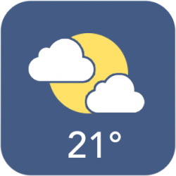
First, here is the icon. Notice the flat design, with weather and temperature that update:

icon_zps24c561a4.png


This provides a more modern look for the weather app.

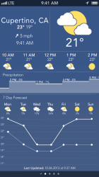
Secondly, this is now what you are presented with upon launching the app:

WeatheriOS7_zps7b5b05f0.png


Included are more modern weather symbols, a new precipitation likelihood chart, a newer typeface (Avenir), and a more detailed outlook for the rest of the week, along with being nicer to look at (hopefully! :p )

So there it is: my concept of how iOS 7 should use the extra 27% of the screen when displaying the weather.

Tell me what you think, any feedback is much appreciated. :)
 
Last edited:
I like it! Clean and plenty of info! Even if Apple uses the new Yahoo Weather app as a stock app, I will be happy. :)
 
I like it! Clean and plenty of info! Even if Apple uses the new Yahoo Weather app as a stock app, I will be happy. :)

Agreed. I think the Yahoo! Weather app is one of the most beautiful apps I have on my phone. It had some issues, but with the last update they really stepped up the game.
 
With that font size, text would be microscopic on an iOS device...

I know, that's the one thing I didn't actually test out, and the first thing I noticed when viewing it on the iPhone... :eek:

I've updated it with bigger font sizes that I'll upload later.

----------

98976335-86F7-43B9-A5D8-236C94D07FD5-5500-000002F39401962D_zps2a35f934.jpg
 
Ouch. Sorry please try again. Very unlikely it will look anything near to this. Font looks to be about size 5 or 6 even on the new pic. Feels a little depressing for a weather app.
 
Ouch. Sorry please try again. Very unlikely it will look anything near to this. Font looks to be about size 5 or 6 even on the new pic. Feels a little depressing for a weather app.

Just wondering what bits you would change, or would you say you'd go in a completely different direction?

Thanks :)
 
Just wondering what bits you would change, or would you say you'd go in a completely different direction?

Thanks :)

Well we will all know what it looks like in about 10 days. But if you have been reading the reports of the new iOS, things will be be much more monocrome with very little to no texture . Think new podcasts app or current iPhone music app. Also only small hints of color as accents. Also using dark grey for your clouds is not the best choice...
 
Well we will all know what it looks like in about 10 days. But if you have been reading the reports of the new iOS, things will be be much more monocrome with very little to no texture . Think new podcasts app or current iPhone music app. Also only small hints of color as accents. Also using dark grey for your clouds is not the best choice...

But they're... uhh... but they're rainclouds! :p

Honestly though, I don't think we'll be seeing this monochrome OS that everyone goes on about. There will be changes I reckon, leading to a lot flatter design, but I doubt it's going to be as radical as a lot of concepts make out.

Of course, I could be totally wrong and next year they release a phone with a black and white screen :p ;)

I think you are taking it a bit too literally as to the black and white look. Also party cloudy does not mean "rain". Doesn't really make sense in that instance.

And yes it will be a very big change. not so crazy it doesn't look like iOS but its going to be very different from numerous insider reports.

Your concept is a VERY radical change from what we have seen too.

I know, I was joking about the clouds, they should be lighter really.

I know it's not going to be completely black and white, but I still don't believe it's going to be mainly that. Possible black and white toggles, sliders etc but I doubt all the apps will be like that.

----------

Or you can just use the Yahoo Weather app. :eek:

Ha... ha.. :p
 
Looks like an interesting design overall, but it feels a bit drab to look at. I don't agree with the dark'ish pastel type colors, and I feel like most of the elements are too small, giving it an "empty" feel overall. It comes across as flat and lifeless. It's a nice start though!
 
For me, tbh, nothing can beat the Yahoo app for what I want apple to do with the default weather app.
 
Very nice! I agree with sdilley14 - the dark pastels could be a little lighter, more bright or vivid, and that there's quite a bit of empty space. Maybe you could utilize this space to make the small text a bit larger and more readable? Just a thought! Also, my first impression when I glanced at it was that it was very simple (which, I understand was the look you were going for), but the large expanse of midnight blue in the middle of it without much variation seemed a bit too... plain, maybe? Not sure if I've explained it well, but I think maybe adding something like a gradient or something to make it a bit more visually appealing? Let me know if I need to better explain it!
 
Looks like an interesting design overall, but it feels a bit drab to look at. I don't agree with the dark'ish pastel type colors, and I feel like most of the elements are too small, giving it an "empty" feel overall. It comes across as flat and lifeless. It's a nice start though!


Very nice! I agree with sdilley14 - the dark pastels could be a little lighter, more bright or vivid, and that there's quite a bit of empty space. Maybe you could utilize this space to make the small text a bit larger and more readable? Just a thought! Also, my first impression when I glanced at it was that it was very simple (which, I understand was the look you were going for), but the large expanse of midnight blue in the middle of it without much variation seemed a bit too... plain, maybe? Not sure if I've explained it well, but I think maybe adding something like a gradient or something to make it a bit more visually appealing? Let me know if I need to better explain it!

Thanks for the feedback :)

Tomorrow I'll play around with the colour scheme and make all the elements a bit bigger. I may play with a gradient, but according to almost everyone it seems, gradients and shadows are evil!! :p
 
Why is there two elements that tell me the time? At first I assumed it was the time it was last updated, but then I looked down and noticed I was wrong. Perhaps it's going over my head. Apple's weather app does this too; I don't get it.

Anyhow, with the current app, I can see the specific temperature for any given day at a glance. However, with your design, I have to look at the day, look down to find the point and then look left to find the temperature. Also, if your going to use a line graph, it's a good idea to put a dot in the middle of the meeting lines (it looks choppy without it).

And, I don't understand why the hourly precipitation requires a bar graph when the daily one doesn't. Could you explain your reason for this?

Aesthetically, it looks nice. I like the color scheme you chose. However, if there's almost no chance of rain, I think you should go with white clouds.


Thanks for the comments.

I think the time is for if the city you're looking at the weather in has a different time zone to yours; however, the last updated time will always be in your time zone.

I'll look into simplifying the temperature graph: dots is a good idea, didn't think of that! The bar graph is an interesting point too - maybe have it so you can flick between 24 hours/7 days?

Anyway, thanks for taking time to read it and comment :)
 
I think the time is for if the city you're looking at the weather in has a different time zone to yours; however, the last updated time will always be in your time zone.

I'll look into simplifying the temperature graph: dots is a good idea, didn't think of that! The bar graph is an interesting point too - maybe have it so you can flick between 24 hours/7 days?

Ah. Yes, that makes sense. duh. :p

I think a pinch gesture would work better than a swipe because by going from day to hour your essentially viewing more precise data. Just like you would with a photo or website when you "zoom" in.
 
Very nice! I agree with sdilley14 - the dark pastels could be a little lighter, more bright or vivid, and that there's quite a bit of empty space. Maybe you could utilize this space to make the small text a bit larger and more readable? Just a thought! Also, my first impression when I glanced at it was that it was very simple (which, I understand was the look you were going for), but the large expanse of midnight blue in the middle of it without much variation seemed a bit too... plain, maybe? Not sure if I've explained it well, but I think maybe adding something like a gradient or something to make it a bit more visually appealing? Let me know if I need to better explain it!

Why is there two elements that tell me the time? At first I assumed it was the time it was last updated, but then I looked down and noticed I was wrong. Perhaps it's going over my head. Apple's weather app does this too; I don't get it.

Anyhow, with the current app, I can see the specific temperature for any given day at a glance. However, with your design, I have to look at the day, look down to find the point and then look left to find the temperature. Also, if your going to use a line graph, it's a good idea to put a dot in the middle of the meeting lines (it looks choppy without it).

And, I don't understand why the hourly precipitation requires a bar graph when the daily one doesn't. Could you explain your reason for this?

Aesthetically, it looks nice. I like the color scheme you chose. However, if there's almost no chance of rain, I think you should go with white clouds.

I've changed a few things. Now, there's a subtle gradient, dots on the graph, white clouds, and everything is much bolder, brighter and bigger.

Let me know what you think :)
 

Attachments

  • WeatheriOS7 v2.1.png
    WeatheriOS7 v2.1.png
    343 KB · Views: 213
  • icon v2.png
    icon v2.png
    17.7 KB · Views: 6,432
Register on MacRumors! This sidebar will go away, and you'll see fewer ads.