Become a MacRumors Supporter for $50/year with no ads, ability to filter front page stories, and private forums.

JohnnyW2001

Suspended
Original poster
Nov 6, 2012
159
43
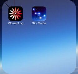
Now that 95% of all the bugs are gone (hurrah -- nice job, Apple) it's nice to be able to focus on the little details, and one thing that's bugged me from the very beginning is the corners on the zoomed in folder. There's something not quite right about them, if you ask me, and it irks every time I open one up.

Is it just me?

ios7-folders-1_zpsd0b82309.jpg


Don't these corners look better?

ios7-folders-3_zps83e868b2.jpg


EDIT: Lol. I guess it's a subtle difference:

anim_zps7f4dad3e.gif
 
Last edited:
The folder shape seems to be exactly like app icon shapes,,,,so its consistent at least! I like them actually, what peeves you off so much?
 
The shape of the folder matches new shape of the homescreen (and 3rd party) icons. They rounded the corners of the icons more, in case you didn't notice that.
 
You got me there!! Been stairing on both to find the difference :)

If anything, I would like them bigger, to utilise at least the half bottom of the screen.
 
Now that 95% of all the bugs are gone (hurrah -- nice job, Apple) it's nice to be able to focus on the little details, and one thing that's bugged me from the very beginning is the corners on the zoomed in folder. There's something not quite right about them, if you ask me, and it irks every time I open one up.

Is it just me?

Image

Don't these corners look better?

Image

EDIT: Lol. I guess it's a subtle difference:

Image

VERY subtle!
 
I noticed this too. I don't see much of a way to remedy it. The folder needs to be the same shape as the app icons, but when it is blown up, the corners of the apps and the folder don't match up. The only way to change it would be so that the folder icon changes its form when you open it, which would bring it's own inconsistencies.

I run into this when working with strokes because when you apply a stroke, you create a new shape that actually isn't identical to the shape that you're applying a stroke to. If anyone's interested, I made a little illustration on why the app icon corners and the folder corners look inconsistent when inside a folder, even when they're both the same shape.

spacing_zpsf84f2adb.png
 
I noticed this too. I don't see much of a way to remedy it. The folder needs to be the same shape as the app icons, but when it is blown up, the corners of the apps and the folder don't match up. The only way to change it would be so that the folder icon changes its form when you open it, which would bring it's own inconsistencies.

I run into this when working with strokes because when you apply a stroke, you create a new shape that actually isn't identical to the shape that you're applying a stroke to. If anyone's interested, I made a little illustration on why the app icon corners and the folder corners look inconsistent when inside a folder, even when they're both the same shape.


Don't get me wrong buddy, but your example is not right, and actually, OP even made the corners more square which makes it look weird, Apple doesn't need to fix anything about that.
 
Last edited:
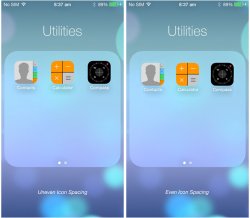
I think the folder shape is correct. But one thing I noticed right away was the icon spacing looks off. Of course it's a minute detail that is barely noticeable so I really don't care that much.
Folder_Icon_Spacing.jpg
 
Good grief what will people come up with next? A certain shade of blue isn't the right shade? :rolleyes:
 
I think the folder shape is correct. But one thing I noticed right away was the icon spacing looks off. Of course it's a minute detail that is barely noticeable so I really don't care that much.
View attachment 427390

I did the exact same thing, and even that the folder icon and the app icon are not the same shape, what they did was to have the same distance from the edge of the folder to the app icon vertical, horizontal and diagonal.

I use a black app icon to see better.
 

Attachments

  • photo.jpg
    photo.jpg
    26.5 KB · Views: 1,444
I did the exact same thing, and even that the folder icon and the app icon are not the same shape, what they did was to have the same distance from the edge of the folder to the app icon vertical, horizontal and diagonal.

I use a black app icon to see better.

Yea but don't you think they could resize the folder or shift the icons so that the spacing between each icon is the same as the spacing from the icon to the folder's edge?
 
Good grief what will people come up with next? A certain shade of blue isn't the right shade? :rolleyes:

This is great news. When people start arguing which variety of identical folder they prefer, then iOS 7 must have no real issues left to discuss.
 
Yea but don't you think they could resize the folder or shift the icons so that the spacing between each icon is the same as the spacing from the icon to the folder's edge?

I did notice that, and yes, they could've done that, so that everywhere is the same space, maybe it's not final, perhaps they haven't decided if they will put 4 icons instead of 3, I guess will find out soon.

----------

This is great news. When people start arguing which variety of identical folder they prefer, then iOS 7 must have no real issues left to discuss.

It's not about that, some here, including myself, are perfectionist, so yeah, if an edge is not right, or something seems out of place it can be discussed.

Actually in iOS 5 or iOS 6 (A final version or a public update) an app icon was not centered, and it was a big deal for Apple.

And also, some people have commented in the Calendar.app not being centered in previous betas of iOS 7.
 
Don't get me wrong buddy, but your example is not right, and actually, OP even made the corners more square which makes it look weird, Apple doesn't need to fix anything about that.

Actually, my example is the reverse of the OP. My reference was the outer shape. In the OP, the reference was the inner shape (app icons). Same exact idea though.
 
Actually, my example is the reverse of the OP. My reference was the outer shape. In the OP, the reference was the inner shape (app icons). Same exact idea though.

Like I said, your example isn't right, all the things you said are correct, but it's not the right example, one thing is to put a smaller centered same shape icon inside another and yes, the corners are going to have a bigger separation than from the horizontal and vertical edges (your example), and another thing is to put three smaller icons inside a big one the same shape, it's the opposite effect.

When you bring that small icon to the corner, it will have less space in the corner than the horizontal and vertical edges, that's why the folder shape is way more cornered that the app icon, and what you suggested with your example was that it has to be rounder.

And that's why, the folder's shape is not as round as the icon app shape.

Hope I made myself clear.
 

Attachments

  • photo.PNG
    photo.PNG
    105.2 KB · Views: 1,137
  • photo2.jpg
    photo2.jpg
    25.6 KB · Views: 1,138
  • Screen Shot 2013-08-08 at 4.01.30 PM.png
    Screen Shot 2013-08-08 at 4.01.30 PM.png
    9 KB · Views: 1,143
Last edited:
I won't post links showing Apple's obsession to detail, but we all know it's there... or was.

Certain details such as this catch the eye of people that have been trained to see them. Others may find them inconsequential, but when inconsistencies start adding up it can become a mess.

Anyway, I quickly repositioned the icons within a folder to be evenly spaced. Yes it's subtle and my 70 year old father certainly wouldn't notice, but for those that do, I would think they would appreciate it.

ios7-folders_even_sheet.jpg
 
Last edited:
Register on MacRumors! This sidebar will go away, and you'll see fewer ads.