Become a MacRumors Supporter for $50/year with no ads, ability to filter front page stories, and private forums.

NeonBible

macrumors member
Original poster
Jun 26, 2012
87
1
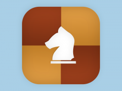
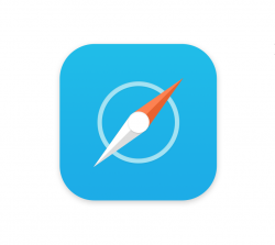
I'm sorry if there's already numerous of threats about this subject but I wonder what you guys think about my redesign of two of iOS 7's icons, respectively Safari and Game Center?

I think the Safari icon in iOS 7 is very boring, and I wanted therefore to give it a try myself.

When it comes to the Game Center icon, I don't find it understandable. I don't think the bubbles interact with the user as a "Game Center".

So, what do you guys think about my icons?
 

Attachments

  • iOS 7 Game Center.png
    iOS 7 Game Center.png
    184 KB · Views: 2,238
  • iOS 7 Safari.png
    iOS 7 Safari.png
    169.5 KB · Views: 2,149
Last edited:
Why do people care about this so much? You spend your time in the apps, not staring at icons...
 
Why do people care about this so much? You spend your time in the apps, not staring at icons...

Because we have a company focused on design and usability together, a lot of people are likely going to be a surprised when you have a UI that is ugly and looks like there is no continuity between icons. As for me, I would like them to be nice, but frankly I don't give a **** as long as the OS functions well.

OP, I like the first safari I icon. It's clean.
 
If you are like me, and care very much about design, then it's always funny to try to redesign "bad things" (meant in a subjective way, of course) yourself. I pay a lot of attention to details, and to mention an example, I've always hated the music icon in iOS 6 because of its metric alignment on the note icon itself, and not optical alignment. Luckily (for me), the new music icon is optical aligned.
 
Last edited:
Why do people care about this so much? You spend your time in the apps, not staring at icons...

It baffles me that some people DON'T care about this.

EDIT: OP, photoshop your new icons onto the iOS 7 homescreen so we can see what they look like out on the savannah.
 
Why do people care about this so much? You spend your time in the apps, not staring at icons...

This. The look of an OS has never been an issue to me. Only how useful it is to me and whether the damn thing functions or not. With all these users complaining about such trivial things like icons, I can see why iOS users don't like Android and I can see why they're willing to put up with slapshod software (iOS 6) as long as it 'looks nice'.

As far as I'm concerned, iOS 7 adds a tonne of functionality and quality to the OS software that should have been added years ago. And here y'all are complaining about damn icons.
 
Love the Safari one since I dislike all the white iOS 7 contains. White backgrounds on the icons make them look unfinished and boring. The full colour Safari icon looks for that reason.

Similarly, I dislike the white GameCenter icon with bubbles. However, your revision I thnk is "meh." Like the bubbles, it should have colour. The chess piece is also too specific am example of a game.
 
This. The look of an OS has never been an issue to me. Only how useful it is to me and whether the damn thing functions or not. With all these users complaining about such trivial things like icons, I can see why iOS users don't like Android and I can see why they're willing to put up with slapshod software (iOS 6) as long as it 'looks nice'.

As far as I'm concerned, iOS 7 adds a tonne of functionality and quality to the OS software that should have been added years ago. And here y'all are complaining about damn icons.

Not y'all. Don't speak for all when this "concern" is isolated to few in comparison to all iPhone owners. ;)
 
Not liking them. Safari is not better than the Apple version and Game Centre is NOT a chess game!

Seriously, let go of the past. Embrace the future. Think different.
 
I think people who don't give a crap what the icons look like might do better to not comment in threads about them rather commenting in them about how they don't care. Icons are a substantial part of the iOS UI so are important to the system, like it or not.

I do think that if Apple were to redesign all the icons to be different shaped turds that half the people on this site would say they love them and that everyone else needs to get over it and stop resisting change etc.

To the OP, I like your icons - I was thinking a dice for game centre (same shape as the icon) but your chessboard is a good spin on it, nice one. I do think Safari is just wrong in its inception since there is also a compass App also but yours is better than Apple's new version. :)
 
I'm sorry if there's already numerous of threats about this subject but I wonder what you guys think about my redesign of two of iOS 7's icons, respectively Safari and Game Center?

I think the Safari icon in iOS 7 is very boring, and I wanted therefore to give it a try myself.

When it comes to the Game Center icon, I don't find it understandable. I don't think the bubbles interact with the user as a "Game Center".

So, what do you guys think about my icons?

Really like the safari icon. The other one could easily get mixed up with some chess games I have on my phone though.
 
It baffles me that some people DON'T care about this.

As someone who doesn't really care much at all about the icons, I can tell you my reasoning.

I want the phone to work. I want the OS to work smoothly, as bug free as possible, do the stuff I want it to do easily, have decent battery life, and not break down easily.

The aesthetic of the icons, if they happen to appeal to MY taste (a wholly individual issue), is nice. If they don't happen to appeal to MY taste, is not particularly important to me, as long as the phone works as I wish. As long as the apps work when I tap on the icons, whether the icons appeal to me or not, is more important, by far, for me, than the look.

None of what I just said is mean in jest nor intended to be smart ass...it is a serious response to your apparent puzzlement regarding why some people are not as exercised about the aesthetic of the icons as others.
 
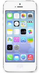
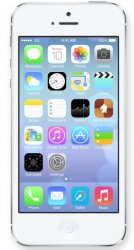
I took the liberty of placing the OP's icons on a homescreen picture. I'm not much of a photo editor, so beware my novice skills :p

Original homescreen on top and updated one at the bottom:

Screen Shot 2013-06-29 at 2.31.40 PM.png
iOS 7 Homescreen with new icons.jpg
 
I took the liberty of placing the OP's icons on a homescreen picture. I'm not much of a photo editor, so beware my novice skills :p

Original homescreen on top and updated one at the bottom:

View attachment 420603
View attachment 420604

I like the Safari icon, mostly because I just don't like the actual icon very much. The game center one not so much. That said, I really don't care what the Safari icon looks like since the actual app is quite nice.
 
I'm sorry if there's already numerous of threats about this subject but I wonder what you guys think about my redesign of two of iOS 7's icons, respectively Safari and Game Center?

I think the Safari icon in iOS 7 is very boring, and I wanted therefore to give it a try myself.

When it comes to the Game Center icon, I don't find it understandable. I don't think the bubbles interact with the user as a "Game Center".

So, what do you guys think about my icons?

Not wanting to be rude, but I prefer the icons and the redesigned for iOS 7 icons better. Just my opinion. I'm that one guy who actually likes the new GC icon.
 
Of course you're not rude :) People have different opinions, and I fully respect and understand those who don't like my icons. And, as it turns out, many people here have a good point about my Game Center icon. It may look like an icon for a chess game. Now I really want to redesign my own redesigned icon :D
 
As someone who doesn't really care much at all about the icons, I can tell you my reasoning.

I want the phone to work. I want the OS to work smoothly, as bug free as possible, do the stuff I want it to do easily, have decent battery life, and not break down easily.

The aesthetic of the icons, if they happen to appeal to MY taste (a wholly individual issue), is nice. If they don't happen to appeal to MY taste, is not particularly important to me, as long as the phone works as I wish. As long as the apps work when I tap on the icons, whether the icons appeal to me or not, is more important, by far, for me, than the look.

None of what I just said is mean in jest nor intended to be smart ass...it is a serious response to your apparent puzzlement regarding why some people are not as exercised about the aesthetic of the icons as others.

Agreed. I spend so little time actually looking at the icons on my phone currently, that unless they were miniature icon sized depictions of animal cruelty I just can't bother to really care.
 
Of course you're not rude :) People have different opinions, and I fully respect and understand those who don't like my icons. And, as it turns out, many people here have a good point about my Game Center icon. It may look like an icon for a chess game. Now I really want to redesign my own redesigned icon :D

I like them both, but not the colours of the Game Center icon. It might look better with colours from the new palette. Green and yellow perhaps. Safari looks great - but I just think Apple should lose the compass needles once and for all and show us a new icon that also implies that we can "navigate around the net".
 
I like them both, but not the colours of the Game Center icon. It might look better with colours from the new palette. Green and yellow perhaps. Safari looks great - but I just think Apple should lose the compass needles once and for all and show us a new icon that also implies that we can "navigate around the net".

Maybe something like this:

4a75c48b367c639ee91f5cc229f2ab39.png
 
Register on MacRumors! This sidebar will go away, and you'll see fewer ads.