Got a tip for us?
Let us know
Become a MacRumors Supporter for $50/year with no ads, ability to filter front page stories, and private forums.
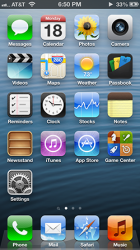
New iOS7 Mock-up
- Thread starter narr
- Start date
- Sort by reaction score
You are using an out of date browser. It may not display this or other websites correctly.
You should upgrade or use an alternative browser.
You should upgrade or use an alternative browser.
I think it looks great. Some of the icons I would perhaps change but I like what you have done with the overall feel of the screen. It flows nicely and the gradients are spot on.
I share your bemusement.
It seems that even after iOS 7 is downloaded in it's final form, folks will continue to post mock ups...of wonderful improvements, no doubt.
Indeed! Surely, we'll have about a year of this….though I'd not be surprised if someone is still doing iOS 7 after the announcement of iOS 8!
I share your bemusement.
It seems that even after iOS 7 is downloaded in it's final form, folks will continue to post mock ups...of wonderful improvements, no doubt.
Yeah I don't get it either.
But Game Center is not a Tetris style game, nor is it a game at all. Its a social app. The App name begins with a "G", so the icon should not have a "C" as the symbol.
Signal is indicated by five bars, not three and you don't see cellular strength at the some time as Wifi Strength.
Signal bars show at the same time as wifi, I'm looking at mine right now. Is it impossible for you to imagine a reduced signal strength showing only three bars instead of five? Not sure why you're so quick to criticize when you obviously don't know what you're talking about.
here is my mockup. i figured since everyone else is doing it I might as well show you what i think iOS 7 should look like. hope you guys like it
It's hideous! AGHHHH!!
here is my mockup. i figured since everyone else is doing it I might as well show you what i think iOS 7 should look like. hope you guys like it
I've been using iOS 7 since the first beta and I actually kind of miss this. If it was strictly an aesthetic upgrade I would have gone back a while ago.
But Game Center is not a Tetris style game, nor is it a game at all. Its a social app. The App name begins with a "G", so the icon should not have a "C" as the symbol.
Signal is indicated by five bars, not three and you don't see cellular strength at the some time as Wifi Strength.
I think the focus of the icon is the "Center" and not "Game" as the icon does not represent a game, it represents a "Center". So, to me a "C" for "Center" makes more sense than a "G" for "Game". It's a center where all comes together. To indicate which kind of "center" we are talking about, it's build out of blocks from a popular game to tell the user that it's about Gaming. A "Game" + "C" for "Center" = Game+Center = Gamecenter. That was my approach. Of course you could do something completely different and I don't say I came up with the best possible solution for that specific icon, but I think it's still better than random 3D bubbles. What is your suggestion for a gamecenter icon?
Re: The signal - in my screenshot the signal was weak.
Register on MacRumors! This sidebar will go away, and you'll see fewer ads.


