Become a MacRumors Supporter for $50/year with no ads, ability to filter front page stories, and private forums.
Platinum is ugly...
Aqua is too childish...
Why'd they remove the stripes?!...
Brushed metal is too obtrusive...

We all get used to it in the end.

(Note:You can get the polished metal look in Finder by using the "Old Finder" button, but that takes away the nav bar and buttons)
 
Whyren said:
Platinum is ugly...
Aqua is too childish...
Why'd they remove the stripes?!...
Brushed metal is too obtrusive...

We all get used to it in the end.

(Note:You can get the polished metal look in Finder by using the "Old Finder" button, but that takes away the nav bar and buttons)

Actually I liked the Pinstripes and Aqua a lot. Why did it have to leave. :(

Do not like the metal or the flat plastic look of the new. :p
 
csubear said:
I would like to vote for this aswell. Now there are four types of windows: orginal aqua, brushed metal, mail.app, and the new not brushed metal. I like aqua, and i though brushed metal was okay, mail.app's new look has still yet to grow on me, and i really not liking the new itunes look.
I think that mail.app (and system preferences.app) are the most beautiful app windows...ever...
 
I feel like the corners are two squared off. I usually have the iTunes taking up the entire screen (12"), but it won't go all the way from left edge to right edge. I have like a 5 pixel gap. Because of that i see the rounded corners of Safari or Mail in the background, very annoying.

Besides that, I think it is much better compared to Mail's interface. The darker grey makes the difference. I agree above with how awkward the mini player looks. I think the square edge display is the cause.
 
maya said:
You must be William Hung, or one of his relatives or family member(s) then. ;) :)


I bought all 3 of his albums in the iTMS. :eek: I like them. Especially the Christmas one! I'm not joking either.
 
Whyren said:
On a Finder window, the oblong button on the upper right. I think there's a way to make that default, but I can't remember off the top of my head.

It's not much, but if you prefer the more Mail-like look over brushed, it might work out.

Ahhh, I didn't realize that button got rid of everything else along with the top row of buttons. I knew what the button does in general, but I've found it useful on so few occasions that I kind of keep forgetting about it. :eek: Although Adium's contact list is an exception. Since Adium started having the global status change in the top, I went from a borderless window to a regular window, but I got rid of the icon row with the oblong button.

I guess I never tried it on a Finder window before, because I was surprised when I saw it. Thanks for the tip!
 
Why is everyoen so whiny?

Things change, change is good, you can expect it to look the same forever, then we'd be like Windows :eek: . I hope Apple makes every window look like this, I absolutely love the new look.
 
ham_man said:
I think that mail.app (and system preferences.app) are the most beautiful app windows...ever...

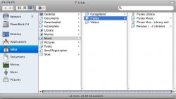
What do you think of a new Finder?
 

Attachments

  • finder.jpg
    finder.jpg
    61.4 KB · Views: 95
I have to say that I don't like the new iTunes. Good features, but the look isn't as good as iTunes 4. Not even the change from the brushed metal is what does it. Is seems like there are way more lines in the layout. The old one was more... fluid. Hard to describe, but this one looks like Windows Media Player. I can get over it though, as the new features (better searching and playlists in folders) more than make up for it!
 
Register on MacRumors! This sidebar will go away, and you'll see fewer ads.