Become a MacRumors Supporter for $50/year with no ads, ability to filter front page stories, and private forums.

Rogifan

macrumors Penryn
Original poster
Nov 14, 2011
24,756
32,260
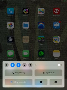
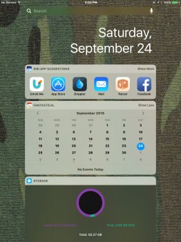
I remember when Tim Cook took a shot at Android tablets for having "blown up smartphone apps". How in the world does he defend the below? It seems in the last few years, outside of split view, iOS on the iPad has regressed to where it's just iPhone OS ported to iPad. Also I hate that the date and time on the lock screen isn't centered now. It just looks weird. When will we get a version of iOS for iPad that properly takes advantage of the screen real estate?

15fncsx.jpg


29ned14.jpg
https://forums.macrumors.com/threads/ios-10-on-ipad-is-an-iphone-experience-again.1977783/
 
I have a mini (2) and it appears to me like it's ported from the mini to the larger ipads. It seems faster than 9 did to me. It does look pretty bad on the larger ipads, but I don't plan on having anything larger than the mini. It's the perfect size for me and as well as it's running 10 I don't plan on upgrading for at least another year.
 

Attachments

  • IMG_0303.PNG.jpg
    IMG_0303.PNG.jpg
    552.3 KB · Views: 120
  • IMG_0304.PNG.jpg
    IMG_0304.PNG.jpg
    656.1 KB · Views: 139
Last edited:
It's ridiculous. It's consistency for consistency sake, disregarding device capabilities.
 
Some of this criticism I can understand and some seems like it's from considering the worst case scenario and declaring it general in terrible.

I like the multi-pane control center and it makes sense to me separate out media, home and system controls. That first pane though, the system one, on the iPad is pretty brutally bad. It looks like the controls were just thrown on and left to auto layout and spread to fill the space.

Widgets page: Well, if you lay out it like it is in the op, with only two controls and both on the right pane, then it's going to look a bit odd. Seems like we hear that iOS needs customization then, when it gets it (put any of the many available widgets, in any order, over two panes) that's apparently bad too. I have Carrot Weather, Outlook Calendar and Siri App Suggestions on the left and News and Battery Widget on the right and it's attractive (to me) and functional.

Lock Screen: Specifically on the iPad, where people seem to complain the most. Previously everything was jammed into a column in the middle of the iPad in landscape and that was a bad design imo. Now, people see the clock on the left or media controls in isolation in the right and freak out about a "bad use of space". Sure, if you take a screenshot of a 3 pane design (clock on the top, notifications under on the left, media under on the right) where any given part is empty it's going to look a bit unbalanced. When you actually have notifications, are using the media player it looks more than fine and is a good use of space, much better than the previous design.

Each to his own and all but, apart from the giant airplay mirroring and nightshift buttons on CC, I think the design is an all round functional improvement.
 
Register on MacRumors! This sidebar will go away, and you'll see fewer ads.