Become a MacRumors Supporter for $50/year with no ads, ability to filter front page stories, and private forums.
Fair enough. And I don’t see Apple giving us a choice in this one, realistically. But I do think that pretty much anybody would agree that some of the window scaling in new Exposé is absolutely ridiculous.

I miss being able to hit Exposé to just get a glance at how things are going in another window (progress in a download, iChat buddy list, etc) without switching apps. Since windows scaled proportionally, none of them got too much smaller (unless there were enough windows that they all had to), so I could get a pretty decent look at any open window. Now I can only do that for the smaller windows (such as iChat buddy lists), while Safari windows, iTunes, and anything else with a big window shrinks down to an unreadable size.

Exactly Devburke,

And now it's totally impossible to see what happens. Also just like me, i have often 15-20 mozillas windows open, terminals 5-10, photoshop, excels, word docs, powerpoints, keynotes, safaris, omnigraffles and more and they are grouped along the spaces. Like different type word/mozilla docs on desktop 2 and something on desk 3 and 1 and 4..

So I'm working on desk two and want to see those 3 mozilla windows on desk 2 but AARRGGHH i now see all 20 of them. And if happen to click wrong window, I start to jumping around desktops switching back and forth.

Also moving stuff around desktops, when zoom to all spaces desks and then to all programs as planning to move window X to desk 3. those windows are so tiny that I have no idea what they are. Yes I know that you can zoooom to them by pressing space but hey it fills whole screen.

I have really often on desk 1 like 20-30 windows open, desk 2 20, desk 3 10-15, desk 4 10. So finding a specific window that i'm looking is now taking from 5-15 secs and earlier it was around 1-2 secs.

I have been using a program called TimeRescue just for fun to track how i perform and it calculates you productiveness, it shows -20% productiveness since last sunday. On last sunday I installed SL.

My time that I spend in suxposé is now about x10-15 more comparing to last week statistics....

Oh how I wish that we could still run that good old dmanager on SL.

Btw. does anyone else get "stuck" with windows. In way that you click another window on suxposé and then it goes to normal desktop views, immediately another windows jumps back on top of your freshly selected window.. so go back to suxposé and click your window again... zadam again that stupid another let say mozilla window pops to top... ok click that one more time and then select window you wanted in suxposé. Ok now it works....

This happens quite often to me. It happens on powerpoint, mozilla, safari, excel basically with every programs. Not all the time but multiple times per day

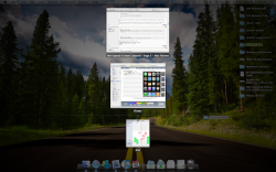
Included my screen shot for fun.. currently not even running so many programs...

Yes I can say that i'm a quiet heavy user but hey that was my original reason to buy a Mac.. And there is many more who are using Mac this way.

Due my actions, i know that at least 10 of my friends did not go and buy SL upgrade after I was complaining these "new features"...

Usually i have been quite happy for Apple upgrades but now i really need to start thinking of downgrading my OS

I just hate it :mad::mad::mad:
 

Attachments

  • Screen shot 2009-10-14 at 8.09.18 AM.png
    Screen shot 2009-10-14 at 8.09.18 AM.png
    81.9 KB · Views: 476
…

Btw. does anyone else get "stuck" with windows. In way that you click another window on suxposé and then it goes to normal desktop views, immediately another windows jumps back on top of your freshly selected window.. so go back to suxposé and click your window again... zadam again that stupid another let say mozilla window pops to top... ok click that one more time and then select window you wanted in suxposé. Ok now it works....

This happens quite often to me. It happens on powerpoint, mozilla, safari, excel basically with every programs. Not all the time but multiple times per day
…
I just hate it :mad::mad::mad:

This happened very often to me, when attempting to use the new Exposé. It drove me nuts, as the best thing about the old properly working Exposé was that it 100% safely switched always only between 2 different Windows and never messed up focus on a Window.

You always could interrupt an extensive operation, while being in Spaces and Exposé halfway and ALWAYS knew hitting ESC brings you right back to the window and space, you started from. It was 100% predictable and the user had full control.

Exposé has been wrongly developed into an overloaded monster from a formerly swift and neat simple tool, that could be relied on and significantly speed up work.

The new Exposé would have been a better choice, to implement as an additional Exposé mode "running apps windows navigator".
It does not take place of the old perfectly working Exposé and therefore needs to be accompanied with the unchanged old "show all windows" of Exposé prior to Snow Leopard.
 
Not only should they bring back proportional scaling (remember how much they touted that as a feature with Panther?), they should have an option that 'all windows' can exclude minimized windows, and one that would allow the clicking and holding an application icon to show only that application's minimized windows. In truth, it would have made more sense to have minimized windows in a Stack. It would have fit in nicely with the original way Stacks was supposed to work, and it would be so much faster than click-and-hold. But whatever, without the proportional scaling, it's become almost useless to me and takes so much longer for me to identify windows now. I hate it.
 
I hate the new Expose

Luckily I only installed Snow Leopard on my MacBook. It's full of bugs, crashes Safari loads and my Adobe CS apps and is basically rubbish.

Worse though is the new Expose - it really does suck. What was once a groundbreaking feature and something to really speed up workflow has become a total waste of time. It is impossible to see your windows properly now - try doing Expose view all when opening stickies - a nightmare!!

Apple MUST sort this. So disappointing.

You have a bogus install of Snow Leopard
 
Luckily I only installed Snow Leopard on my MacBook. It's full of bugs, crashes Safari loads and my Adobe CS apps and is basically rubbish.

Worse though is the new Expose - it really does suck. What was once a groundbreaking feature and something to really speed up workflow has become a total waste of time. It is impossible to see your windows properly now - try doing Expose view all when opening stickies - a nightmare!!

Apple MUST sort this. So disappointing.

I have had a few Safari crashes too since Snow Leopard (usually occuring with heavy beach balling to almost freeze the complete computer, making it very difficult, to even force quit the involved app).

I am completely with you with your writing about Exposé. Snow Leopard COMPLETELY broke this natural responsive feature. All has been said already, what is wrong about the new Exposé.

I truly hope, Apple fixes this and gives us the complete, unaltered old version of Exposé as an option.

Make sure, you send your request to Apple with their form, posted here in the thread. Without telling Apple about it through their communication channel, they won't do anything about the crooked Exposé.
 
I also dislike the new Expose. My workflow has gotten worse, but I've never been able to pinpoint the reason.

After reading this thread, I think it may be largely due to the proportional scaling issue. I hate how a small finder window is the same size as a large Safari window–it looks silly.

Also, I don't like I hate how sometimes the windows are lined up in one vertical line instead of side by side. It looks unintuitive and makes the thumbnail views smaller. Same thing when it is too horizontal. Before, the windows would intuitively spread out according not far from their initial position. Now, you have to go through every thumbnail in a row of icons.

Additionally, I don't really care for the minimised window bar on the bottom.
 

Attachments

  • Screen shot 2009-10-22 at 1.10.41 AM.png
    Screen shot 2009-10-22 at 1.10.41 AM.png
    468.4 KB · Views: 248
^^your screenshot shows everything that is wrong with expose. Ever computer screen ever made it wider than it is tall, so why would expose stack windows on top of each other like that? It makes no sense. I cant figure out why apple thought they needed to change the expose everyone liked into something this incredibly stupid and unintuitive.
 
I might not like the scaling thing, but I'm really pleased to see minimized windows with Exposé!

If I want to completely hide a window I use command+h, but since I discovered that I can minimize a window into it's application and invoke it back with Exposé, I've been hiding less and less stuff.

In my humble opinion, it makes a lot of sense... :D
 
I also dislike the new Expose. My workflow has gotten worse, but I've never been able to pinpoint the reason.

After reading this thread, I think it may be largely due to the proportional scaling issue. I hate how a small finder window is the same size as a large Safari window–it looks silly.

Also, I don't like I hate how sometimes the windows are lined up in one vertical line instead of side by side. It looks unintuitive and makes the thumbnail views smaller. Same thing when it is too horizontal. Before, the windows would intuitively spread out according not far from their initial position. Now, you have to go through every thumbnail in a row of icons.

Additionally, I don't really care for the minimised window bar on the bottom.

Please, also share your experiences and opinion about Exposé with Apple:

http://www.apple.com/feedback/macosx.html

This is the only way, to improve the situation about the new Exposé.

The new Exposé broke things for a lot of people - including myself - I do not use Exposé and Spaces any more, as with the traditional windows dragging, I am quicker now than using the new clunky Exposé - I am much slower though, than with the old perfectly integrated Exposé.

For some people though the introduced minimized window display is helpful. This could well be an optional function, to have it

a) off at all times
b) displayed at all times
c) displayed and hidden automatically (autohide similar to dock)
d) hidden and displayed on key press (option key)

I would use a).
 
Add me to the list of those frustrated with the new Exposé. All of my criticisms have already mentioned and include proportional sizing, overly quick animation, blue outline, and wasted space in grid layout. The only changes I like are the enabled 4 finger swipe and the window names underneath. However I would give both up to have the old Exposé back. Overall it is a big step backwards.

And yes I have submitted my comments to Apple.
 
I hate the new exposè too. Is there any way to go back to its old, pre-snowleopard behaviour guys?

Yes, the only known way would be, to write your thoughts about Exposé to Apple by using their website here:

http://www.apple.com/feedback/macosx.html

… and hope, they hear us and implement a solution with the old behavior as an user option.

I do not use Exposé anymore and eagerly await 10.6.2, to hopefully address some other issues, I experience since Snow Leopard too.

Exposé is my biggest issue with SL.
 
Just a paste of what I added to Apple's feedback site. Comments welcome.

Ok, I get the new features such as click and hold on the dock. Nice stuff. However, overall, Expose is in my opinion BROKEN compared to the original version. My biggest complaint BY FAR is that the windows are no longer proportional. You've reoved a simple visual cue as to what that window is!

The second gripe is I rather liked the 'scattered' arrangement of the older expose windows as they remained relatively where they originally were pre-expose-mode and just 'slid' nearby. Again, visual flow and tracking.

Third, while I like the idea of seeing minimized windows, I think this extra 'bar' at the bottom should ONLY be shown when you click an item in the dock. In other words if you have three minimized Safari windows and two TextEdit windows also minimized with another window of each which is not minimized, enabling expose should just show the two non-minimized windows. Then if I click the dock for Safari, the TextEdit window disappears and the minimized Safari windows all pop up where they do now. Even better, make it so when you hover over the dock icon you get the windows' thumbnails, ala Win7 but only when in Expose mode, not regular mode.

Anyway, just my thoughts. As of right now, I rarely use Expose anymore no matter how often I try to. IF nothing else, please, PLEASE at least fix the proportional sizes issue.

Make sure you submit your feedback here: http://www.apple.com/feedback/macosx.html
 
At risk of digging up an older thread, the Mac OS X website feedback is largely useless in my opinion. If you really want to kick up a fuss start submitting radar tickets to the devs - http://radar.apple.com.

And further, I can't let this slide.
Since it now displays the labels of every window by default there is no need to hover over every window just to find the window you were looking for. You can now look instead of using the mouse to search for it. That is a big improvement.
Missing the point. There are two primary strategies here - a) visual search, and b) memory recollection. We have very strong spatial memory capability (e.g. remembering the position of things relative to something - in this case a screen). Because of it's dynamic nature, expose can't really utilise spatial memory THAT much, other than keeping windows close to their original locations to remove some of the search area (sometimes the old version failed at this, but the algorithm clearly tries to keep them close). What happens is that we degrade to a visual search technique (i.e. we don't know where the thing we need to click is and have to inspect on a one-by-one basis each element until we find it - SLOW).

While working, we know the position of our windows (largley) - this is our powerful spatial memory at work. In old expose, these windows moved a minimal amount from their locations and displayed visual cues about a) position, b) relative size of the window, and c) contents. The window title is largely irrelevant because we aren't actively aware of it, and it the window size, shape and contents give higher entropy. The idea seemed to be that our spatial memory should give us a base area to look for the window in, then we would have to visually search that area of the screen in the expose view for the exact window. The new expose extends this base area to the whole screen, instead of a small part, and removes some of the most important cues used to identify and differentiate window thumbnails.

Now I haven't researched this, but with an educated guess I'd say that in general, the size and shape of the window are the most important cues, followed by the relative position, and finally the actual contents. With the new expose, apple has effectively removed our ability to ascertain the shape and size of windows and forced us to a contents or title search. This technique is slower (for me, and I suspect for many others given how many are complaining) than the old technique.

Typing, sorting, even reading the title are all techniques that basically mean expose has failed in its job. With the old expose, i never had to use these functions, and would have already switched by the time I need them in 10.6.

The single app mode has always been that way, hence it's the single app mode. It does what the name implies ;) Pressing F10 or ctrl-F3 is the same as press and holding the primary mouse button on the app icon in the dock. Since Snow Leopard you also have the ability to add apps so it becomes a multi-app selection. Just another way of searching for the window you're looking for by narrowing down the search results (less results makes you find things much easier and quicker). It even works with apps on other spaces (I really like that one since that really improves the use of spaces). The downside is press and holding the primary mouse button because that slows things down. It's not much, maybe a second or two. If you do want Dock Exposé by using key presses try cmd-tab and then press cmd arrow up/down.
A second or two is a lifetime in UI interactions. I'm well aware that the single mode has always worked that way. What I'm saying is that the new functionality they added is useless and poorly conceived.

Apple's way:
  • Locate the target (open loop, maybe 100ms)
  • Accurately fix on the target (closed loop, maybe another 100ms)
  • Click (20ms)
  • Hold (1000ms)
  • Re-orient yourself. Approx total: 1200ms

A better way:
  • Locate the target (open loop, maybe 100ms)
  • Accurately fix on the target (closed loop, maybe another 100ms)
  • Button press (20ms if it's on the mouse, 50-100ms if it isn't)
  • Re-orient yourself. Approx total: 300ms

I actually think Apple did do a lot of HCI research and you didn't. The only thing I see is someone who is frustrated with Snow Leopard typing away without every really thinking about why things are what they are. Exposé is meant as a tool to find a window you're looking for. SL improves the Leopard version by using a grid, the ability to type the label, displaying the labels by default, etc. It's like as if they added some spotlight functionality to Exposé. If you want to switch apps than you're using the wrong tool. Switching apps is done by using cmd-tab or clicking the icon in the dock. Exposé is only for window mangement, not app management. A lot of people seem to forget this and use it as an application switcher. I think a lot of people need to readjust their ideas about Exposé as well as the way they were using it. In the end it's all about either liking or disliking it, nnot about it being wrong and needing better HCI research because it clearly isn't.
Yeah, I'm frustrated. But I'm not just blurting - HCI is my area of expertise - task switching is too, in fact - I've done plenty of research and unlike many I can identify exactly why the new expose is slowing me down in comparison to the old.

Let's not get dogged down in semantics here. Expose's primary use is to find a window very quickly and interact with it - whether that involves switching to said window, or dragging a proxy onto it, the point is the same. The new expose slows this process down to a point where I'm finding myself hugely frustrated with it even a month after SL's release.

It's not up to the user to 'readjust' their ideas about expose. It's a tool, and while tool designers have an idea about what they think their tool should be used for, ultimately it's up to the end user. As a tool designer I would be hugely arrogant if I expected my users to conform to MY model alone.

That's why HCI research is around - to find out how users interact with tools and measure these interactions. It's something Microsoft knows a LOT about (Robertson, Horvitz, Baudisch et al take a bow), and Apple consistently seems to shunt (publically, at least).
 
I also dislike the new Expose. My workflow has gotten worse, but I've never been able to pinpoint the reason.

After reading this thread, I think it may be largely due to the proportional scaling issue. I hate how a small finder window is the same size as a large Safari window–it looks silly.

Also, I don't like I hate how sometimes the windows are lined up in one vertical line instead of side by side. It looks unintuitive and makes the thumbnail views smaller. Same thing when it is too horizontal. Before, the windows would intuitively spread out according not far from their initial position. Now, you have to go through every thumbnail in a row of icons.

Additionally, I don't really care for the minimised window bar on the bottom.

Hit spacebar and Boom! The "exposed" windows zooms in...problem solved
 
What i find absolutely frustrating is how stupid the grid array is. At the moment i have firefox as tall as possible taking up about 60% of my screen width. iTunes is occupying the other 40% on the right side of firefox. When i go into Expose it doesnt line them up horizontally and save space, it stacks them on top of each other which causes the windows to shrink more than they need to in order to fit on the screen. The new expose took away everything that makes sense and replaced it with a grid. Good job, apple. :mad:
 
Hit spacebar and Boom! The "exposed" windows zooms in...problem solved

Yep! It works on Leopard, too if you use Tab rather than the spacebar. :cool: However, Tab brings windows to the front by app rather than by window.
 
It's nice to see this thread alive. Seems like the ones who like the "new" exposé are the ones who don't use it often. I can't imagine somebody having any productivity improvement.
 
Hit spacebar and Boom! The "exposed" windows zooms in...problem solved

No, it is not. In the properly working Exposé, the spacebar was a shortcut, to OPEN the underlying Exposé displayed window, not just a bloated zoom.

This way, you could grab, drag and drop any item from mouse copied text to files from one application to another.

-grab item with mouse,
-swing mouse with grabbed item to a hot corner to summon Exposé (the old, working Exposé of course)
-move the mouse over the window, you want to drop your item
-hit space, to move the window to the front
-drop your item

This extraordinary usable function has been crushed with the not working new Exposé.
No more quick and intuitive working between several windows. It feels like back to Windows Me to me (because the occasional finder crashes are really annoying too).
 
Missing the point. There are two primary strategies here - a) visual search, and b) memory recollection. We have very strong spatial memory capability (e.g. remembering the position of things relative to something - in this case a screen). Because of it's dynamic nature, expose can't really utilise spatial memory THAT much, other than keeping windows close to their original locations to remove some of the search area (sometimes the old version failed at this, but the algorithm clearly tries to keep them close). What happens is that we degrade to a visual search technique (i.e. we don't know where the thing we need to click is and have to inspect on a one-by-one basis each element until we find it - SLOW).
I know but the only problem is that this is only something that happens in theory. People do not work that way in reality. In reality they know they were working in document x with title t and that window got lost behind other windows. They don't know it's visual position so they can't use visual search ;) So they have this big view and they still have to look at each window simply because they have no idea where that window went. However, they do know what they were working on and so they look for that.

Now I haven't researched this, but with an educated guess I'd say that in general, the size and shape of the window are the most important cues, followed by the relative position, and finally the actual contents. With the new expose, apple has effectively removed our ability to ascertain the shape and size of windows and forced us to a contents or title search. This technique is slower (for me, and I suspect for many others given how many are complaining) than the old technique.
A lot of people have researched this and a lot of people have day to day experience with this. Visual reference is something that works beautifully in theory but in reality it is a whole different ball game. People know what they are working on and start looking for that. They don't care about windows, apps, just the content. That's also the reason why Microsoft introduced that ribbon: it was meant to be more content related and more task based as people perform tasks.

Typing, sorting, even reading the title are all techniques that basically mean expose has failed in its job. With the old expose, i never had to use these functions, and would have already switched by the time I need them in 10.6.
That's just false. The old expose failed miserably when you had a lot of windows (it failed its job). The change of windows being close together that look similar increases a lot in this case. This makes recognizing windows really hard and even impossible. The only way of telling what each window entailed was by hover over them so it would display the label telling you what is inside. This is now default and thus speeds up finding windows in this case. For people who are used to the old way the new way imposes problems when having a small amount of windows. They (like you) expect windows to show up at certain spaces in Expose but they don't. In other words, Expose does not fail its job, some users who are used to the old way don't like the new way. People disliking how something works is completely different but not unimportant.

A second or two is a lifetime in UI interactions. I'm well aware that the single mode has always worked that way. What I'm saying is that the new functionality they added is useless and poorly conceived.

Apple's way:
  • Locate the target (open loop, maybe 100ms)
  • Accurately fix on the target (closed loop, maybe another 100ms)
  • Click (20ms)
  • Hold (1000ms)
  • Re-orient yourself. Approx total: 1200ms

A better way:
  • Locate the target (open loop, maybe 100ms)
  • Accurately fix on the target (closed loop, maybe another 100ms)
  • Button press (20ms if it's on the mouse, 50-100ms if it isn't)
  • Re-orient yourself. Approx total: 300ms
I honestly do not see any difference in these 2 approaches. In order of things a user needs to do they stay the same. You activate the functionality, look for whatever you were looking for, select it and done. The only thing Apple did in 10.6 is adding functionality to the dock for Expose so you can, if you want, activate it from that dock. It does not change the way it was done in 10.4 and 10.5.

Yeah, I'm frustrated. But I'm not just blurting - HCI is my area of expertise - task switching is too, in fact - I've done plenty of research and unlike many I can identify exactly why the new expose is slowing me down in comparison to the old.
Looking at what you're pointing out it really does not show HCI is your expertise, it actually shows the opposite. The only things you seem to point out are stuff that are in textbooks and not things that are reality and how real users work. I've done some user-testing myself as well as look at such tests from others and I've never seen what you're telling. Users behaviour can be a surprise most times as they do things completely different than expected. Also there are situations where the old expose fails big time which you don't seem to be noticing. It seems you're a bit blinded by your own experiences making you subjective instead of objective.

It's not up to the user to 'readjust' their ideas about expose. It's a tool, and while tool designers have an idea about what they think their tool should be used for, ultimately it's up to the end user. As a tool designer I would be hugely arrogant if I expected my users to conform to MY model alone.
This is what we would call "utopia". People shout the GPL is a free license but just like your idea this is false as it is just 1 side of the story. The other side of your story is that whatever you come up with it will be forced onto your users whether you like it, intended it or not. Some users go along with it because it really improves their experience, others hate it because it prevents them doing what they used to do. The GPL may be free towards users but towards developers it is extremely restrictive so it can't be considered a free license. That's how reality works: there are 2 sides of the story and you as a developer are trying to find a good balance between the two. In reality this simply comes down to making most of your customers happy. And yes, things like HCI can help you in finding that balance.

It's something Microsoft knows a LOT about (Robertson, Horvitz, Baudisch et al take a bow), and Apple consistently seems to shunt (publically, at least).
I had to laugh at this because it is completely untrue. Microsoft is known as 1 of the companies that have a HIG but is not using it nor enforcing it causing too much freedom for developers. That's why Office, MS Paint look the same but are completely different from Windows Explorer, Windows Media Player, VMware Player, Avast, etc. Some MacOS X applications have the same problem, they are a bit different than other OS X applications. Another big complaint about Microsoft is the start menu and the shutdown button. A lot of people do not find it to be intuitive to go to something called start and then shutdown (start/shutdown...which one of the two? iow they find it confusing).

It's nice to see this thread alive. Seems like the ones who like the "new" exposé are the ones who don't use it often. I can't imagine somebody having any productivity improvement.
I'm using it quite often actually but with a lot of windows on a big screen or on a small screen. The old Expose in these situations failed big time as I had to check each window to see the label and what is inside. There was no way of getting a good look at it because you couldn't zoom in. Needless to say I choose the wrong window too often. The new Expose is different in that it resolves these problems for me.

I do know that for some this new way is annoying as they were relying solely on the visual positions of the windows on the screen. They now have to remember what they are doing and that seems too difficult and slows them down.

For the average Joe (which is Apple's main target!) the differences between the old and new Expose mean nothing. They were looking for their lost window anyway and they will still do that. It just looks more organised as windows are laid out on a grid. I think a lot of people are forgetting this.

No, it is not. In the properly working Exposé, the spacebar was a shortcut, to OPEN the underlying Exposé displayed window, not just a bloated zoom.
It is somewhat of an inconsistancy as Leopard introduced the spacebar to quicklook (or what you call zoom) a file/dir/etc. It is more consistent now as it now does quicklook in Expose instead of selecting. However, there still are some portions of OS X where the spacebar is used for selecting an option (when using tab you need the spacebar if you want to select that option you just highlighted).

This way, you could grab, drag and drop any item from mouse copied text to files from one application to another.

-grab item with mouse,
-swing mouse with grabbed item to a hot corner to summon Exposé (the old, working Exposé of course)
-move the mouse over the window, you want to drop your item
-hit space, to move the window to the front
-drop your item

This extraordinary usable function has been crushed with the not working new Exposé.
No more quick and intuitive working between several windows. It feels like back to Windows Me to me (because the occasional finder crashes are really annoying too).
The only thing in your procedure that has changed is pressing the spacebar as you now need to use the enter key. It also uses spring loaded windows meaning you can hoover for a sec on a window causing it to be selected. Working quick and intuitive between windows by using your keyboard is still possible, it's just that the key you need has been changed.

I don't think most people will notice this change as most people use the mouse far too much instead of the keyboard (take a look at the Magic Mouse: most people dislike it because of its lack of buttons for Expose).
 
Spacebar still brings the highlighted window to the front for me (while dragging a file). Try it out.
 
The new Expose is becoming nicer and nicer. From perfect (IMO) to buggy in one major release and two updates.

Put your mouse on the target location in Expose of a specific window (a target location not covered by the movements of all the other windows). You will see the magic blue box.

See the video here:
http://www.youtube.com/watch?v=1lUdhn4D3Vc

or here (blue glow more visible):
http://www.youtube.com/watch?v=Szlnrzk51kA

regards
 
I know but the only problem is that this is only something that happens in theory. People do not work that way in reality. In reality they know they were working in document x with title t and that window got lost behind other windows. They don't know it's visual position so they can't use visual search So they have this big view and they still have to look at each window simply because they have no idea where that window went. However, they do know what they were working on and so they look for that.

I'm another HCI researcher chiming in here to tell you that you're completely off base with this assertion. People DO NOT find the window they want by the window's title unless they absolutely have to. They find it primarily by a combination of the following three attributes: appearance, location, and size. Previously, the old Expose's algorithm degraded each of these attributes in scale ONLY UNTIL all windows could be fit on the screen. Unfortunately, the new Expose disregards and throws away both the location and size attributes. It is CLEARLY less usable.

Finding a window using Expose should rely on visual cues, not a search through each item in a grid. The one-by-one search should occur only in the wost cases, that is, when the expose algorithm has failed and not enough visual cues are preserved to accurately select the window. At a time like this, yes, labels for every window would be an improvement to the old Expose. Labels would actually always be an improvement (it is one extra piece of information), but not at the expense of more useful visual cues. That's the key.

I'm using it quite often actually but with a lot of windows on a big screen or on a small screen. The old Expose in these situations failed big time as I had to check each window to see the label and what is inside. There was no way of getting a good look at it because you couldn't zoom in. Needless to say I choose the wrong window too often. The new Expose is different in that it resolves these problems for me.

You say yourself that you only activate Expose with a very large number of windows. But at that point, the grid view is not THAT much better (if at all) than the classic Expose jumble of many windows. It's primarily the labels that you're championing, as well as the zooming and whatever else. You need to realize that. We ALL like the ideas of, if not necessarily the execution, of zooming, labels, extra stuff, etc. It's the sizing/positioning/grid algorithm that we want changed. There is no logical argument for having a grid view over the old view.

That's just false. The old expose failed miserably when you had a lot of windows (it failed its job). The change of windows being close together that look similar increases a lot in this case. This makes recognizing windows really hard and even impossible. The only way of telling what each window entailed was by hover over them so it would display the label telling you what is inside. This is now default and thus speeds up finding windows in this case. For people who are used to the old way the new way imposes problems when having a small amount of windows. They (like you) expect windows to show up at certain spaces in Expose but they don't. In other words, Expose does not fail its job, some users who are used to the old way don't like the new way. People disliking how something works is completely different but not unimportant.

This is great: You say that the old Expose failed when presented with a multitude of windows, a test that the new grid view also fails and which is only helped by the addition of labels. Labels are a completely different issue than the Expose algorithm. And then you chalk unhappiness with the new system up to user error, rather than a fundamental flaw in the new algorithm. The new Expose is failing in its job of helping users find the windows they want because it is not giving the users the information that would best help them make the correct selection. It is not giving them size or position information for any windows. Failure. End of story.
 
Register on MacRumors! This sidebar will go away, and you'll see fewer ads.