

Become a MacRumors Supporter for $50/year with no ads, ability to filter front page stories, and private forums.

MacRumors

macrumors bot
Original poster


Opera One browser just pushed an update adding a Vertical Tabs option that moves the tab bar from the top of the window to a resizable panel down the left-hand side.
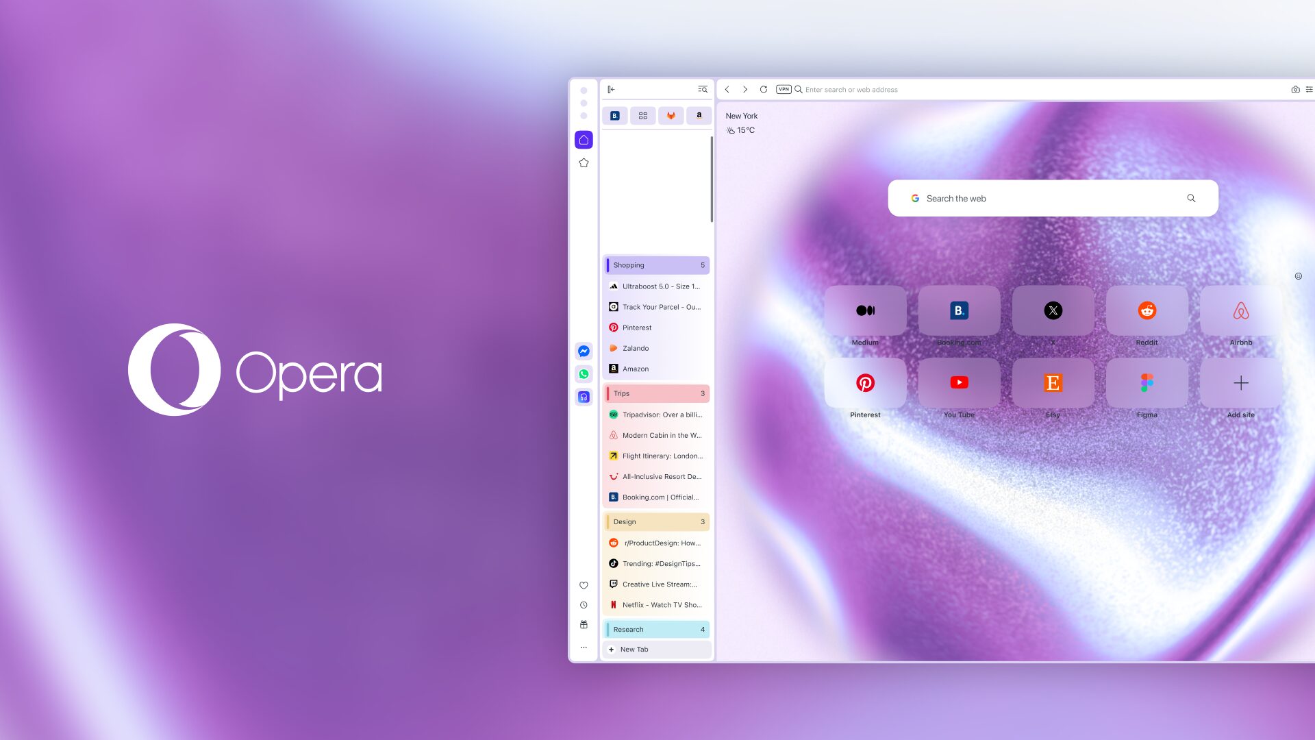
opera-one-vertical-Tabs-HERO-1.jpg

The feature aims to solve the perennial horizontal tab problem where too many open tabs makes each one shrink to an unreadable sliver of the webpage's favicon.

By contrast, in the vertical layout, page titles always stay legible. Opera's existing Tab Islands feature – where tabs that came from the same page or browsing session are grouped into a collapsible section in the tab strip – carries over from the standard view, and the panel collapses when screen space is tight.

Opera has also built Google Lens directly into the start page search bar with this update, so now an image search can be started by uploading a file, dragging and dropping, pasting from the clipboard, or entering a URL. Both features are live now in Opera One.

Opera is a late arrival to the vertical phenomenon that has slowly been making inroads across the wider browser landscape. Microsoft made vertical tabs generally available in Edge back in May 2021, and the feature has been popular with users on both Windows and macOS.

Mozilla followed in March 2025 with Firefox 136, which introduced vertical tabs as part of a redesigned sidebar. Firefox also allows the strip to be moved to the right edge of the window, if that's your preferred style.

Google was the last of the big names to make the same move. Chrome began rolling out vertical tabs in April, making full page titles readable and tab groups easier to manage, even at double-digit tab counts.

Apple's Safari browser features Tab Groups, which can be navigated from the sidebar and do give a vertical list of sorts, but there's never been a dedicated vertical tabs mode. Do Safari users want one, or are Tab Groups enough? Let us know in the comments.

Article Link: Opera One Browser Adds Vertical Tabs - Should Safari Follow?
 
  • Haha
Reactions: Migelan
I personally like it. It’s nice to not have to do as much scrolling on websites since tabs are wasting vertical space. I used to keep one monitor flipped vertical and used that for web browsing.
 
  • Like
Reactions: strawbale
Safari is the only major browser that doesn't have this feature at this point.

Very few websites span the full width of the display. Just take a look at this one, for example. I'd rather have the tabs display on the side, taking up the unused space, and gain the vertical space. Plus, you can actually read the titles (compared to Safari's compact tabs) and collapse the sidebar.
 
I'm lucky to have ten tabs open at a time, so not really a big improvement to me. I've been happy with Vivaldi's handling of hiding the tabs until near top of the screen. I've got a web app I use with poor real estate handling, so switched to a browser that could do most full screen and hide the fluff until hovered over the top of the browser.
 
Good to see this. No issue in having it in Safari as long as it is an option and user can easily switch between vertical and current horizontal tabs. I prefer the current view in Safari.
 
  • Like
Reactions: wlev and FoxyKaye
Regardless of browser I have a tendency to dismiss anything in the sidebar compared to the main chrome at the top of the window.
 
As expected— some people here don't need it (or they just accept everything from Apple!) so others don't need it as well.
 
I've been using vertical tabs in Helium (and before that, Brave) for a while now, and when I try to give Safari another shot, this is what ends up being a deal-breaker for me.

However, Opera's implementation looks ****ing ugly.


Opera One browser just pushed an update adding a Vertical Tabs option that moves the tab bar from the top of the window to a resizable panel down the left-hand side.

opera-one-vertical-Tabs-HERO-1.jpg

The feature aims to solve the perennial horizontal tab problem where too many open tabs makes each one shrink to an unreadable sliver of the webpage's favicon.

By contrast, in the vertical layout, page titles always stay legible. Opera's existing Tab Islands feature – where tabs that came from the same page or browsing session are grouped into a collapsible section in the tab strip – carries over from the standard view, and the panel collapses when screen space is tight.

Opera has also built Google Lens directly into the start page search bar with this update, so now an image search can be started by uploading a file, dragging and dropping, pasting from the clipboard, or entering a URL. Both features are live now in Opera One.

Opera is a late arrival to the vertical phenomenon that has slowly been making inroads across the wider browser landscape. Microsoft made vertical tabs generally available in Edge back in May 2021, and the feature has been popular with users on both Windows and macOS.

Mozilla followed in March 2025 with Firefox 136, which introduced vertical tabs as part of a redesigned sidebar. Firefox also allows the strip to be moved to the right edge of the window, if that's your preferred style.

Google was the last of the big names to make the same move. Chrome began rolling out vertical tabs in April, making full page titles readable and tab groups easier to manage, even at double-digit tab counts.

Apple's Safari browser features Tab Groups, which can be navigated from the sidebar and do give a vertical list of sorts, but there's never been a dedicated vertical tabs mode. Do Safari users want one, or are Tab Groups enough? Let us know in the comments.

Article Link: Opera One Browser Adds Vertical Tabs - Should Safari Follow?
HOW ABOUT HIDE TABS TEMPORARILY 😉
 
I'd definitely use it. A lot websites these days are formatted for mobile anyway, so no matter how wide you make the window on a desktop or laptop screen, the webpage only shows so much from side to side anyway. Having tabs on the side gives that much more room vertically for more information to be seen.

I usually leave my bookmarks sidebar open anyway, and Apple is really close since they keep the Tab Groups in the side bar already, and you can already see and toggle between open tabs there. It's just one step away from hiding the top tab bar anyway.
 
  • Like
Reactions: ZZ9pluralZalpha
I don't use Safari, I use Brave, but in any case I think vertical tabs are a horrible design. I see some other browsers out there have them, and I will gladly pass.
 
Register on MacRumors! This sidebar will go away, and you'll see fewer ads.