Got a tip for us?
Let us know
Become a MacRumors Supporter for $50/year with no ads, ability to filter front page stories, and private forums.
Original 'Rainbow' Apple HQ Signs Up for Auction, Bidding Starts at $10,000
- Thread starter MacRumors
- Start date
- Sort by reaction score
You are using an out of date browser. It may not display this or other websites correctly.
You should upgrade or use an alternative browser.
You should upgrade or use an alternative browser.
whooleytoo
macrumors 604
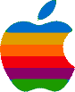
I think all styles go through phases where they appear stale and dated; so switching from the rainbow to monochrome logo made sense. Sooner or later that'll look dated too and they may switch to a new one... an outline? An updated rainbow look? 3D? Holographic? 🙂
nostaws
macrumors 6502a
I kind of feel like Apple still owes me a refund for buying an LCII.
I think you are romanticizing a bit and filtering out all the unmagical years the multicolored logo reigned on product -- when LC IIIs, Performas, and IIVXs roamed the land.
I don't mean to be politically incorrect and hope not to offend anyone in anyway. However, when I see the old apple logo, it does remind me of the Gay Flag. It makes me wonder if there was any connection or if the color selection was just coincidental.
I think in the "Jobs" book they said it was supposed to represent going from the Earth to the sky...except the green and the blue are upside down. If that's the case it should have been (my startup apple via BootXChanger):
Attachments
Last edited by a moderator:
Crosscreek
macrumors 68030
TantalizedMind
Suspended
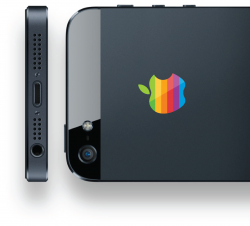
here's what the classic logo would look like on the iPhone.
That's not horrible looking. Not as nice as the newer logo though.
----------
Sorry to disappoint you but according to Wikipedia the Rainbow Flag was designed in 1978 while this article states that the Rainbow Apple was created in 1977.
I guess they just loved rainbows in late '70's California.
Anyone remember Mork & Mindy. Late 70's + rainbow suspenders.
Anonymous Freak
macrumors 603
Sorry to disappoint you but according to Wikipedia the Rainbow Flag was designed in 1978 while this article states that the Rainbow Apple was created in 1977.
I guess they just loved rainbows in late '70's California.
Not to mention, the colors are in different order.
Or (directed at Cuban Missiles, not DoubleU,) do you associate every use of a rainbow with the gay-pride flag now? (The 'gay pride' rainbow has colors in correct rainbow order - the Apple logo doesn't.) There have been many different groups and causes over the years that use a rainbow flag as their symbol.
Plus, as others have said, both the Apple logo and the gay pride flag were designed in the late '70s, a time when rainbow colors were popular for just about everything.
jthompson666
macrumors member
I've got the original Samsung sign. Anyone want to buy it? ...Anyone? ...Anyone at all?
😀 (sorry)
Anyone interested will have to get in line behind me!! 🙄
MacSince1990
macrumors 65816
here's what the classic logo would look like on the iPhone.
Not flat enough.
ghost of jobs
macrumors regular
i miss those days. I will sound like a fan boy but you need to accept that Steve Jobs was the only human being who knew how to control everyone opinions including costumers. he was a master mind.
Everyones opinions?.. the entire world's opinions?.. Mmm...thats a bit of a reach there fella..
Persian Apple
macrumors newbie
I think in the "Jobs" book they said it was supposed to represent going from the Earth to the sky...except the green and the blue are upside down. If that's the case it should have been (my startup apple via BootXChanger):
The colors can represent the Newton apple that fell from above his head to the ground.
Every time I see the classic logo a bit of my heart tugs and wishes apple still used it 🙂
Here you go... The modern reincarnation. Much better 🙂
Attachments
I don't mean to be politically incorrect and hope not to offend anyone in anyway. However, when I see the old apple logo, it does remind me of the Gay Flag. It makes me wonder if there was any connection or if the color selection was just coincidental.
----------
I may be mistaken, but I also thought it had to do wth the Apple Records deal related to the name, logo, and music.
That is an interesting connection. I never made it before I guess because the Apple rainbow is by design, chromatically incorrect. Here is a story on it.
http://creativebits.org/interview/interview_rob_janoff_designer_apple_logo
dec.
Suspended
Everyone has an opinion, and we all like what we like. But I much prefer the current Apple logo to the rainbow one. It was just dated. Thought so back then...
I agree, it reminds me of the early 80s home computer style in general where magazines and computers all had tons of lines and colour and stuff going on...


Mums
Suspended
Sorry to disappoint you but according to Wikipedia the Rainbow Flag was designed in 1978 while this article states that the Rainbow Apple was created in 1977.
I guess they just loved rainbows in late '70's California.
I think the love for rainbows you cite was inspired by prism installations at the Exploratorium.
----------
That looks really nice. Better than the mockups.
sophiamendezzz1
macrumors regular
I wouldn't mind...
I wouldn't mind having the logo at my house! I'm sure, as everyone else would too haha. I don't think starting $10K is that unreasonable since it's so iconic. One of them seems like someone tagged it though 🙁.
I wouldn't mind having the logo at my house! I'm sure, as everyone else would too haha. I don't think starting $10K is that unreasonable since it's so iconic. One of them seems like someone tagged it though 🙁.
gnasher729
Suspended
I like the theory that it is a tribute to Alan Turing, the guy who cracked the enigma code and was prosecuted and chemically castrated for being gay.
I doubt it's true but I'd love it if it was...
http://en.wikipedia.org/wiki/Alan_Turing
Alan Turing wasn't very famous at all when Apple started. For example, Alan Hodges' biography appeared in 1983. Before that time, the work that he is famous for now was all classified. You wouldn't have known his name at that time unless you studied computer sciences, and if you did, you wouldn't have a face associated with the name.
Register on MacRumors! This sidebar will go away, and you'll see fewer ads.