PowerBook-G5
macrumors 65816
Is "Dark Mode" supposed to turn the borders of the windows dark also? (I understand that it is not completed at the is point in time.)
I remember there being a keyboard shortcut like "CMD+Shift+." or something to temporarily show hidden files when in a Open/Save file dialog, but I don't remember if they pulled the feature, I installed something to make it do that in the first place, or a combination of the two (it's been a while).
Is "Dark Mode" supposed to turn the borders of the windows dark also? (I understand that it is not completed at the is point in time.)
And a non-flat mode. 😀
Not ready yet... at all...
And that, my friend, is why it's a beta 🙂
As stupid and minor as dark mode is, I'm actually pretty excited about it. I spend too many late nights alone with my computer in a dark room. (Not just masturbating.)
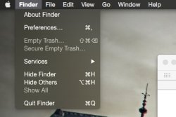
Need to make the windows dark as well or translucent. white window sticks out like a sore thumb
What!? I really like it. It looks almost exactly like Ubuntu now.Ugh. Yosemite is such an eye sore. Ugly, ugly, ugly.
Love it! The drop down menu's are perfect, just like the old HUD menu's (still used in some app's).
Only issue, dual displays shows a white and black menubar and menubar items still need new symbols. Otherwise, I'll keep it.
Is "Dark Mode" supposed to turn the borders of the windows dark also? (I understand that it is not completed at the is point in time.)
Ugh. Yosemite is such an eye sore. Ugly, ugly, ugly.
Ugh. Yosemite is such an eye sore. Ugly, ugly, ugly.

I am sick of hearing people complain about the look of Yosemite and even iOS 7(8) for that matter. Apple will not change it back because a few pessimists won't just accept it....
The Menu Extras items haven't been updated yet to deal with Dark Mode. Quite simple really.Odd that the clock doesn't change to white text, even though the icons on that side don't change you'd think the text would?