Become a MacRumors Supporter for $50/year with no ads, ability to filter front page stories, and private forums.

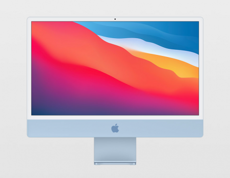
Does the new iMac look better with an Apple logo?

  • I can't decide

    Votes: 21 10.2%
  • Yes

    Votes: 107 51.9%
  • No

    Votes: 78 37.9%

  • Total voters
    206

JohnnyWalker

macrumors member
Original poster
Feb 25, 2005
73
61
A lot of people have been complaining about the white bezels or the chin on the new iMac, but I don't mind them as much as I mind the emptiness of the chin. I thought I'd add the Apple logo to see how it would change things.

What do you think?

new-imac-fixed.png


new-imac.png
 

Attachments

  • new-imac-fixed-2.png
    new-imac-fixed-2.png
    177.8 KB · Views: 803
  • new-imac-fixed-3.png
    new-imac-fixed-3.png
    177.8 KB · Views: 595

uller6

macrumors 65816
May 14, 2010
1,042
1,682
I don't like brand logos staring me in the face. I used to keep a sticky note over the Apple logo on my old iMac. I scraped the silver Dell logo off my Dell monitor with a knife. And I'm very happy the new iMac does not have a logo on the front - it feels much cleaner to me. It doesn't need to be branded for me to know it's an Apple computer.
 

opeter

macrumors 68030
Aug 5, 2007
2,680
1,602
Slovenia
If it is the right size, than yes, the logo would be solid. I think a small apple (Ø = max. 2 cm) would be great.
 

za9ra22

macrumors 65816
Sep 25, 2003
1,441
1,892
It's perfectly good as it is, without a logo there. Aside from the fact that I am pretty sure I know it's a Mac so I don't need to be told with a little Apple logo, I don't even see this part of the computer when I'm using it, because I'm looking at the screen.
 

Warped9

macrumors 68000
Oct 27, 2018
1,628
2,181
Brockville, Ontario.
I think I would have liked a colour complimentary marking on the front, either an Apple logo as illustrated by the OP or simply the word iMac. Having said that people will likely be able to apply their own applique or decal if they really want one or just leave it as is from the factory. Strangely, and correct me if I’m wrong, the stickers that come in the box with the iMac look too big to fit on the chin.
 

Tozovac

macrumors 68040
Jun 12, 2014
3,012
3,220
I think the problem isn’t just the white bezel, just the blank chin, just the missing logo, etc. I think it’s more the combined effect of “the addition of the removal” all at once of several things we’ve come to expect in an Apple product (or a computer device in general) but with no discernible functional improvement and for some, a functional or intangible step back.

White bezels support Apple’s light/airy/clean minimalist aesthetic, but there’s a reason why movie theaters are dark, why 99% of televisions have black bezels, and why the MacBook Pro’s black bezel separated it as “upscale” at one time compared to the MacBook Air…

A blank chin and missing logo once again leans towards a change towards the Apple’s sometimes-to-a-fault design-focused minimalist direction…a rather heavy-handed deviation from what’s expected in an Apple product. Thesubtle, classy logo and/or “MacBook Pro” indication still separates Apple computers from the typical Microsoft PC-based laptop with all the unnecessary processor/graphics/memory/vendor decals that later wear away and look even worse than when new.

Change is great but when a bunch of questions arise that suggest the change was primarily for the sake of change for something new and dramatic in a dramatically-redesigned iMac, it is worth questioning. :)
 

Warped9

macrumors 68000
Oct 27, 2018
1,628
2,181
Brockville, Ontario.
Given some of the feedback it would be interesting to see Apple make a change in about a year or two by putting the logo back on the front. Certainly at present hardly anyone is going to mistake the familiar iMac form, particularly with the colours, as anything other than an Apple iMac. The recognition factor is built into the design itself even if you never see the logo still there on the back of the machine.
 

Feyl

Cancelled
Aug 24, 2013
964
1,951
I think the problem isn’t just the white bezel, just the blank chin, just the missing logo, etc. I think it’s more the combined effect of “the addition of the removal” all at once of several things we’ve come to expect in an Apple product (or a computer device in general) but with no discernible functional improvement and for some, a functional or intangible step back.

White bezels support Apple’s light/airy/clean minimalist aesthetic, but there’s a reason why movie theaters are dark, why 99% of televisions have black bezels, and why the MacBook Pro’s black bezel separated it as “upscale” at one time compared to the MacBook Air…

A blank chin and missing logo once again leans towards a change towards the Apple’s sometimes-to-a-fault design-focused minimalist direction…a rather heavy-handed deviation from what’s expected in an Apple product. Thesubtle, classy logo and/or “MacBook Pro” indication still separates Apple computers from the typical Microsoft PC-based laptop with all the unnecessary processor/graphics/memory/vendor decals that later wear away and look even worse than when new.

Change is great but when a bunch of questions arise that suggest the change was primarily for the sake of change for something new and dramatic in a dramatically-redesigned iMac, it is worth questioning. :)
The new iMac and the rumored model name removal from the laptops reminds me of the blank, just white iPhone 6 box. It was something so stupid that it's beyond my realm.
 

Tozovac

macrumors 68040
Jun 12, 2014
3,012
3,220
The new iMac and the rumored model name removal from the laptops reminds me of the blank, just white iPhone 6 box. It was something so stupid that it's beyond my realm.

Probably another self-proclaimed genius decision by the same marketing and design staff at Apple wearing $500 fashion prescription glasses and black or grey turtlenecks, similar crew who decide things like iPad model names (The iPad Air that was replaced by…the iPad Air) that are nice and (un)clear for customers down the line, well after the studio has hatched their ideas.
 
  • Angry
  • Like
Reactions: ikir and Feyl

JohnnyWalker

macrumors member
Original poster
Feb 25, 2005
73
61
Certainly at present hardly anyone is going to mistake the familiar iMac form, particularly with the colours, as anything other than an Apple iMac. The recognition factor is built into the design itself even if you never see the logo still there on the back of the machine.

Not sure I agree with this. HP have been making PCs with chins for a while now. I think anyone could mistake the new iMac for one of their designs (minus the colours -- but I'm sure they'll copy those, shortly).

ezgif.com-gif-maker.jpg
 

Warped9

macrumors 68000
Oct 27, 2018
1,628
2,181
Brockville, Ontario.
Not sure I agree with this. HP have been making PCs with chins for a while now. I think anyone could mistake the new iMac for one of their designs (minus the colours -- but I'm sure they'll copy those, shortly).

View attachment 1789491
I have seen that very device as well as others and they don’t look that great compared to the old iMac let alone the new one. Apple’s devices have an overall refined finish and sense of design thats beyond what other manufacturers are doing.
 

JohnnyWalker

macrumors member
Original poster
Feb 25, 2005
73
61
I have seen that very device as well as others and they don’t look that great compared to the old iMac let alone the new one. Apple’s devices have an overall refined finish and sense of design thats beyond what other manufacturers are doing.

My point is just that the shape of the iMac isn't exclusive to Apple anymore. I think looking the new iMac face-on the average consumer wouldn't know it was Apple.
 

applesque

macrumors regular
Jun 2, 2021
152
48
USA/Israel
I think the problem isn’t just the white bezel, just the blank chin, just the missing logo, etc. I think it’s more the combined effect of “the addition of the removal” all at once of several things we’ve come to expect in an Apple product (or a computer device in general) but with no discernible functional improvement and for some, a functional or intangible step back.

White bezels support Apple’s light/airy/clean minimalist aesthetic, but there’s a reason why movie theaters are dark, why 99% of televisions have black bezels, and why the MacBook Pro’s black bezel separated it as “upscale” at one time compared to the MacBook Air…

A blank chin and missing logo once again leans towards a change towards the Apple’s sometimes-to-a-fault design-focused minimalist direction…a rather heavy-handed deviation from what’s expected in an Apple product. Thesubtle, classy logo and/or “MacBook Pro” indication still separates Apple computers from the typical Microsoft PC-based laptop with all the unnecessary processor/graphics/memory/vendor decals that later wear away and look even worse than when new.

Change is great but when a bunch of questions arise that suggest the change was primarily for the sake of change for something new and dramatic in a dramatically-redesigned iMac, it is worth questioning. :)
What's the MacBook Pro indication? Do you mean the shape of the laptop and the additional ports?
 

neo_cs193p

macrumors regular
May 17, 2016
224
269
I like it without the logo. I'm curious if people who actually own and use it vote otherwise. I suspect it's just another case of getting used to the new status quo and seeing what the Apple designers wanted to achieve (and succeeded). Just my opinion, of course.
 

JohnnyWalker

macrumors member
Original poster
Feb 25, 2005
73
61
I like it without the logo. I'm curious if people who actually own and use it vote otherwise. I suspect it's just another case of getting used to the new status quo and seeing what the Apple designers wanted to achieve (and succeeded). Just my opinion, of course.

You could be right. I hated Big Sur at first, but now I love it (apart from the dreadful icons, of course -- they still cause me pain).
 
Register on MacRumors! This sidebar will go away, and you'll see fewer ads.