Become a MacRumors Supporter for $50/year with no ads, ability to filter front page stories, and private forums.

countryside

macrumors 6502a
Original poster
Jan 9, 2016
660
2,173
I have increasingly seen more and more comments and complaints about the number of entertainment posts (Apple TV+)... or even about more trivial news stories about Apple services being down. People also seem to dislike advertising and giveaway posts.

To be honest, I agree with some of it. I don't dislike the entertainment posts, often I read them... however, I can see how it gets annoying. At the end of the day, I would rather have more content than I care to consume than not enough content! Thank you to the editorial team for all the work you do. We appreciate it and you do not get enough thanks. Often times you just get criticism.

Apple is only growing, especially in the serviced category. Apple TV+ will eventually be worthy of its own website at some point.

Therefore, it may be time for MacRumors to change the front page layout. I know this is no easy feat, and the current front-page is an XenForo extension I assume which is not easy to customize. However, a layout that lets us see more stories at once without having to scroll would solve so many issues.

Here are the front pages of CNN, NBC News, and The Dailywire. All of these websites let visitors pick from at least 8 of the most recent stories to read. No need to scroll past stories that are not of interest or go to page 2.

I have no doubt this has been suggested before and considered by staff... But I wanted to bring it up just in case.
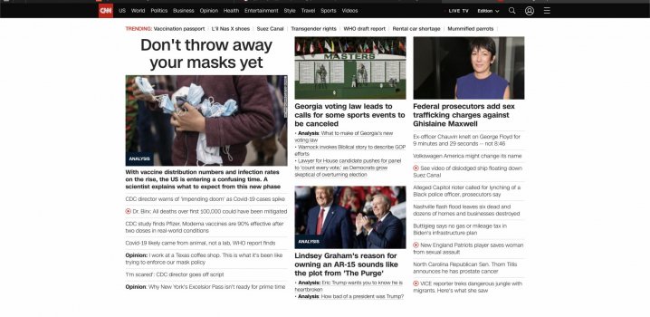
Screen Shot 2021-03-29 at 9.38.36 PM.jpgScreen Shot 2021-03-29 at 9.38.10 PM.jpgScreen Shot 2021-03-29 at 9.37.27 PM.jpgScreen Shot 2021-03-29 at 9.37.36 PM.jpg
 
Why would anyone bother to go to the front page if all they're interested in is the forum discussions? I have bookmarked something as my kicking-off-point so that I arrive directly at the forum discussions and from there go and look at whatever I please. I rarely look at the front page, no need to do so.
If they are only interested in the forum discussions, then, of course, they would not bother to go to the front-page? I do not see your point.

I am suggesting an idea to an annoyance and growing problem that people who do use the front-page. The purpose of this forum is to largely consume and discuss Apple news/rumors. Therefore, I assume a large percentage of visitors read from the front-page.
In my quite extended circle of people none is visiting the front page. We all drop directly into the forums.
 
If they are only interested in the forum discussions, then, of course, they would not bother to go to the front-page? I do not see your point.

I am suggesting an idea to an annoyance and growing problem that people who do use the front-page. The purpose of this forum is to largely consume and discuss Apple news/rumors. Therefore, I assume a large percentage of visitors read from the front-page.

1) I personally have a link in my bookmarks that goes to the forums directly.

2) My main device of choice here is my iPhone.

I'd be fascinated to know the ratio of full screen / smartphone sized devices that hit up MR.
 
Here are the front pages of CNN, NBC News, and The Dailywire. All of these websites let visitors pick from at least 8 of the most recent stories to read. No need to scroll past stories that are not of interest or go to page 2.
You have to scroll on those websites

I'm speaking as a member not as a "staff member" I'm simply a volunteer moderator who has zero say on the design or content. I'd really hate to see stuff jam packed onto the screen in the name of no-scrolling. I wouldn't mind seeing two columns, but I'm guessing the layout is such that it will look good on a computer, tablet and phone.

Overall, I head straight to the forum when I'm interested in discussing something but I do go to the front page to see what new stories are posted.
 
Appreciate the feedback and suggestion, and we're always thinking about ways we can improve things.

All of those example websites just have headlines (and maybe a short blurb for some stories) on the front page, so you have to click through to each individual article you want to read. That makes it easy to cram a lot of story headlines in a small amount of space.

From the very beginning, we've gone in a different direction and put the full text of every article right on the front page so you can read a dozen articles without having to leave the page. It generates fewer total page views for us, but we think it makes the site easier to use.

As the scale of Apple news and our coverage have increased, things do move quite a bit faster than they used to, which has certainly proven challenging for those who don't spend all day every day on the site. That's why we semi-recently implemented the feature block up top with links to the biggest recent stories to help people catch up. It's kind of a hybrid approach.

It's also worth noting that people increasingly come directly to our individual stories rather than by visiting the front page, thanks to the rise of social media where people click in via Facebook, Twitter, Google, etc. A decade ago, the front page represented over 80% of our total news traffic. It's now less than half.
 
It's also worth noting that people increasingly come directly to our individual stories rather than by visiting the front page, thanks to the rise of social media where people click in via Facebook, Twitter, Google, etc. A decade ago, the front page represented over 80% of our total news traffic. It's now less than half.
Can you tell how many are coming in from RSS feeds? Just curious.
 
Thanks for the suggestion. It's a constant balance in trying to fit more information and trying to keep some familiarity with historic designs. We've probably leaned towards trying not to rock the boat too much over the years.

And the front page remains the most popular page on the site so changes to it affect the largest number of eyeballs.
 
Overall, I head straight to the forum when I'm interested in discussing something but I do go to the front page to see what new stories are posted.
It sounds like a lot of people do this. For me, if I went to the announcement section of the forum, I would never know what is new or old, as the top threads in that forum are simply the ones with the most recent comment. Not sure if that makes sense.
but I'm guessing the layout is such that it will look good on a computer, tablet and phone.
Good point... mobile friendly is obviously very important since there is no iPhone app (not really necessary). Which, I must say, this website probably has the best seamless Mac, iPad, and iPhone experience. It just works on all devices.
As the scale of Apple news and our coverage have increased, things do move quite a bit faster than they used to, which has certainly proven challenging for those who don't spend all day every day on the site. That's why we semi-recently implemented the feature block up top with links to the biggest recent stories to help people catch up. It's kind of a hybrid approach.
I had not noticed that feature block until now, thanks for pointing that out. I like that a lot and it sorta solves the issue at hand... one can at a glance look at the most recent stories and choose what to read.
Thanks for the suggestion. It's a constant balance in trying to fit more information and trying to keep some familiarity with historic designs. We've probably leaned towards trying not to rock the boat too much over the years.

And the front page remains the most popular page on the site so changes to it affect the largest number of eyeballs.
Totally understand... a site as big of this cannot just willy nilly change things. Thanks again for all you do to run this site... it is a great outlet for me when stressed out to browse this website.
 
I think the whole site and forums are fine the way they are now.

The changes last year really improved it enough imo.
 
  • Like
Reactions: arn
Have you guys considered consolidating the beta release articles into one post and one forum thread?

“Apple releases new betas for iOS 14.5, iPadOS 14.5, tvOS 14.6 and Apple Watch 7.4”
Yeah, it's not ideal to be pushing four stories in quick succession, but the main issue with combining them into one is that the discussion thread becomes jumbled up with people talking about all of the different releases. We do typically publish at least the tvOS ones in a "blurb" format that collapses the article down even smaller than usual on the front page, since they're usually pretty minor.
 
  • Like
Reactions: ouimetnick
The only new change that I see as adding to a sense of bulk is the replacement of some relevant photograph below each article header with the giant rectangles of color gradient in the style of the ads from the last wwdc. I now realize how photographs chosen were directly relevant to the article, often warm and personable with Handsome Dan and his smiling face, making the news feel real and relatable. ...compared to those, the big gradient fills just feel like placeholder icons, amounting to giant blocks of nebulous empty space to scroll past, interrupting the information flow and making it feel more like an impersonal marketing piece. That’s the only thing I’ve found adding to the feel of bulk.
 
Last edited:
Register on MacRumors! This sidebar will go away, and you'll see fewer ads.