Got a tip for us?
Let us know
Become a MacRumors Supporter for $50/year with no ads, ability to filter front page stories, and private forums.
Post your iOS 14 home screen layout
- Thread starter PilotTiny
- Start date
- Sort by reaction score
You are using an out of date browser. It may not display this or other websites correctly.
You should upgrade or use an alternative browser.
You should upgrade or use an alternative browser.

All of these home screens with widgets and custom icons make the iPhone look like its running android.
Personally I think they look terrible and that’s why I switched away from Android years ago.
People’s tastes differ though.
Personally I think they look terrible and that’s why I switched away from Android years ago.
People’s tastes differ though.

I agree but the thing with widgets is you don't need to add em on your home screen for either deviceAll of these home screens with widgets and custom icons make the iPhone look like its running android.
Personally I think they look terrible and that’s why I switched away from Android years ago.
People’s tastes differ though.
All of these home screens with widgets and custom icons make the iPhone look like its running android.
Personally I think they look terrible and that’s why I switched away from Android years ago.
People’s tastes differ though.
I find them handy for when I want to quickly consume glanceable pieces of information without having to open the app. However, I do feel that Apple still has a lot of work to do. Currently, I find that the large (4x4) widgets take up way too much space for the limited functionality that they provide.

Such a kick-ass scene.
Absolutely! Can still hear the soundtrack in my head.Such a kick-ass scene.
Keep coming back to it for all my devices, great wallpaper.
How did you get the transparent battery? Thanks!
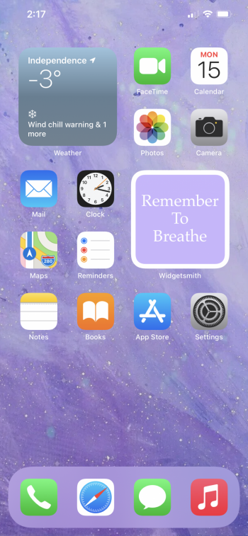
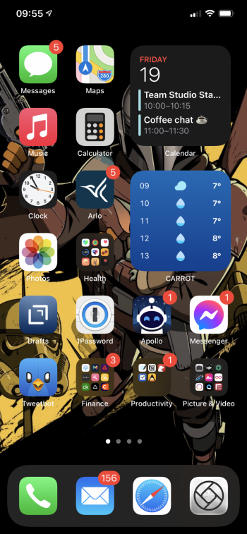
I’ve stacked news with music with smart rotate on and clock under calendar with smart rotate off. As a bonus, here’s what my widgets screen/today view looks like..


Thought I’d let you know, since you haven’t realized, you have 767 new messages 🤔😂I’ve stacked news with music with smart rotate on and clock under calendar with smart rotate off. As a bonus, here’s what my widgets screen/today view looks like.. View attachment 1731953View attachment 1731954View attachment 1731955
It be like that sometimes 😂🤣Thought I’d let you know, since you haven’t realized, you have 767 new messages 🤔😂
How did you get the transparent battery? Thanks!
It’s an app called ClearSpaces

hi would you care to name the clock widgy or share the qr if you have it please....thanks
")
Very nice! Would you be kind enough to share that wallpaper?
Very nice! Would you be kind enough to share that wallpaper?
Absolutely.

Register on MacRumors! This sidebar will go away, and you'll see fewer ads.