Got a tip for us?
Let us know
Become a MacRumors Supporter for $50/year with no ads, ability to filter front page stories, and private forums.
Post your iOS 7 screenshots here! [Some NSFW]
- Thread starter nhlfreak98
- Start date
- Sort by reaction score
You are using an out of date browser. It may not display this or other websites correctly.
You should upgrade or use an alternative browser.
You should upgrade or use an alternative browser.
Apple ruined the music app!
You're entitled to your own opinion. Personally, I like the color scheme and find it really clean.
Ruined the music app? What the...? iTunes Match finally works like a native app for me. This beta works better than the latest version of iOS 6. Way too much emphasis placed on appearance, although it doesn't make sense to have wallpapers that render text unreadable. I haven't encountered that yet. Has anybody else noticed that retina display is no longer really a retina display with this new thin text? I see pixels from a normal viewing distance very clearly. I HATE APPLE, THEY NEED 1080P DISPLAY OR ELSE THEY'RE GOING TO FAIL, SAMSUNG MORR INNOVATIVE, and so forth....
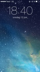

I really like it so far but I do agree that having the "right" wallpaper seems to make a difference in the look.
I love this background because the colors seem to work well together (plus the angle of the pier zooms in and out when you move the phone which is pretty amazing):

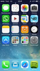
Here I compared it to another wallpaper I have and I couldn't stand how the folders look! I hope those become more transparent in the final release.

I love this background because the colors seem to work well together (plus the angle of the pier zooms in and out when you move the phone which is pretty amazing):
Here I compared it to another wallpaper I have and I couldn't stand how the folders look! I hope those become more transparent in the final release.
I really like it so far but I do agree that having the "right" wallpaper seems to make a difference in the look.
I love this background because the colors seem to work well together (plus the angle of the pier zooms in and out when you move the phone which is pretty amazing):
View attachment 416991
Here I compared it to another wallpaper I have and I couldn't stand how the folders look! I hope those become more transparent in the final release.
View attachment 416992
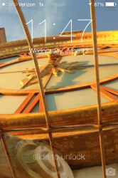
How did your clock color change from white to black?
5575 notifications for MailI really like it so far but I do agree that having the "right" wallpaper seems to make a difference in the look.
I love this background because the colors seem to work well together (plus the angle of the pier zooms in and out when you move the phone which is pretty amazing):
View attachment 416991
Here I compared it to another wallpaper I have and I couldn't stand how the folders look! I hope those become more transparent in the final release.
View attachment 416992

5575 notifications for Mail
It isn't as bad as it looks - most are press releases and advertisements for work ----------
How did your clock color change from white to black?
That is the default with that particular wallpaper. I am guessing that its black with lighter backgrounds?
----------
That is the default with that particular wallpaper. I am guessing that its black with lighter backgrounds?
Nice, I also see some people with green colored battery icons, is that an enabled or setting or just wallpaper dependent?
Nice, I also see some people with green colored battery icons, is that an enabled or setting or just wallpaper dependent?
Wallpaper dependent.
Wallpaper dependent.
Mine only turns green when it's charging
Mine only turns green when it's charging
Oops. You are right.


Can you share this wall please?
Can you share this wall please?
Correct me if i'm wrong, but that looks like the OS X Mavericks default
Nice homescreen! Can you post your wallpaper? Thanks
Thanks. This is the image. Since it fades to black I just positioned the photo centered and towards the lower part of the screen
http://www.wallpapers-online.net/wallpapers/2013/01/Astronaut-weightlessness-orbit-space-2048x2048.jpg
Can you share this wall please?
Mavericks Default wallpaper.
https://forums.macrumors.com/threads/1593467/
I really like it so far but I do agree that having the "right" wallpaper seems to make a difference in the look.
I love this background because the colors seem to work well together (plus the angle of the pier zooms in and out when you move the phone which is pretty amazing):
View attachment 416991
Care to share this wallpaper?
Register on MacRumors! This sidebar will go away, and you'll see fewer ads.