Control center in landscape
Excellent taste in music Antoni! I just saw "The National" in Pittsburgh 2 nights ago. I am seeing them again in Columbus, OH this Saturday. The Pittsburgh show was epic!!
Control center in landscape
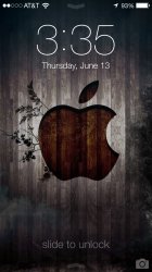
Mind posting those wallpapers you have there in your AirDrop?
Excellent taste in music Antoni! I just saw "The National" in Pittsburgh 2 nights ago. I am seeing them again in Columbus, OH this Saturday. The Pittsburgh show was epic!!

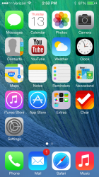
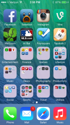
I went with the Mavericks theme. Love it so far.
Could you share the mavericks wallpaper?
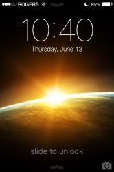
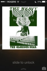
Lockscreen. Definitely my fav visual improvement coming from ios 6
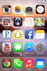
A plain black wallpaper on the homescreen also does wonders in making the icons pop more.
i think this is the first SS i see of iOS 7 on an iphone 4/s
the clock in the lockscreen looks way too big. kinda like making a statement: 'dont forget what time it is!'
Add them as attachments, not images.These appear very large how do I make them smaller?
Countdown timer on lock screen & Image action menu:

See this is the thing... this interface (that dial screen, for example) can look so damn beautiful with certain wallpapers. Yet other wallpapers make everything look so tacky. :/
sorry if it's been posted, don't want to dig through 10 pages.
Any screenshots of ios 7 with a black/dark wallpaper?

Here is mine:
Lockscreen. Definitely my fav visual improvement coming from ios 6
A plain black wallpaper on the homescreen also does wonders in making the icons pop more.