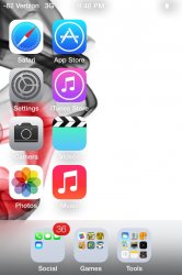
I love a lot of the new features of iOS 7. Although I have looked into Android phones a bit (I have an iPhone 4S right now). I'm still up in the air on whether I like the new iOS 7 icons or not. The old ones got tiring cause of the glossy shiny feel but the new ones look too flat. A few apps that come to mind with great icons are Facebook and Google Maps as well as some others from Christian resources I keep up to date on. The icons for those apps are not "3D" with the glossy shiny feel nor are they flat like the new iOS 7 apps. They are solid and bold. They have a good look and feel to them. Apple should take cues from that for their icons. Even Apples Settings, Calculator, Calendar and Maps icons from iOS 6 have no gloss and they look fine. They should have just done the same with their other apps. Just my take anyway.
EDIT: One thing I like about Android app icons is that they are not all the same. By that I mean they are not all square with rounded corner with the graphic inside.
For example look at the Gmail or Google Maps app icons here. Even the Phone app is just a phone. No square background behind it.
http://alphaod.com/pics/mr02/Screenshot_2013-05-06-04-27-35.jpg
Last edited:


")