I wish I could post a screen **** of the power off screen, essentially it's a red bar with white text with the typical "Swipe to power off" and a large cancel bar at the bottom. Once you slide to power it off, it "closes" to black from the top and from the bottom and meets in the middle. Unable to screen shot from this screen
Got a tip for us?
Let us know
Become a MacRumors Supporter for $50/year with no ads, ability to filter front page stories, and private forums.
Post your iOS 7 screenshots here! [Some NSFW]
- Thread starter nhlfreak98
- Start date
- Sort by reaction score
You are using an out of date browser. It may not display this or other websites correctly.
You should upgrade or use an alternative browser.
You should upgrade or use an alternative browser.
It's cool how the text changes from white to black depending on the background. Can anybody show a shot of the phone with an all white wallpaper?
No difference. The developer has to update their app to the new UI language which can't be done till the GM seed.
Are you sure? Many apps these days are highly customised, and so will not pick up any changes, but it is possible apps that use stock elements - UINavigationBar, UITabBar, systemFontOfSize, etc - will look different. For example, apps that used UINavigationBar in iOS 5 automatically picked up coloured status bars in iOS 6.
If this is the case, and there is no difference at all, then I'd still love to see a screenshot of an old-school looking iPhone app consisting purely of stock UI elements running on iOS 7, just as a stick in the mud kind of thing.
Here's a screenshot of the kind of app I'm talking about, running on iOS 5
http://www.austlii.edu.au/austlii/apps/ios/AustLII_app_001.jpg
If you want to use it as an example, search "AustLII" in the App Store.
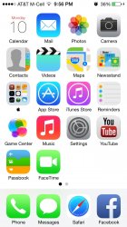
Can someone post the default arrangement of icons for the first two pages of the home screen? The way it looks when you set up as new iPhone
I wish I could post a screen shot of the power off screen, essentially it's a red bar with white text with the typical "Swipe to power off" and a large cancel bar at the bottom. Once you slide to power it off, it "closes" to black from the top and from the bottom and meets in the middle. Unable to screen shot from this screen
Here ya go.
Attachments

![IMG_2624[1].PNG](/data/attachments/352/352598-3cb4924501c650a469ced5b37b780435.jpg)
Here is a nice new feature at the bottom
AMBER Alerts
That's there in iOS 6 as well.
can you please post that wallpaper? it's great
Love the ability to add a panoramic photo as a wallpaper that moves when you move your phone. It's hard to capture in a still photo (obviously) but it's really nice. Photo is of Sunset Cliffs in Point Loma, San Diego. As I move my phone to the right the background pans over to show the ocean and the sunset.
All white background
Thanks, kind of strange, but I do like that I don't have to deal with that awful shadow for any light wallpapers like in the past.
can you please post that wallpaper? it's great
There no way to pull the wallpaper off the phone.
----------
Can someone post the default arrangement of icons for the first two pages of the home screen? The way it looks when you set up as new iPhone
Check the images on Apples website.
can you please post that wallpaper? it's great
Sure, no problem: http://www.mediafire.com/download/ow2kxp07u42yauw/IMG_1214.JPG
There's a bit of a black bar in the upper right portion from where I didn't hold my hand steady enough while taking the panorama. I would have fixed it in Aperture already if I wasn't so lazy with my photos.
Love the ability to add a panoramic photo as a wallpaper that moves when you move your phone. It's hard to capture in a still photo (obviously) but it's really nice. Photo is of Sunset Cliffs in Point Loma, San Diego. As I move my phone to the right the background pans over to show the ocean and the sunset.
Wow just tried it, that's really cool. I have a reason to make panos now.
There no way to pull the wallpaper off the phone.
----------
Check the images on Apples website.
It doesnt show the arrangement of the second page.
thanks! didn't know you took that yourself, it looks great!
Sure, no problem: http://www.mediafire.com/download/ow2kxp07u42yauw/IMG_1214.JPG
There's a bit of a black bar in the upper right portion from where I didn't hold my hand steady enough while taking the panorama. I would have fixed it in Aperture already if I wasn't so lazy with my photos.
S
syd430
Guest
Actually looks pretty good if you change the wallpaper to something less over the top. As for the default app icons, how many of you keep all those icons on the homescreen and not burry half of the ones you don't use in folders? the main ones (safari, calls, mail, messages) look fine.
The one thing I hate though is the grotesque cover flow tab switcher in Safari. I can see why they did it (so it doesn't look the same as the main app switcher view), but there had to be a better way then bring back the cover flow monstrosity.
The one thing I hate though is the grotesque cover flow tab switcher in Safari. I can see why they did it (so it doesn't look the same as the main app switcher view), but there had to be a better way then bring back the cover flow monstrosity.

Can someone get a shot in here of their zoomed out, non selected folder icons? Mine are always this dull grayish blue box. It looks absolutely horrible on a black background. When you select them it goes transparent and matches the icon bar at the bottom - which is what I feel they should be doing all the time. Am I seeing a bug? Or is this grey blue madness there for everyone?
----------
For reference - here is what I have.

----------
For reference - here is what I have.
Speaking of photos, it seems photos aren't being synced to my PhotoStream?
Hmm, mine definetely are. Are you on wifi, or have cellular activated for photo stream?
")
Register on MacRumors! This sidebar will go away, and you'll see fewer ads.