Got a tip for us?
Let us know
Become a MacRumors Supporter for $50/year with no ads, ability to filter front page stories, and private forums.
Post your iOS 7 screenshots here! [Some NSFW]
- Thread starter nhlfreak98
- Start date
- Sort by reaction score
You are using an out of date browser. It may not display this or other websites correctly.
You should upgrade or use an alternative browser.
You should upgrade or use an alternative browser.
See - your folder icon is clearly keying off your background - looks a little nicer. Wonder why mine isn't doing that. Would you mind sending me a link to that photo? I want to see if using it will give me the same results.
Hmm, mine definetely are. Are you on wifi, or have cellular activated for photo stream?
Yeah, I'm on Wi-fi. I tried rebooting the device, toggling Airplane Mode, and disabling/enabling PhotoStream. No dice.
Not a huge deal. Obviously something that will be addressed if it's a bug.
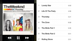
New Cover Flow
You can pinch it to expand it to 4 columns or decrease it to 2.
Not sure why some album covers aren't coming up.
can you post how the album art is displayed in the lock screen when playing music?
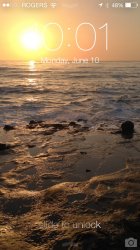
Seriously this is something I love about iOS 7. Any wallpaper looks beautiful with it. Even regular photos.
See - your folder icon is clearly keying off your background - looks a little nicer. Wonder why mine isn't doing that. Would you mind sending me a link to that photo? I want to see if using it will give me the same results.
files.fiftyfootshadows.net/ip5/lost_in_sand_iphone5.jpg
Seriously this is something I love about iOS 7. Any wallpaper looks beautiful with it. Even regular photos.
no they dont.
light wallpapers don't look as good. for one you cant read the time on the LS if its too bright.
files.fiftyfootshadows.net/ip5/lost_in_sand_iphone5.jpg
Thanks - still blue grey for me. I wonder if it's because I restored and it has somehow locked in the color palatte of the lock screen I was using at the time I did so. Did you start fresh? And if not, if you change you wallpaper to say, something green, would the color key switch?
Thanks - still blue grey for me. I wonder if it's because I restored and it has somehow locked in the color palatte of the lock screen I was using at the time I did so. Did you start fresh? And if not, if you change you wallpaper to say, something green, would the color key switch?
color stays the same when I change it to green. it's probably a bug.
Really loving this new lockscreen. I use to jailbreak to get rid of the bars to see my background better. No need to jailbreak anymore.
color stays the same when I change it to green. it's probably a bug.
Good to know. So it's just keying off whichever it started with and sticking to it. Ok - time to find that old wallpaper...
")
no they dont.
light wallpapers don't look as good. for one you cant read the time on the LS if its too bright.
Lockscreen text changes based on the wallpaper chosen. Maybe they just need to refine their white/black detection method. Of course that won't help if your wallpaper is half light and half dark...

Last edited:
Also is there an option to turn off auto update in app store
Yes.
Lockscreen text changes based on the wallpaper chosen. Maybe they just need to refine their white/black detection method. Of course that won't help if your wallpaper is half light and half dark...
Image
oh i see!
yes i saw one person post a half light half dark and it obviously confused the OS.
interesting though.

That's just racist.

Love the ability to add a panoramic photo as a wallpaper that moves when you move your phone. It's hard to capture in a still photo (obviously) but it's really nice. Photo is of Sunset Cliffs in Point Loma, San Diego. As I move my phone to the right the background pans over to show the ocean and the sunset.
Just noticed the text on the lock screen is so light that it's easy to obscure what it says if you have a bright wallpaper. (It's hard to tell but it should say 10:01)
quick one buddy... i noticed ur 1st screen shot didn't have the "slide to unlock" text on the lockscreen. ur 2nd screenshot however did.
this tells me there's an option to hide the "slide to unlock" text? or perhaps set a custom text? am i right?
quick one buddy... i noticed ur 1st screen shot didn't have the "slide to unlock" text on the lockscreen. ur 2nd screenshot however did.
this tells me there's an option to hide the "slide to unlock" text? or perhaps set a custom text? am i right?
It's there. Squint harder.
Attachments

In my opinion the old icons looked much better and more consistent. The new ones look toyish, like something out of Android 3 years ago. The in app music/browser icons look totally different to the ones on the main screen. It goes from being very colorful to totally white (quick settings panel) and some of the settings just seem to appear there at random.
The new lockscreen looks good, but again it's something that jail break or Android users have had for ages.
The rigid grid structure is still there with limited glanceable information.
Was expecting more/better...
The new lockscreen looks good, but again it's something that jail break or Android users have had for ages.
The rigid grid structure is still there with limited glanceable information.
Was expecting more/better...
Register on MacRumors! This sidebar will go away, and you'll see fewer ads.