I agree with that. I don't need icons that look like they have clear coat or lacquer on them, but I appreciate some richness and depth.
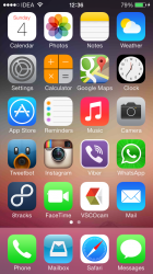
iOS 7 still looks a bit generic to my eye, and the colors are just garish. Still hate the icons, although I don't use many of the stock apps, so it might not matter as much.
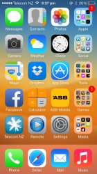
Post #731 in this thread (home screen with Apple icons hidden in folder) looks ok to me. I can live with that.
Agreed. But Apple may have all the other developers redesign their icons to match the Apple App icons in terms of design style. That way it looks more seemless. Why else do you think Apple gave the iOS developers the new design rubric for their icons?


")