That's only iMessage I suppose? Does regular text (green text) get lighter & darker or no?
The green text does get lighter and darker.
That's only iMessage I suppose? Does regular text (green text) get lighter & darker or no?
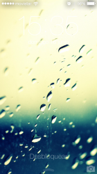
Can you share these walls?
This looks so slick.
The home screen would look good with these colors. Simple icons with black/silver outlines and perhaps some subtle/soft colors like this background.
I second it. SchneiderMan, very nice wallpaper. Pls share?


")

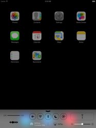
Can someone get a shot in here of their zoomed out, non selected folder icons? Mine are always this dull grayish blue box. It looks absolutely horrible on a black background. When you select them it goes transparent and matches the icon bar at the bottom - which is what I feel they should be doing all the time. Am I seeing a bug? Or is this grey blue madness there for everyone?
----------
For reference - here is what I have.
Image
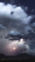
My Windwaker, panorama, moving wallpaper! Amazing!
I don't know if any of you guys noticed, but your side of the conversation while iMessaging (idk about sms), the higher up messages are, the lighter they are, and vice versa.
I got it from a google search.Please share the original?? Thanks.
Hi, how you get the face on the contact icon???
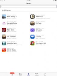
It confuses me that you have all those folders, especially Social, Finance, and Entertainment, yet you don't have Music inside Entertainment. Facebook, Vine, Tweetbot and Instagram inside Social, and then Mint inside Finance. Why?
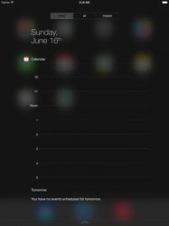
The calendar icon on iPad is really screwed up.
I hate the long day view thing in NC. Just show the events, not a whole big timeline.
Why is there a flashlight in the control panel? iPad's don't have a flash.
Eww.
I hope that's a mockup.