Wondering if the line at the bottom of the iPhone x screen serves any purpose. I mean, can't the new gestures work if you just swipe up from the bottom without this line? Does it exist more as a visual cue as the location to start your gestures from in which case it could disappear in the future?

Got a tip for us?
Let us know
Become a MacRumors Supporter for $50/year with no ads, ability to filter front page stories, and private forums.
Purpose of the hideous line at the bottom
- Thread starter harpyeagle
- Start date
- Sort by reaction score
You are using an out of date browser. It may not display this or other websites correctly.
You should upgrade or use an alternative browser.
You should upgrade or use an alternative browser.


Ralfi
macrumors 601
Some videos showed it disappearing on some Apps.
I'd presume future IOS updates will see it become invisible within more Apps.
Don't fret, early adopter. 😀
I'd presume future IOS updates will see it become invisible within more Apps.
Don't fret, early adopter. 😀

Peanut207
macrumors 6502

deany
macrumors 68030
Excellent write up. A+

Faelan
macrumors 6502
My concern with the line in the bottom just like booting up or getting an update is image burn in. Calling the line hideous is kind of funny. It’s similar with people calling the red dot on the S3 Watch a monstrosity. Silly. Just silly.
The red dot on the S3 LTE version serves no other purpose than showing the rest of the world that it’s a fancier, more expensive model. I think that rubs some people the wrong way. It also looks a bit out of place depending on the color of your watch band. The line at the bottom of the X at least serves a purpose.

Apple_Robert
Contributor
The line at the bottom of the screen is for drunks, so that they can look at it (keep it level) and hopefully, stop themselves from tipping over.

PanAm-L1011
macrumors 6502a

lyngo
macrumors 6502a
The red dot on the S3 LTE version serves no other purpose than showing the rest of the world that it’s a fancier, more expensive model. I think that rubs some people the wrong way. It also looks a bit out of place depending on the color of your watch band. The line at the bottom of the X at least serves a purpose.
My point is the line isn’t hideous and the dot isn’t a monstrosity. Get over it! Don’t like it, don’t get it. I never, never see the dot. It’s on the side. Also, it doesn’t clash with everything.
I think it’s hideous because I don’t own an X and only see it in passing when looking over my husband’s shoulder. It stands out, like the Notch, in those cases and is distracting. But on the occasions my husband lends me the IPhone X to evaluate it and use it, I do immediately forget it is there or seek it out as a guideline on where to swipe from to get back home. For me it’s a matter of perspective and definitely not a deal breaker. It’s like training wheels on a bike. I think eventually Apple will phase it out.

ImBuz
macrumors 6502
I had a version 2 watch and sold it and got a version 3--not one person has commented on the red dot--not even my wife--who notices everythingThe red dot on the S3 LTE version serves no other purpose than showing the rest of the world that it’s a fancier, more expensive model. I think that rubs some people the wrong way. It also looks a bit out of place depending on the color of your watch band. The line at the bottom of the X at least serves a purpose.
Faelan
macrumors 6502
My point is the line isn’t hideous and the dot isn’t a monstrosity. Get over it! Don’t like it, don’t get it. I never, never see the dot. It’s on the side. Also, it doesn’t clash with everything.
I’m fine with the dot. There’s nothing for me to get over. I actually kinda like it on the space gray. I’m just able to see why other people might dislike it. Still, it serves no purpose other than showing which model you got. I think that could have been done more elegantly by putting a little embossed apple logo on the crown. But I suppose it could annoy some people to have it upside down half the time *shrug*.
As for the line, it strikes me as wasted screen space. I don’t need a line to remind me that I can swipe up on my 8+ to get to the control center, so why do I need one on the X? Sure, it’s nice in the beginning when you’re new to the experience, but an option to take off the training wheels once you’re comfortable with the new way of doing things would be nice. Just an option. Is it terribly wrong to have options?

ppdix
macrumors 6502a
I also hate it. I understand iPhone X has a new concept of swiping and a bar gives you the idea of "grabbing" something to swipe up, but it does get in the way. it should be a toggle on accessibility if u really want it but it takes too long to fade off in photos and videos. it takes away from the cleanliness of the screen. I wish I could remove it.

KingslayerG5
Suspended
I don't mind the line as it does serve a visual cue to swipe to different apps. What I dislike is that gray area background in the dock if you set a plain black wallpaper. Why can't it just be invisible? Nova Launcher gives us an option to keep the dock background transparent. They just give us a ton of options like hiding apps, renaming them, resizing, and changing the icons.
The pic below is what my home screens look on both my G5 and V20 with no gray area for the dock. Please, Apple! Let us make the home screen the way we want to!
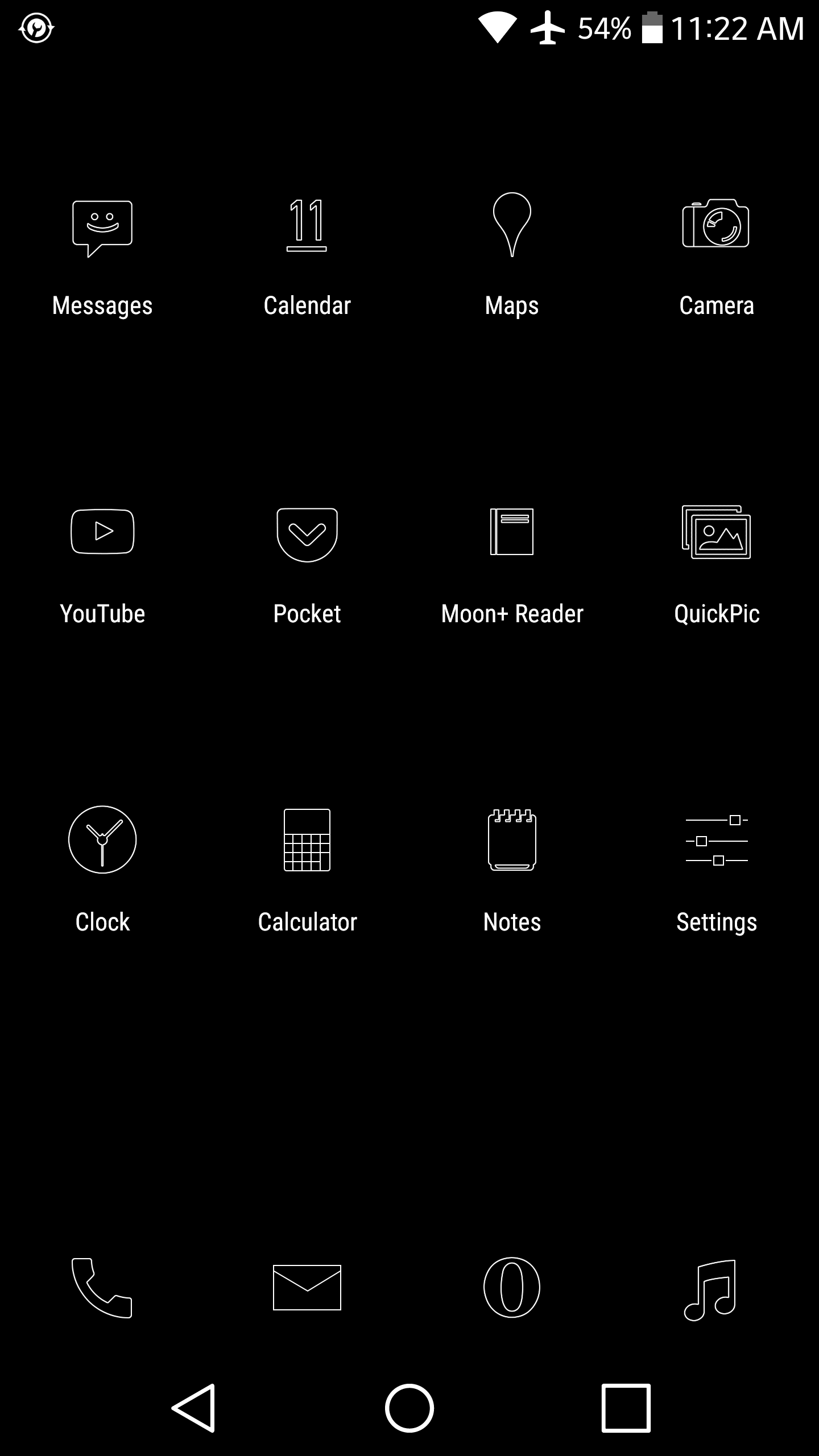
The pic below is what my home screens look on both my G5 and V20 with no gray area for the dock. Please, Apple! Let us make the home screen the way we want to!
Jasonstevens
macrumors regular
The line is there to indicate where you can swipe. It’s so when an app is in landscape you can tell that you swipe from a different edge of the screen.
Overall it's meant to be a target for home button tapping and swiping. But honestly, after about 1 hour of usage on the device anyone can find that target easily without a visual indicator. And yes, it's VERY annoying for it to be omnipresent essentially in apps. Sometimes I just put my thumb over it and see how wonderful the world is going to be when the put in a settings option to REMOVE IT!
My concern with the line in the bottom just like booting up or getting an update is image burn in. Calling the line hideous is kind of funny. It’s similar with people calling the red dot on the S3 Watch a monstrosity. Silly. Just silly.
My point is the line isn’t hideous and the dot isn’t a monstrosity. Get over it! Don’t like it, don’t get it. I never, never see the dot. It’s on the side. Also, it doesn’t clash with everything.
LOL. Of course you won't see it. Because, you said it - It's on the side. Comparing this, which is out of the visual experience when in use, to a line that is right in the display on a phone whose major selling point is a bezel less wonderful screen? And it's full time purpose is to remind you where to start swiping from? Okayyy and Image burn in? With a line? Silly. Just silly. You think Apple would've never thought about it? Because everything Apple does is right, correct?
We all have our opinions. I for one think that the line just spoils the X's immersive experience with the screen, new gestures and is just a visual hinderance to the overall buttery smooth workflow. What is the problem to make it an option if it's just a visual cue?
For the record, I got the phone & returned it. Not because of the line, but because I couldn't adjust going in from a 6S+. I'll wait for a wider, not necessarily bigger, version next year. But w/o the phone now and all videos/screenshots I am seeing, that line stands out for some reason for me and so I wanted to find out what it really was for. It's good to know that I am not alone in preferring to not to have it.
[doublepost=1510432946][/doublepost]
I think it’s hideous because I don’t own an X and only see it in passing when looking over my husband’s shoulder. It stands out, like the Notch, in those cases and is distracting. But on the occasions my husband lends me the IPhone X to evaluate it and use it, I do immediately forget it is there or seek it out as a guideline on where to swipe from to get back home. For me it’s a matter of perspective and definitely not a deal breaker. It’s like training wheels on a bike. I think eventually Apple will phase it out.
My experience was exactly like yours. In the few days I had the phone, I rarely realized it's presence, but it doesn't complement the good looks of the phone when you look at the screen when someone else is using it or at a screenshot..cannot un-see it now that I've noticed it.
[doublepost=1510433188][/doublepost]
Hideous? Lol. Some people.
It's hideous because I can imagine how the screen would be like w/o it...much better. Thanks for your comment.
Last edited:
I remember 'skeuomorphism' to be a thing until iOS 7, which had until then helped users learn the ropes and get around with minimal instructions. So, a raised button made us realise that something needs to be actioned just because of the way it was designed. Then came the flat design. A majority of the users understood that a button is for pressing, without needing a bevel to appear to make it look like a button in real-life.
I think, with the major shift towards a button-less, completely gesture-based approach, Apple has thrown the home bar as a guiding rope for the users to get used to the design that's going to stay for quite sometime in the future. I would think that within another 2-3 years, most of the major phone brands would be moving towards a gesture-based interface too and users would generally get used to them just like they did when flat design became a thing. So, my thinking would be the bar would be done away with in iOS 12 or 13, but probably not earlier.
I think, with the major shift towards a button-less, completely gesture-based approach, Apple has thrown the home bar as a guiding rope for the users to get used to the design that's going to stay for quite sometime in the future. I would think that within another 2-3 years, most of the major phone brands would be moving towards a gesture-based interface too and users would generally get used to them just like they did when flat design became a thing. So, my thinking would be the bar would be done away with in iOS 12 or 13, but probably not earlier.
KingslayerG5
Suspended
^ The home screen of my SE. You see that area background where the dock is? I wished X had that background across or not there at all. It looks weird using a black wallpaper.
I applied the black wallpaper every time I saw it and that "open gray mouth" in the dock area annoys me. I want it seamless. That's a flaw. Admit it. Oh yeah, no ability to make the grid rows 4x4 or whatever.
iOS was originally built on smaller displays (3.5"-4"). With the inability of no drawer, hiding apps in a folder, the home screen becomes cluttered with rows of apps. My SE looks clean with just 12 apps for each page.
PanAm-L1011
macrumors 6502a
LOL. Of course you won't see it. Because, you said it - It's on the side. Comparing this, which is out of the visual experience when in use, to a line that is right in the display on a phone whose major selling point is a bezel less wonderful screen? And it's full time purpose is to remind you where to start swiping from? Okayyy and Image burn in? With a line? Silly. Just silly. You think Apple would've never thought about it? Because everything Apple does is right, correct?
We all have our opinions. I for one think that the line just spoils the X's immersive experience with the screen, new gestures and is just a visual hinderance to the overall buttery smooth workflow. What is the problem to make it an option if it's just a visual cue?
For the record, I got the phone & returned it. Not because of the line, but because I couldn't adjust going in from a 6S+. I'll wait for a wider, not necessarily bigger, version next year. But w/o the phone now and all videos/screenshots I am seeing, that line stands out for some reason for me and so I wanted to find out what it really was for. It's good to know that I am not alone in preferring to not to have it.
[doublepost=1510432946][/doublepost]
My experience was exactly like yours. In the few days I had the phone, I rarely realized it's presence, but it doesn't complement the good looks of the phone when you look at the screen when someone else is using it or at a screenshot..cannot un-see it now that I've noticed it.
[doublepost=1510433188][/doublepost]
It's hideous because I can imagine how the screen would be like w/o it...much better. Thanks for your comment.
You’re welcome. I happen to actually like the notch.

QuarterSwede
macrumors G4
I just used the X at the Apple store today for the first time and I never even noticed the notch and I knew about it but I did the Home indicator. I didn’t feel like it was in the way and I agree that they’ll get rid of it once everyone is used to the new gestures.I think it’s hideous because I don’t own an X and only see it in passing when looking over my husband’s shoulder. It stands out, like the Notch, in those cases and is distracting. But on the occasions my husband lends me the IPhone X to evaluate it and use it, I do immediately forget it is there or seek it out as a guideline on where to swipe from to get back home. For me it’s a matter of perspective and definitely not a deal breaker. It’s like training wheels on a bike. I think eventually Apple will phase it out.

Surf Monkey
Suspended
I don't mind the line as it does serve a visual cue to swipe to different apps. What I dislike is that gray area background in the dock if you set a plain black wallpaper. Why can't it just be invisible? Nova Launcher gives us an option to keep the dock background transparent. They just give us a ton of options like hiding apps, renaming them, resizing, and changing the icons.
The pic below is what my home screens look on both my G5 and V20 with no gray area for the dock. Please, Apple! Let us make the home screen the way we want to!
View attachment 734701
I’m happy to trade the grey line for Android’s ungly circle square and triangle.
You’re welcome. I happen to actually like the notch.
So? I think its hideous.
lyngo
macrumors 6502a
I’m fine with the dot. There’s nothing for me to get over. I actually kinda like it on the space gray. I’m just able to see why other people might dislike it. Still, it serves no purpose other than showing which model you got. I think that could have been done more elegantly by putting a little embossed apple logo on the crown. But I suppose it could annoy some people to have it upside down half the time *shrug*.
As for the line, it strikes me as wasted screen space. I don’t need a line to remind me that I can swipe up on my 8+ to get to the control center, so why do I need one on the X? Sure, it’s nice in the beginning when you’re new to the experience, but an option to take off the training wheels once you’re comfortable with the new way of doing things would be nice. Just an option. Is it terribly wrong to have options?
LOL. Of course you won't see it. Because, you said it - It's on the side. Comparing this, which is out of the visual experience when in use, to a line that is right in the display on a phone whose major selling point is a bezel less wonderful screen? And it's full time purpose is to remind you where to start swiping from? Okayyy and Image burn in? With a line? Silly. Just silly. You think Apple would've never thought about it? Because everything Apple does is right, correct?
We all have our opinions. I for one think that the line just spoils the X's immersive experience with the screen, new gestures and is just a visual hinderance to the overall buttery smooth workflow. What is the problem to make it an option if it's just a visual cue?
For the record, I got the phone & returned it. Not because of the line, but because I couldn't adjust going in from a 6S+. I'll wait for a wider, not necessarily bigger, version next year. But w/o the phone now and all videos/screenshots I am seeing, that line stands out for some reason for me and so I wanted to find out what it really was for. It's good to know that I am not alone in preferring to not to have it.
[doublepost=1510432946][/doublepost]
My experience was exactly like yours. In the few days I had the phone, I rarely realized it's presence, but it doesn't complement the good looks of the phone when you look at the screen when someone else is using it or at a screenshot..cannot un-see it now that I've noticed it.
[doublepost=1510433188][/doublepost]
It's hideous because I can imagine how the screen would be like w/o it...much better. Thanks for your comment.
Look, I believe that you’re both missing what I am trying to get at, so hopefully this post won’t be clear as mud as apparently my last post was for you.
First, It’s a damn line. If you don’t like it or do, that’s on you. The ring color, same thing. You can like it or not. It’s up to you. NO WHERE IN MY POST DID I SAY ABOUT EVERYTHING THAT APPLE DOES IS PERFECT. And yet you imply that I support every one of apples decisions on this. Frankly, I don’t care. If you like it, fine. If not, fine. This is just as you imply! We are on the same page with this. So, I would appreciate it if you didn’t put words in my mouth or on my posts that I didn’t write.
My issue is the use of the descriptive words that you are using to describe a damn line. The word hideous is strong. Hideous is watching people needlessly suffer when they don’t need to. Hideous is cleaning up a mess of vomit a kid makes after barfing in a school cafeteria. You get my point. As you said, it’s a line. This damn line might be wasted space, an inconvenience, maybe even ridiculous. It’s not HIDEOUS! It’s a damn line.
The dot on the Watch isn’t a monstrosity. It might be a color clash, maybe even aweful looking. But it’s not a monstrosity as others have stated.
My point (again, like I’ve said), it’s subjective whether or not you like these things. I don’t care if you do or not. It’s not skin off of my back. Whatever. I get both sides of it. Not everything Apple does is perfect, far from it. I get it, this isn’t my argument and never has been! My argument has been the use of your wording to describe a line, or - for others - the dot. The sky isn’t falling and the line is far from being hideous.