That's one and certainly a valid way of looking at it. For me (and I'd imagine for many others) it doesn't work – I live constantly inside "My Music" because I don't really care about the other things like Connect, but because this new hierarchy is forced upon all of us, the stuff I want (access to my library and different ways of sorting it) is now deeper inside of the navigation structure whilst the other items are sitting totally unused, only taking screen real-estate I would happily use for something else.There is method to this madness and a surprising variety in how different subdivisions are presented (to best suit the type of subdivision). If all these subcategories were individually selectable for the bottom row of icons, you would loose this hierarchy of categories and all would have to be presented via the same method (icon in bottom row). The hierarchy and the different methods by which the subcategories are represented (dropdown menu vs tiles vs blocks) would be lost.
Got a tip for us?
Let us know
Become a MacRumors Supporter for $50/year with no ads, ability to filter front page stories, and private forums.
Replace the 'Apple Connect' Tab with a 'Playlists' Tab in Apple Music
- Thread starter MacRumors
- Start date
- Sort by reaction score
You are using an out of date browser. It may not display this or other websites correctly.
You should upgrade or use an alternative browser.
You should upgrade or use an alternative browser.
I probably didn't phrase it as well as it could have been. I've been doing that for a while on iTunes itself. However, I'm interested to find out if there's a similar toggle for Recently Added in the new Music app on iOS 8.4
Agreed. The new app is a navigation disaster - Apple clearly wants you to not listen to anything but Apple Music anymore.
We used to be able to customize the icons at the bottom to jump to different views of our own music. But even if you turn off the 'fawn over musicians' option, and the 'Rent music option', you're not able to add genres back in (and are still stuck with the 'data sucking radio' option as mandatory.
Plus they moved audiobooks into iBooks, which has to be one of the worst, most unreliable apps apple has ever released. I'm going to have to work around that by changing them all to an 'audiobooks' genere, and manually checking the 'remember position' option on each track.
A big raspberry to Apple for force-feeding apple music down our throats. I so wish they'd separate app updates from OS updates so we could keep using functional versions.
If you banish the Connect section, you can get Playlists there as an icon in the bottom row (next to 'My Music' and Radio).That's one and certainly a valid way of looking at it. For me (and I'd imagine for many others) it doesn't work – I live constantly inside "My Music" because I don't really care about the other things like Connect, but because this new hierarchy is forced upon all of us, the stuff I want (access to my library and different ways of sorting it) is now deeper inside of the navigation structure whilst the other items are sitting totally unused, only taking screen real-estate I would happily use for something else.
I find that using the dropdown menu to select artist, album, song, etc. (inside the My Music section) is absolutely good enough for me and is definitely better than having to go the old 'Other' category at the bottom which moved you out of current view (and I had to go there from time to time because there was not enough space to fit all categories that mattered to me in the bottom row which was five categories if I remember it correctly, one of which had to be Other, leaving four places for (1) Artist, (2) Album, (3) Song, (4) Playlists and (5) Genre, not to speak of (6) Audiobooks which I occasionally also needed (I essentially never used (7) Compilations, (8) Composers or (9) Radio). Given that you had four spots for nine categories made that UI already somewhat compromised (part of that came with new categories like Radio being added to an existing UI).
And the fact that there is a global search which is always only one tap away (previously one had to be in one of the lists of songs, albums, etc. (ie, it didn't work if you were inside an artist or album and had to do a pulldown), makes up for any extra taps needed to go to any list.
You simply cannot change any UI without offending somebody. They could have kept the customisability for the users which don't use Apple Music (ie, the streaming service) but then they would have a different UI inside the My Music section
I'm not getting how people are not interested in Connect... do you have a favorite artist or band that you really love to listen to and flow? If so, what if they are putting up previously unreleased tracks for free on Connect, or behind the scenes rehearsal videos, wouldn't that be of interest to you? That's what Connect is all about.
All of my music projects from my record label have been approved for Connect and I've started to post previously unreleased songs, photo sessions and a short analog synth test video. I think Connect is going to be the thing that really changes the music world for indie artists... as long as people "get" it.
All my favourite artists are dead, there has been no good music since 1996.
Sorry but people who claim "there has been no good music since..." are living with blinders on and are afraid to open their minds. My best friend I grew up with is like that. He still listens to the Scorpions, UFO, etc. He has no clue what he is missing since then because he is so stuck in his little bubble of what he grew up with. He really needs to open his mind/expand his horizons...All my favourite artists are dead, there has been no good music since 1996.
And so I ask you, give me an example of what you think is good music... music that has apparently died out in 1996. I'm asking honestly so I can see if maybe you missed something that's come out in the last couple of years.
EDIT: And I agree if your point is that, there is a lot of crap music out today, with the likes of Justin Bieber, et al, but that has always been the case in music. In the 1970s, whether you were a Led Zeppelin fan or on the opposite end, a KISS fan, they both agreed that Leif Garrett and Shaun Cassidy sucked; they were the Justin Biebers of their day. (of course the Crosby Stills Nash and Credence and Grateful Dead fans thought the same of Zeppelin and KISS, so...)
Last edited:
Sorry but people who claim "there has been no good music since..." are living with blinders on and are afraid to open their minds. My best friend I grew up with is like that. He still listens to the Scorpions, UFO, etc. He has no clue what he is missing since then because he is so stuck in his little bubble of what he grew up with. He really needs to open his mind/expand his horizons...
And so I ask you, give me an example of what you think is good music... music that has apparently died out in 1996. I'm asking honestly so I can see if maybe you missed something that's come out in the last couple of years.
EDIT: And I agree if your point is that, there is a lot of crap music out today, with the likes of Justin Bieber, et al, but that has always been the case in music. In the 1970s, whether you were a Led Zeppelin fan or on the opposite end, a KISS fan, they both agreed that Leif Garrett and Shaun Cassidy sucked; they were the Justin Biebers of their day. (of course the Crosby Stills Nash and Credence and Grateful Dead fans thought the same of Zeppelin and KISS, so...)
Is a winky face really neccessary for sarcasm filter to be engaged?...
I like most of what Connect is about, but I cannot ****ing get 50 Cent off the top of the feed. I don't own a single 50 Cent track, he's not listed in my "following" artists, nothing. But his invite to hear his new song is the first thing I see.
I don't see a Shuffle button...Go to "My Music." There's a drop down menu under "Recently Added" in which you can select "Songs." The "Shuffle" button shuffles all of them.
Or they could just get rid of the awful pulldown menu and do something similar to what they're doing in App Store top charts (tabs on top, in that particular section only). Allow me to choose my favourites to be permanently visible and leave the rest (and the editing UI) inside a pulldown like now. Behold, a mockup:You simply cannot change any UI without offending somebody. They could have kept the customisability for the users which don't use Apple Music (ie, the streaming service) but then they would have a different UI inside the My Music section
Attachments
Oh good! I disabled Apple Music on my iPhone because I didn't like how it pushed all my music into one tab, made navigation cumbersome. Good to know I can re-enable Apple Music and just swap out that useless tab for a useful one!
Poking around in the new IOS UI and hoping that somehow they've added something to differentiate or sort full albums vs. individual tracks when viewing "Albums." Couldn't find it.
I've gotten in the habit of playlisting my purchased albums, and using "Playlists" as a de facto album collection that ignores the singles. Sorting is an issue, but using folders has allowed me to make it navigable.
I've gotten in the habit of playlisting my purchased albums, and using "Playlists" as a de facto album collection that ignores the singles. Sorting is an issue, but using folders has allowed me to make it navigable.
Marvis has done this job in a reasonable way.Or they could just get rid of the awful pulldown menu and do something similar to what they're doing in App Store top charts (tabs on top, in that particular section only). Allow me to choose my favourites to be permanently visible and leave the rest (and the editing UI) inside a pulldown like now. Behold, a mockup:
")
Any way to get the SONGS tab back?
Or GENRES! Or anything else I want which Apple now has removed and replaced by something I DON'T WANT!
I'm not getting how people are not interested in Connect...
I don't read music - I listen to music. If I want to find concert tickets I visit sites I would buy the tickets from. But usually the artists and groups I listen to don't do concerts.
I don't read music - I listen to music. If I want to find concert tickets I visit sites I would buy the tickets from. But usually the artists and groups I listen to don't do concerts.
What? What does that have to do with anything? Most of the artists I'm following are posting rare unreleased tracks (me included) so I am pretty much doing nothing BUT listening on Connect.
So I ask you, as I've asked someone else and got no response, if you have a favorite artist whose music you love, wouldn't you want to hear something of theirs that you've never heard before? For free! Seems like a no-brainer to me...
Last edited:
If you say so, you will end up bringing iOS 8.3 music app back. There would have everything you want.Or GENRES! Or anything else I want which Apple now has removed and replaced by something I DON'T WANT!
I was really glad to get rid of Connect since I will never use it and it took up space. Apple needs to make the tabs on bottom customizable like they used to be,
Then you can use the combination of settings and restrictions to customise, for now.I was really glad to get rid of Connect since I will never use it and it took up space. Apple needs to make the tabs on bottom customizable like they used to be,
But even previous customisation could not remove more than three or four icons. You still need to stick to several icons at the bottom, which some of them is not what you want.I was really glad to get rid of Connect since I will never use it and it took up space. Apple needs to make the tabs on bottom customizable like they used to be,
So the big question is, what does @arn listen to in his playlist while reading MacRumors?
View attachment 565412
Arnold Layne?
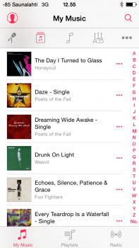
Apple is changing the UI to accommodate new 'categories' that require a new organisational level. There is 'Your Music', 'New Music', 'For You Music', Radio, Connect. 'Your Music' is split into 'Library' and 'Playlists' (removing Connect elevates Playlists into the first category) Artists, genres, albums, etc. are subcategories of the 'Your Music'/Library category. Genres are subcategories in the 'New Music' categories. 'Apple Music Playlists' and 'My Playlists' are subcategories within Playlists. These subcategories are accessed via a dropdown menu. Different stations in the Radio category are represented by tiles as a playlists in the 'For You' category. Different subcategories in 'New Music' are represented by blocks with tiles within them.
There is method to this madness and a surprising variety in how different subdivisions are presented (to best suit the type of subdivision). If all these subcategories were individually selectable for the bottom row of icons, you would loose this hierarchy of categories and all would have to be presented via the same method (icon in bottom row). The hierarchy and the different methods by which the subcategories are represented (dropdown menu vs tiles vs blocks) would be lost.
I rather doubt that Apple will make more money from streaming than from downloads and at best that difference will be marginal compared to the overall profits of Apple. Streaming is what an increasing number of people prefer (streaming services are growing steadily while downloads stagnate). By offering it, Apple provides people with (a) what they want and (b) in a way that provides users with something extra that other streaming services don't offer: integration with existing personal iTunes music libraries plus potentially better ways of discovering new music and great playlists. This of course helps Apple (by stemming the losses to other streaming services and making their devices more appealing, though with Apple Music coming to Android the effect is more indirect by making the brand Apple more appealing) but it is also designed to help the user (via the iTunes library integration and better discovery methods).
Reducing this change to an attempt to reduce choice by Apple is an extremely narrow point of view that hangs its argument onto one small change (having to use a dropdown menu to switch between albums, song, artists, genres instead of an icon in the bottom row) and ignores all other changes in its narrative.
This is actually Apple's (and the record industry at large) response to "lost" revenue. It is not about providing more for a customer. This is about paying for each song you listen to, when you listen to it, just like the way radio has been doing for decades. The only difference is each person can be the Radio DJ instead of phoning in a request.
To say this is for the good of the consumer is probably the most narrow minded viewpoint of all. At least you admit that it is "madness", so there is hope for you yet.
To also say that someone else knows how I like my UI laid out more than me is insulting. Choice hurts no one. Lack of choice, or having choices made for us, hurts us all. (no matter how small)
Sorry but people who claim "there has been no good music since..." are living with blinders on and are afraid to open their minds. My best friend I grew up with is like that. He still listens to the Scorpions, UFO, etc. He has no clue what he is missing since then because he is so stuck in his little bubble of what he grew up with. He really needs to open his mind/expand his horizons...
And so I ask you, give me an example of what you think is good music... music that has apparently died out in 1996. I'm asking honestly so I can see if maybe you missed something that's come out in the last couple of years.
EDIT: And I agree if your point is that, there is a lot of crap music out today, with the likes of Justin Bieber, et al, but that has always been the case in music. In the 1970s, whether you were a Led Zeppelin fan or on the opposite end, a KISS fan, they both agreed that Leif Garrett and Shaun Cassidy sucked; they were the Justin Biebers of their day. (of course the Crosby Stills Nash and Credence and Grateful Dead fans thought the same of Zeppelin and KISS, so...)
Sounds like maybe your mind is also a little closed, there are a lot of people who really like Leif Garrett and Shaun Cassidy, come on dude open that mind and get on the bus.
Download sales have been declining for a few years now as streaming services have gained a lot of customers. Consumers are moving on their own accord from buying music to (flat-rate) renting them. There aren't any companies that are pushing people into streaming services. I really don't understand why people so often claim that a higher power is behind any activity they don't like.This is actually Apple's (and the record industry at large) response to "lost" revenue. It is not about providing more for a customer. This is about paying for each song you listen to, when you listen to it, just like the way radio has been doing for decades. The only difference is each person can be the Radio DJ instead of phoning in a request.
To say this is for the good of the consumer is probably the most narrow minded viewpoint of all. At least you admit that it is "madness", so there is hope for you yet.
To also say that someone else knows how I like my UI laid out more than me is insulting. Choice hurts no one. Lack of choice, or having choices made for us, hurts us all. (no matter how small)
And I have news for you, every company is designing their UI in a way they think people will like it.
And I have news for you, every company is designing their UI in a way they think people will like it.
You actually think that the UI in the new music app was laid out how the people want it?
You've obviously never designed anything like the Music app. Apps on a subscription model you lay out the UI/UX to drive subscriptions and be friendly to subscribers with little regard for non-subscribers (You don't want them anyway).
Just like you'd tune the gameplay for a pay-to-get-ahead game to take advantage of impatience/competition to drive sales.
People just fall for anything apple does hook line and sinker sometimes....
Register on MacRumors! This sidebar will go away, and you'll see fewer ads.